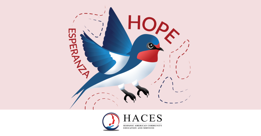
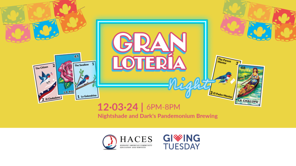
daiyidesigns

Mike’s Pizza

https://daiyidesigns.com/wp-content/uploads/2025/07/Mikes-Pizza-APP.mp4 About the Business Founded in 1964, Mike’s Pizza is an italian family owned company located in the northern suburbs of Chicago. Famous for its delicious pizza, Mike’s Pizza is a local favorite with heavy foot traffic. The restaurant offers delivery and pickup, with no dine-in option. Challenge App glitches, high demand, and inconsistent branding were negatively impacting customer satisfaction. The client needed a redesigned app that could reliably support increased traffic while delivering a more intuitive user experience. My Role As the Lead UX Designer, I conducted user research, created wireframes, developed low-fidelity prototypes, synthesized insights using affinity diagramming, and delivered a high-fidelity prototype. Project Date January 30, 2023 – November 19, 2023 Duration Eleven Months Project Overview App Summary I designed a new Mike’s Pizza app for busy professionals who need a fast, reliable way to order food. The Problem Flip ↻ The Mike’s pizza app needs to provide a fast, reliable, and easy user experience. The Goal Flip ↻ To create an reliable and fast user experience that allows users to easily schedule a pizza order. Scroll to Section Empathize Define Ideate Prototype Takeaway Empathizing with the User User Research: Summary User interviews were conducted. It was discovered that Mike’s pizza attracts working single professionals who work in medium to large companies and need pizza delivered for themselves and for everyone at the office 2-3 times a week. Mike’s pizza also attracts busy individuals on a tight schedule who multitask and wear multiple hats in their day-to-day lives. This individual prefers pickup. Before conducting the research, it was assumed that single individuals under the age of 30 would be the user group who would order pizza the most. After the research it became clear age was not the deciding factor but lack of time, whether people were in groups, and an individual’s energy level. People who are in a group (whether it’s a family or coworkers)  are likely to order pizza for everyone. Individuals who are busy and do not have time to cook will also order pizza. Lastly, individuals who do a lot throughout their day become hungry around dinner time but do not have the energy to cook; they, too, will order pizza. Pain Points 01. Time Users are busy and do not have time to cook. Users need a FAST, EASY, and EFFECTIVE solution. 02. Accessibility Users do not enjoy an app that is not optimized and does not work well with assistive technology or alongside other apps. Users do not enjoy having a language barrier that makes it difficult to use the app. 03. UX Users have a difficult time ordering from food apps that do not have a friendly, logical, navigational experience. Food apps are inconvenient when users have to reorder the same order or go through a long series of steps that do not follow a logical order. 04. Communication User do not like how difficult it is to communicate with an actual person when problems arise. User also feel uncertain when ordering food without speaking to an individual. They dislike not knowing the progress of their order. Personas Based on user research findings, two personas — George (Group 1) and Natalia (Group 2) — were developed to represent the primary user segments identified through shared behaviors and needs during interviews. George Natalia George Age: 26Education: College-GraduateHometown: North Chicago, ILFamily: Single, Lives AloneOccupation: Mid-Level Researcher George is a mid-level researcher at a large biopharmaceutical company and often orders pizza for everyone to show his commitment to the team. His days are very busy especially because he wants to get a promotion soon. Due to this, George values efficient and effective food service. He does not want to worry about yet another responsibility. A smooth, easy, and reliable service is what George needs. “At work, I always have a lot to do. I love efficiency. The more efficient I can be, the more I can cross off my checklist.” Goals George likes to focus on work as much as possible without any distraction. He wants to receive a promotion soon and is taking on extra responsibilities. Frustrations “I often order food for myself and coworkers. I dislike the tediousness and find it time consuming. I reorder the same order three times a week and have to reselect all my options each time.” “It’s difficult to estimate when the pizza will arrive to the office. It often gives a range and it’s frustrating to not know when the driver is close. I wish communication could improve.” “It’s frustrating when the pizza does not arrive on time or arrives cold.” Natalia Age: 39Education: Online College ClassesHometown: Grayslake, ILFamily: 4 Children, 2 PetsOccupation: Stay at home mom As a busy mom of four and two pets, Natalia’s time is precious. Natalia orders food during dinner time when she does not have anymore energy from her very busy day or lunch time when she is deep in her studies. In both scenarios she is looking for a quick and easy option to obtain food. Natalia needs an application that is easy to use, works with supportive apps, and is effective. “Being a mom and a student is like having two full time jobs. I only use tools that are effective.“ Goals Go back to school now that her kids are all in school. To earn a degree by the time her kids go to college.  To care for her family and ensure they feel supported. Frustrations “I have a visual impairment. It’s frustrating when my screen reader app cannot work with food apps because they are not optimized.” “Picking up food can be tricky. Sometimes I come earlier and have to wait or other times I come later and the food is cold.” “As a russian immigrant, it can be difficult to communicate, I enjoy apps that are efficient / effective and straight to the point.” User Stories Who, what, and why? George Natalia George As a working professional who frequently orders pizza for my

Mike’s Pizza Read More »

YCC Website

About the Business In 2024, the Youth Conservation Corps (YCC) celebrated 50 years of equipping Lake County youth (16-24 years) with lifelong skills. YCC is a nonprofit organization dedicated to helping every young person find a pathway to success. It mentors and empowers young adults through education and training in life skills, career development, and environmental stewardship. The organization offers six core services: life skills and mentoring, education, community service, trades and vocational training, conservation and sustainability, and job placement. My Role As a contractor, I independently executed full webpage designs and redesigns, aligning with strategic marketing goals and reinforcing brand identity. Project Date March 2024 – August 2024 Duration Six-Months Project Overview Website Design Summary I worked on eight pages and the site’s footer for the YCC website. I created website pages from scratch and redesigned others to strengthen the site’s brand presence. Homepage (Redesigned) Footer (Created from Scratch) Partner Page (Created from Scratch) Events General Page (Redesigned) Rockegan (Redesigned) Golf Outing (Redesigned) Summer Campaign (Created from Scratch) Career (Created from Scratch) About Us (Redesigned) Get Involved (Redesigned) Staff (Redesigned) Sitemap (Created from Scratch) The Problem The YCC website needs to easily communicate it’s objectives and services to its target audience. The Goal To improve access and clearly communicate with the target audience. The Solution The YCC website redesign improved communication and the navigational experience between different target audiences. Empathizing with the User Pain Points Under the direction of the Director of Development & Communications, I was asked to design or redesign webpage. She expressed the following pain points. 01. Clarity The website pages do not quickly answer the questions of: 1) What am I looking at? 2) What does this organization do? Or what is the purpose of this page? 02. Layout The layout makes it difficult for the user to digest information and/or distinguish one section from another. 03. Communication The website excluded key users, including partners, supporters, and alumni. Website pages and forms need to be created and/or added to improve YCC’s communication with these specific users. 04. Brand The current use of brand elements lacks consistency and impact. Strengthening its application would improve visual hierarchy, enhance contrast, and reinforce brand recognition throughout the website. 05. Website Essentials The website is missing key elements that are essential for usability and credibility, which can negatively impact user trust. User Stories Who, what, and why? Partner Donor Board Member Alumnus Parent Prospective YCC Member Partner As a corporate company, we want to volunteer, so that we can give back to the community. Donor As an sponsor, I want to practice philanthropy at a trustworthy organization, so that I can empower the next generation of young people. Board Member As an board member, I want to stay informed about recent activites and events, so that I can support the organization’s growth. Alumnus As an alumnus, I want to keep up with upcoming events, so that I can continue being part of the YCC community. Parent As an parent, I want to easily understand YCC’s services, so that I can potentially enroll my child. Prospective YCC Member As an prospective YCC member, I want to easily understand YCC’s services, so that I can see if it’s a good fit. Defining the User’s Need Problem Statements After understanding the pain points users faced, I created problem statements to define how different users specifically experience pain points.  Partner Donor Board Member Alumnus Parent Prospective YCC Member Partner Grainger is a large-sized business who needs to sign up for volunteer opportunities on the YCC’s website, because they are committed to social responsibility. Donor Kim is a retired professional interested in philanthropy who needs to validate YCC’s credibility through its website because she wants to create a lasting legacy with real-world impact. Board Member Laurence is a real estate agent and board member who needs to easily find YCC fundraising initiatives on its website because he wants to contribute to YCC’s mission.  Alumnus Jerry is a YCC alumnus who needs to effortlessly find YCC alumni opportunities via website communication because he wants to continue being involved with the YCC mission. Parent Veronica is a busy single working mom who needs to quickly find information about YCC services on its website because she has limited time to help her son find a career path.  Prospective YCC Member Enrique is a prospective YCC member who needs to determine if YCC’s services, as communicated on its website, will help him achieve his GED because he wants to return to school via a non-traditional school system. Summary It is challenging for users to navigate webpages and interpret the information due to the website’s layout. The website is missing key elements that are essential for establishing credibility like a footer. In addition, specific target audiences like alumni and partners do not have the tools to directly communicate or receive communications from YCC.  The Solution YCC’s website layout was improved to clarify each page’s purpose and reinforce consistent branding. Key elements such as a sitemap and footer were added to build user trust. Communication tools, including a redesigned partner page with a contact form and updated events pages, were developed to enhance engagement and facilitate easier connection with the YCC team. Scroll to Section Homepage Website Essentials Partner Page Events Career About Us Get Involved Staff Result 01 HomepageBeforehttps://daiyidesigns.com/wp-content/uploads/2025/07/HomepageMockup_Screens_YCC-1.mp4Afterhttps://daiyidesigns.com/wp-content/uploads/2025/07/Homepage2Mockup_Screens_YCC-2.mp4 VISIT HOMEPAGE Project summary Redesigned layout to improve clarity between sections and strengthen brand presence. Pain Points + Solutions Image above the fold Outdated. Does not quickly answer the questions of: What am I looking at? What does this organization do? The call to action could be a more prominent focal point, showcasing current campaigns. Modern. Quickly informs viewers of what YCC does. Emphasizes the call to action. Can be updated accordingly. Layout The layout is lengthy and requires extensive scrolling. There are three columns of two. Does not follow brand colors. The layout is shortened into two columns of three. The color scheme is attractive, effectively emphasizing the brand’s identity.

YCC Website Read More »

Under the Same Moon

https://daiyidesigns.com/wp-content/uploads/2025/06/Untitled-design.mp4  Between July 1, 2022, and June 30, 2023, 3,309 individuals received navigation and case management supportive services, and over 10,000 people received information about services and community resources. About the Business HACES is a nonprofit based in Lake County with 20 years of experience providing navigational support and expertise. Department of Justice-accredited, HACES specializes in immigration law and offers expert guidance on immigration cases. Operating on three pillars—legal, education, and health—HACES divides its services to address different aspects of clients’ lives, aiming to improve their overall quality of life. My role Marketing & Development Coordinator oversees the marketing department and creates all event visuals. Assisted by a marketing intern.  Project Date December 9, 2023 Project Duration Four months Project Brief Following the COVID-19 pandemic, HACES’ goal was to return to in-person galas, signaling HACES’ return to conducting business in person. “Under the Same Moon” was a theme created by board member Ivan to bring the community together again after the pandemic. This theme reflects the idea that, no matter where we are, who we are, we all look up at the same moon and share our hopes and dreams with it. It was also inspired by the movie “La Misma Luna.”  “Under the Same Moon” targeted the business community, including partners, corporate sponsors, organizations, and nonprofits. It was our goal to raise a net profit of $15,000.  Phase 1: Gathering Requirement / Research 01 Gathering Requirements Empathized with stakeholdersDefined stakeholders expectations Understood project goals/scope Empathized with stakeholders Stakeholders were interviewed and shared the following about their intentions and goals for the gala: Board Members “To engage in creative marketing efforts in an effort to raise the awareness of the HACES brand in the community.  By doing so, hopefully to make prospective clients aware of HACES services and also to convince prospective donors of the worth of financially supporting HACES.” “It should feature HOPE and also families gazing up at a Moon symbolizing their connection and that we all share the same moon.”  “We can do more in the area of outreach, especially those that have many contacts in the community.” Executive Director “It is time for HACES to reestablish its presence in the community and extend a warm welcome as we emerge from the COVID-19 pandemic. We have officially resumed providing in-person services.” Defined stakeholders expectations Stakeholders expressed interest in reintroducing the annual HACES gala in the post-COVID era to signify that HACES is now resuming complete in-person services. Stakeholders were excited to boost HACES’ visibility within the community through: Community Engagement and Outreach Attracting local businesses and potential clients through in-person networking Reaching new audiences who follow HACES’ social media campaigns, especially those featuring success stories Marketing and Brand Presence Showcasing HACES through printed materials like postcards Displaying those materials in local businesses and display boxes throughout Lake County, further increasing community awareness Understood project goals / scope The marketing department is responsible for creating visuals that align with the event’s theme, Under the Same Moon, and managing efforts to sell and promote admission tickets and sponsorships. 02 Research Based on the stakeholders’ vision, I researched the different types of moons. The Board Members wanted to create a creative event that would be eye-catching and attract the community. They envisioned the following moons as sponsorship levels: Full Moon  Lunar Eclipse Flower Moon Blue Moon  Crescent Moon Stars I researched each moon type, learning about its cultural significance and the season in which it is observed. I studied the anatomy of the moon by going to the Adler Planetarium in Chicago. Conducting research enabled me to create an accurate visual representation of the moon, while also honoring the cultural meanings associated with each moon type. Visiting the Alder Planetarium was inspiring. While there, I studied their presentation of visuals and reflected on my own experience while interacting and absorbing information. I was inspired to create an experience for future attendees of the Under the Same Moon gala, utilizing visual and motion graphics.  Notes Phase 2: Visual Identity Development Project Overview As an HACES employee, I began marketing “Under the Same Moon” four months before the event. During this period, I created graphic designs and video materials while advancing ticket sales and sponsorships. “Under the Same Moon” was paired with our Giving Tuesday campaign to maximize donations. HACES was given a match from the Healthcare Foundation of Northern Lake County during the giving period from November 21 to December 19. Graphic Design Visual Design Postcard Invitation Sponsorship Form  Event Signage  Program Powerpoint Letterhead 5X5 QR Code Cards Videography Social Media Testimonial Promo Video Teasers Under the Same Moon Client Testimonial Video Marketing Social Media Marketing  Email Marketing  Sponsor Form  Above the Fold Image on Website Facebook Event Cover Graphic Ticket Event Site Events Brand Language Join us for a night of elegance and purpose at our end of the year fundraising gala, Under the Same Moon! As we approach the close of another remarkable year, we invite you to celebrate with us in style while making a meaningful impact. Your presence at our gala will not only mark a fabulous night of joy and connection but also contribute to our mission’s continued success. Between July 1, 2022, and June 30, 2023, 3,309 individuals received navigation and case management supportive services and over 10,000 people received information about services and community resources. HACES’ mission is to provide the expertise and navigational support for immigrants and new citizens to become knowledgeable, empowered members of society. Together, we can amplify our impact and create positive change that resonates far beyond this evening. Date: Saturday, December 9, 2023 Time: 6:00 – 9:00 p.m. Venue: Greenbelt Cultural Center, 1215 N. Green Bay Road, North Chicago, IL 60064 Secure your spot now and be a part of this extraordinary celebration with a purpose. We look forward to sharing this unforgettable evening with you! Event Highlights Include: Logo A Spanish and English logo was created using the typeface Dulcinea. Color Palette Gradients By combining a color from the color palette with

Under the Same Moon Read More »

YCC Print Materials

About the Business In 2024, the Youth Conservation Corps (YCC) celebrated 50 years of equipping Lake County youth (16-24 years) with lifelong skills. YCC is a nonprofit organization dedicated to helping every young person find a pathway to success. It mentors and empowers young adults through education and training in life skills, career development, and environmental stewardship. The organization offers six core services: life skills and mentoring, education, community service, trades and vocational training, conservation and sustainability, and job placement. My Role Contractor Project Date March 2024 – July 2024 Duration Six-Months  Project Brief During the six months I worked as a contractor at Youth Conservation Corps (YCC), I was responsible for creating print materials that adhered to the organization’s visual brand identity. Each piece could be printed for physical distribution or shared digitally. This supported clear and consistent communication with a wide range of audiences. My work supported both external outreach and internal communication goals. For example: I developed materials for the YCC Celebration of Achievement, a key event honoring program graduates. I created informative posters to communicate workshop rules and expectations in the woodshop environment. I produced donor and partner material highlighting YCC’s programs and inviting continued support for its mission. These visual tools played an important role in reinforcing YCC’s brand consistency and enhancing stakeholder engagement. 01 Visual Brand Identity YCC is a vibrant, youth-focused brand that champions inclusivity and a supportive learning environment. It is built on mutual respect and driven by a cycle of empowerment. The brand is fun while showcasing the seriousness of their mission and commitment to removing barriers that young people face.  Color Scheme YCC’s color scheme consists of two primary colors and four secondary colors. All designs consistently incorporate the primary colors, while the secondary colors are used selectively to differentiate topics or draw attention to lower-priority elements within the visual hierarchy. Visual Brand Elements Rounded-edge triangles are key players in YCC’s visual communications. They’re arranged in various fun patterns and playfully alternate in color to create visual interest. The triangles serve as symbolic building blocks, reflecting the inner foundation members begin to construct—skills, habits, and values that shape their journey toward lifelong learning and personal fulfillment. Pattern 1 Pattern 2 Pattern 3 Pattern 4 Pattern 5 02 Mockups I created the following Graphic Design materials for YCC: 50th Anniversary Logo One Pagers Partner Volunteer Program Brochure Posters Celebration of Achievements Parent Community Event Photography 50th Anniversary Logo 2024 marked YCC’s 50th anniversary. To celebrate this milestone, I was asked to create a logo to be featured on all print and digital materials throughout the year. One Pagers One-pagers were created to inform donors about YCC’s two biggest programs: YouthBuild and the Summer Conservation Program. After learning about the programs, donors are encouraged to explore how their potential donation can create IMPACT through these initiatives. Partner Volunteer Program Brochure A partner and volunteer trifold brochure was designed to easily communicate volunteer opportunities throughout the year to interested organizations.  Hover to the bottom left corner to flip and see the inside of the brochure, or place your cursor in the middle of the brochure.   Posters 24 X 36 inch posters were made to display in YCC’s carpentry classroom. The posters reminded the YCC members of the shop expectations and the shop rules.  Celebration of Achievements Each year, YCC holds a Celebration of Achievements ceremony where YCC members who have graduated from the program are recognized. For this event, I was assigned to create an invitation and program. Hover to the bottom left corner to flip and see the inside of the program, or place your cursor in the middle of the brochure.   Parent Community Event A Spanish and English flyer was designed to invite the YCC’s members’ parents or legal guardians to tour the YCC building.  Photography I photographed staff alongside YCC’s core values and uploaded the images to the website to visually reinforce the organization’s brand. Testimonial Return to Portfolio Diana is a very talented designer and technician who is also delightful to work with. She consistently holds herself to the highest standards of quality and professionalism. Any organization would be lucky to have her on their team. Return to Portfolio

YCC Print Materials Read More »

Gran Lotería Night

About the Business HACES is a nonprofit based in Lake County with 20 years of experience providing navigational support and expertise. Department of Justice-accredited, HACES specializes in immigration law and offers expert guidance on immigration cases. Operating on three pillars—legal, education, and health—HACES divides its services to address different aspects of clients’ lives, aiming to improve their overall quality of life. My Role The Marketing & Development Coordinator oversees the marketing department and creates all event visuals. Assisted by marketing interns. Project Date December 2024 Project Duration 6 Months Project Brief HACES introduced the annual Gran Lotería Night to bring the community together in a casual setting. This mini-fundraiser, which offered small sponsorship opportunities, grew HACES’ community visibility while raising funds. Designed as a more affordable and inclusive alternative to the formal gala, the event provided a fun and accessible opportunity for the community to connect with HACES and its cause. The Gran Lotería Night took place in the evening at a brewery. This event targeted working adults. We organized the event from 6-8 PM to accommodate the busy schedules of our participants. Loteria is a Mexican game similar to bingo, but instead of numbers, it uses colorful illustrations with an associated title.  While playing, attendees could purchase beer brewed in-house at Nightshade and Dark’s or food from a taco truck outside. In addition, seven lucky winners won prizes and gift baskets. To further connect attendees to the HACES mission, I created nine custom HACES lotería cards and incorporated them into the game. Speakers shared information about HACES’ services when these special cards were announced. Seven of the nine cards featured Hope, the HACES mascot, adding a recognizable and engaging element. These changes offered attendees a unique and memorable HACES experience, reinforcing the mission they were supporting, highlighting its impact, and strengthening brand equity within the community. Project Overview The board members were interested in creating an annual fundraiser that would be: Cost effective Fundraise an additional $3,000 Easy for the staff to recreate every year Would bring the community together to increase the visibility and strengthen the brand recognition of HACES To successfully launch our new annual fundraiser, we chose a reliable platform that supported multiple payment methods and streamlined both online and in-person transactions. We also focused on creating a compelling and memorable HACES experience that attendees would look forward to each year. To maximize impact, the event was strategically launched on Giving Tuesday, allowing all donations to be matched. Graphic Design Visual Design Postcard Invitation Sponsorship Form  Loteria Cards Sponsorship Table Cards Marketing Social Media Marketing  Email Marketing  Functioning Online Ticket Platform Above the Fold Image on Website Facebook Event Cover Graphic Stakeholders The Gran Lotería Night was organized by HACES staff and the Board of Directors. A dedicated fundraising committee was established to oversee the planning and execution of the event. Board members helped secure sponsorship and gift basket donations. Throughout the design and marketing process, careful consideration was given to the target audience, working adults, to create an event that would be fun, easy to participate, and well attended. Sketches After being assigned to create the event’s visual identity, I asked HACES marketing intern JP to review the project brief and provide me with an original idea of where we could take the visuals of the event. JP thought we could make the logo a glowing sign to emphasize the “gaming” aspect of the event, as seen in other industries like the casino. Additionally, he added that we should have flying loteria cards around it. Next to his written notes, he showed me a picture of a glowing sign he found on Amazon.  I loved JP’s idea. It was unique, eye-catching, and targeted the correct audience. Once I approved JP’s idea, JP created three initial sketches. I enjoyed JP’s layout in the second sketch. I did a quick sketch to picture how the cards could interact with the neon sign. I began to study the color scheme of the classic Mexican Loteria game made by Don Clemente and picked out the repeated colors I saw, noting them in my sketchbook. In addition, I started sketching the sponsorship logos for each category.  Color Scheme The visual identity for Gran Lotería Night features a vibrant color palette of blue, yellow, pink, and green. These colors were chosen both to capture attention and to evoke the traditional look and feel of the classic Don Clemente Mexican Lotería game. This helped ensure that when the nine new HACES cards were integrated, they matched the overall design and felt authentic within the classic lotería aesthetic. The classic Don Clemente Loteria cards lay on my desk at work. I chose ten cards that repeated the colors I most frequently saw within the deck.  I created a color palette based on those colors. I added five pigmented hues and three lighter hues for contrast. Visual Elements Nine unique HACES cards were created to add a personalized element to the invitation and the Loteria card. Considering our audience, the HACES cards included the title for each card in English and Spanish.  Showcases the three pillars of HACES from which the continuum of services is provided.  Represents HACES clients and volunteers. Depicts HACES services and Hope, the HACES Mascot, informing the audience she is a Swallow. The Final Design In conclusion, the design of Gran Lotería Night maintained the look and feel of the classic Don Clemente Mexican lotería game while thoughtfully integrating HACES visual elements. This balance of tradition and personalization ensured familiarity for attendees while generating excitement around the unique twist HACES would bring to the experience. Marketing To promote Gran Lotería Night, I led a multi-channel marketing campaign that included: A sponsorship letter (digital and printed) A ticketing platform Social media posts Email marketing newsletters A digital banner is displayed across various platforms The digital banner played a central role in building brand recognition. It was promoted through multiple online outlets to raise awareness of the event and maintain visual

Gran Lotería Night Read More »

HACES Newsletter

About the Business HACES is a nonprofit based in Lake County with 20 years of experience providing navigational support and expertise. Department of Justice-accredited, HACES specializes in immigration law and offers expert guidance on immigration cases. Operating on three pillars—legal, education, and health—HACES divides its services to address different aspects of clients’ lives, aiming to improve their overall quality of life. My Role Contractor2021-2023 Marketing & Development Coordinator2023-2025 Project Date January 2021 – Present Duration Five-Year ProjectA newsletter is published monthly. Project Brief As a medium-sized organization, HACES receives funding from foundations, donors, and grants. It is also a well-recognized community resource, working closely with both community members and partner organizations. Monthly newsletters are produced to keep stakeholders informed of ongoing initiatives while strengthening business relationships, reinforcing brand positioning (how the organization is perceived), and building brand reputation (establishing trust and credibility). Each issue includes program updates that highlight impact through both qualitative data—such as client testimonials—and quantitative data, including key statistics. The newsletters also showcase staff commitment to continuous improvement and promote upcoming events. While my coworker develops the content, I design each newsletter using our CRM platform, Bloomerang, ensuring visual consistency with the HACES brand and clear communication of the intended message. 01 Visual Brand Identity HACES’ mission is to provide expertise and navigational support for immigrants and citizens to become knowledgeable and empowered members of society. It operates from a foundation of three pillars: legal, education, and health, so everyone has their personal, private, and professional needs met. The brand’s tone is serious, experienced, trustworthy, and passionate, establishing itself as an expert dedicated to addressing the needs of its community. Color Scheme HACES’ color scheme consists of three primary colors and three secondary colors. All designs consistently incorporate the primary colors, while the secondary colors are used selectively to differentiate topics or draw attention to lower-priority elements within the visual hierarchy. Visual Brand Elements Squares and trapezoids are key players in HACES’ visual branding.  The shapes above are a well-known combination used often for flyers, the HACES letterhead, posters, social media posts, etc. The exact combination or variants of the shapes are consistently used.  02 Imagery HACES’ brand tone and visual identity are always on the top of my mind when I design the HACES newsletters. To reinforce brand recognition, consistent design elements were used over a span of 4–5 years. These included: Hope, HACES’ mascot, who serves as a friendly and approachable communicator designed to build trust with the reader. Photos, especially action shots, help tell compelling stories and act as social proof of business activities. Statistics offer quantitative data to illustrate program success and impact. Hope, HACES Mascot Throughout the newsletter, Hope can be seen: Sharing program updates Encouraging readers to volunteer or donate Inviting the audience to participate in fundraising events Reporting on funds raised through recent fundraisers Highlighting community partnerships January 2021- March 2022 Call to action. Volunteer. Donate. Program updates. Call to action. Volunteer. Donate. Invite audience to fundraising events Reporting on funds raised through fundraising events. Program updates. Community partnerships. LEARN MORE Photos Throughout the newsletter, photos are used strategically: In collages to capture multiple moments or themes Alongside quotes to highlight client testimonials, or to emphasize a statistic To introduce and support storytelling Paired with graphics to draw attention to key messages Statistics 04 Email Newsletters 66 newsletters were created over a four-year period. Each newsletter recaps HACES’ monthly activity. Additional newsletters are designed to promote fundraising campaigns. View a specific newsletter below. 2021 VIEW 2022 VIEW 2023 VIEW 2024 VIEW 2025 VIEW 05 Outcome Interact with graph by hovering through the markers. After analyzing data across four years of consistent monthly newsletter distribution, it is evident that HACES has significantly expanded its email outreach. Starting with approximately 274 constituents in 2021, the subscriber base grew to 759 by 2024—a 177% increase. The most notable rise in open rate occurred between 2021 and 2022, with an 8% increase. While this metric remained relatively stable afterward, it held at an exceptional level even as the audience continued to grow. User interaction saw a slight dip from 2021 to 2022, followed by steady improvement in the years that followed. Though a few outlier months are visible in the mean, the median reflects a clear upward trend in engagement, indicating that readers became increasingly responsive over time. In summary, HACES expanded its outreach by gaining 485 new subscribers and maintaining strong engagement, as demonstrated by the “Open Rate per Year” and “Clicks per Year” data from its consistent monthly publications.  Testimonial Diana has worked with our organization, HACES, for several years, handling most of our graphic design work, including maintaining our website, create graphics and logos for our special events and creating and managing our monthly e-newsletter. We’re very pleased with the work that she does and I have enjoyed working with her. Diana is professional, easy to work with and very talented, I highly recommend her services!

HACES Newsletter Read More »

Family Fun Walk & Run

Scroll to Section About the Business Project Brief Project Overview Sketches Color & Composition Final Design Marketing Event Material Photography About the Business HACES is a nonprofit based in Lake County with 20 years of experience providing navigational support and expertise. Department of Justice-accredited, HACES specializes in immigration law and offers expert guidance on immigration cases. Operating on three pillars—legal, education, and health—HACES divides its services to address different aspects of clients’ lives, aiming to improve their overall quality of life. My Role ContractorGraphic Design Services Project Date 1st Annual Family Fun Walk & Run February 2022 – June 2022 2nd Annual Family Fun Walk & Run February 2023 – June 2023 Project Duration 5 months Project Brief HACES introduced the annual Family Fun Walk & Run with three primary objectives: to engage a younger demographic and cultivate the next generation of supporters; to increase awareness of HACES and its services among local families and community members; and to create a small fundraiser event to support the organization’s mission. Designed as a more affordable and inclusive alternative to the formal gala, the event provided an enjoyable and accessible opportunity for the community to connect with HACES and its cause. While targeting a different audience, the Family Fun Walk & Run offered sponsorship opportunities, ensuring continued support from partners and stakeholders. The event was held for two consecutive years, with the next annual event scheduled for June 2026. A unique and much-anticipated feature was the annual debut of a new version of Hope, HACES’ swallow mascot. Her evolving design reflected not only the organization’s continued growth but also its innovative approach to community engagement—making its brand more approachable, relatable, and visually compelling. The first Family Fun Walk & Run served as the catalyst for reimagining Hope, transitioning her from a realistic depiction of a swallow to the vibrant, friendlier, and more animated character she is today—a design that draws attention, resonates with families, and has become a beloved symbol of the HACES brand. Project Overview As a contractor, I was hired for five months each year to support HACES with their Family Fun Walk & Run, providing graphic design and marketing services. Graphic Design Visual Design Postcard Invitation Building Banner  Sponsorship Form  Yard Signs T-shirts Event Signage  Marketing Social Media Marketing  Email Marketing  Sponsor Form  Above the Fold Image on Website Facebook Event Cover Graphic Stakeholders The Family Fun Walk & Run was collaboratively organized by HACES staff and the Board of Directors. A dedicated fundraising committee was established to oversee the planning and execution of the event. All graphic design materials were subject to committee review and approval to ensure consistency with organizational objectives. Throughout the design and marketing process, careful consideration was given to the target audience, including families, local community members, young adults, board members, staff, sponsoring organizations and individual donors. Sketches 2022- hope reimagined The initial Hope was made to look like a 2D version of a swallow. The proportions were correctly made to resemble those of a real-life swallow. After being assigned to create Hope running, I asked, “What would Hope look like with more cartoon-like proportions?”Hope’s appearance was revised to be more cartoon-like.  2023- FACING THE FUN During the second annual Family Fun Walk & Run, Hope was once again redrawn. As a designer, I wanted to keep the theme of Hope running in nature consistent, while introducing a slight variation from the previous year. To maintain continuity with the event’s imagery and still add something new to build excitement, Hope was illustrated from a frontal perspective for the first time. hope reimagined To refresh Hope’s look for 2022, gradients were applied across her body to achieve a clean, vibrant finish. Final refinements were made to Hope’s eyes and feet to enhance expressiveness and visual balance. Jogging accessories—including tennis shoes, a running bandana, and sweat droplets—were added to reinforce the event’s athletic theme. Additionally, her feathers were pulled back to convey motion and give the impression of running, completing the dynamic character redesign. Facing the fun While reviewing the 2022 Family Fun Walk & Run invitation, I decided to depict Hope from a frontal perspective in the 2023 design to help maintain visual interest. Additionally, I noticed that the printed version of the 2022 invitation appeared less vibrant and lacked the contrast seen on screen, which presented an opportunity for improvement in the 2023 edition. Color Scheme & Visual Composition The color scheme for the Family Fun Walk & Run incorporates vibrant oranges, blues, and greens. The visual compositions for the First and Second Annual Family Fun Walk & Run feature subtle variations to keep each year’s design fresh, while maintaining a consistent look and feel. This approach ensures that both editions are visually connected, clearly indicating they belong to the same event series, while offering a new and engaging experience for the audience each year. 2022: First Annual Family fun walk & Run The First Annual Family Fun Walk & Run design used more shades of green than the Second. The four shades in this design are strategically placed to create a depth of field, with the darkest shade in the background, a slightly lighter green in the middle ground, and the lightest green in the foreground. Additionally, the varied greens add visual interest to the nature scene and make it more engaging. 2023: Second annual Family Fun Walk & Run The design for the Second Annual Family Fun Walk & Run used fewer shades of green, shifting the approach to depth by introducing dynamic perspective. Instead of relying solely on color variation to suggest spatial depth, the composition uses movement and linear perspective to create visual interest. For example, two alternating shades of blue form a spiral-like motion in the sky. Hope is illustrated running directly toward the viewer, creating the illusion that she might burst out of the frame. To amplify this effect, I applied linear perspective to the typography—words positioned closer to the viewer appear larger, while those further away

Family Fun Walk & Run Read More »

YCC Newsletter

About the Business In 2024, the Youth Conservation Corps (YCC) celebrated 50 years of equipping Lake County youth (16-24 years) with lifelong skills. YCC is a nonprofit organization dedicated to helping every young person find a pathway to success. It mentors and empowers young adults through education and training in life skills, career development, and environmental stewardship. The organization offers six core services: life skills and mentoring, education, community service, trades and vocational training, conservation and sustainability, and job placement. My Role Contractor Project Date March 2024 – August 2024 Duration Six-Month ProjectA monthly newsletter was designed over six months.  Project Brief Monthly newsletters are vital for maintaining business transparency and building trust among sponsors, partners, and volunteers. YCC’s goal is to keep stakeholders informed about its ongoing activities in order to increase trust and foster generosity. Each monthly issue, written from March to July 2024, featured stories highlighting a youth member’s story, a partner collaboration, a staff spotlight, a program update, a conservation or sustainability project, and upcoming events. My coworker created the content, while I designed the newsletter using Network for Good, ensuring it reflected YCC’s brand and clearly communicated the desired message. 01 Visual Brand Identity YCC is a vibrant, youth-focused brand that champions inclusivity and a supportive learning environment. It is built on mutual respect and driven by a cycle of empowerment. The brand is fun while showcasing the seriousness of their mission and commitment to removing barriers that young people face.  Color Scheme YCC’s color scheme consists of two primary colors and four secondary colors. All designs consistently incorporate the primary colors, while the secondary colors are used selectively to differentiate topics or draw attention to lower-priority elements within the visual hierarchy. Visual Brand Elements Rounded-edge triangles are key players in YCC’s visual communications. They’re arranged in various fun patterns and playfully alternate in color to create visual interest. The triangles serve as symbolic building blocks, reflecting the inner foundation members begin to construct—skills, habits, and values that shape their journey toward lifelong learning and personal fulfillment. Pattern 1 Pattern 2 Pattern 3 Pattern 4 Pattern 5 02 Imagery When creating the newsletters, YCC’s brand tone and visual identity were always top of mind. Fun, repeating design elements were used to enhance brand recognition and visual consistency. These elements included: Triangular images with a pop-out effect to grab attention and spark interest in the content; Polaroid-style photographs to highlight meaningful moments within the YCC community, adding a personal and sentimental touch; Photo collages to reflect the busy, hands-on nature of YCC’s programs. By combining multiple images into a single layout, the collages visually conveyed the variety and intensity of activities taking place—showing that there’s always something happening and highlighting the active, engaged environment YCC fosters. Triangular Images Polaroid Photographs Photo Collages 04 Email Newsletters A total of eight newsletters were created during a six-month period. Every month, a newsletter recapped YCC’s monthly activity. Additional newsletters were created during the months of June and July to promote the Roots & Branches summer campaign. View a specific newsletter below. March VIEW May VIEW JuneJuneteenth VIEW Roots & Branches VIEW VIEW July VIEW Roots & Branches VIEW August VIEW Testimonial Return to Portfolio Diana is a very talented designer and technician who is also delightful to work with. She consistently holds herself to the highest standards of quality and professionalism. Any organization would be lucky to have her on their team. Return to Portfolio

YCC Newsletter Read More »

Celeste Flores

About the Brand Celeste Flores is a community leader who ran for College of Lake County Trustee in the April 2025 elections. She was interested in creating a logo that reflects her personal brand. A first-generation college graduate, Celeste has overcome personal challenges, remains deeply rooted in her Mexican heritage, and enjoys bold, colorful design elements. Celeste is a passionate organizer, a natural connector, and an unstoppable force for transformational change. Known for her strong voice and relentless drive, she constantly attends community events, builds relationships, and rallies others toward meaningful action. Her superpower lies in mobilizing the right people to get things done—she listens, she cares, and she leads with heart. My Role Contractor Project Date January 2025 Duration One-Month Project Week 1:Initial Consult  Week 2: Present Sketches + Color Palette Week 3: Present Vectored Logo Week 4: Revisions + Logo Kit Project Brief Celeste needs to create a personal brand identity and logo for her upcoming election. It’s important to her that the logo is highly visible, easy to read, and adaptable across various mediums for her political campaign. She used the logo design and brand identity in her social media campaign, yard signs, website, newspaper ads, and “Vote Celeste” cards. Celeste planned to begin marketing her political campaign in February 2025. 01 Initial Sketches During Celeste’s initial consultation, she shared her vision for creating a personal brand that authentically reflects who she is and the work she does in the community. Her full name, Celeste Flores, carries symbolic meaning—Celeste translates to “sky blue,” and Flores means “flowers” in Spanish. Inspired by this translation—“Blue Sky Flowers”—Celeste envisioned a logo that incorporated these natural, vibrant elements. As a candidate for College of Lake County Trustee and a current Vice President of the Warren Newport Public Library Board, Celeste considered incorporating a book into her visual identity to reflect her commitment to education and literacy. She resonated strongly with the image of a butterfly, symbolizing transformation and growth. Three sketches of the letter “C” were created to reflect Celeste’s personality through the design. The first “C” showcases a humanistic quality and features flowers, symbolizing Celeste’s commitment to growth and community transformation. The flower theme is especially fitting, as her last name, Flores, means “flowers” in Spanish. The second “C” incorporates an arrow and a hand reaching toward a star. The hand reaching for the star represents Celeste’s passion for politics and natural leadership, while the arrow reflects her energetic, “on-the-go” attitude. Celeste is constantly moving from one event to another, supporting as many community members as possible. The third “C” is similar to the second design but features more dynamic movement in the arrow and omits the reaching hand, creating a cleaner and more focused visual. 02 Mockup The “C” variations were drawn using Illustrator. From there they were integrated into the logo. Monserrat was used as a typeface. When creating the mockups, the font was personalized by adding rounded edges to each letter. Concept #1 Concept #2 Concept #3 Outcome The client expressed a desire for a logo that felt less artistic and more robust and stern. The rounded letterforms appeared too soft and whimsical. While the combination of the “C” and the arrow was appealing, the humanistic qualities gave it a look more suited to a career in the social sciences than someone running for office. Moving forward, the client was open to exploring how the “C” just being integrated with the arrow. She also wanted to see how a logo would look with minimal alterations to a typeface, particularly one that is bold and strong. Additionally, we began discussing potential color palettes. In our conversations, Celeste expressed a preference for light blue, sky blue, purple, and red. Politically, purple often symbolizes a bridge between Republican and Democratic values, aligning with Celeste’s inclusive and community-focused approach. We decided to create mockups featuring two primary color schemes: one focused on purple and the other on sky blue. 03 Second Mockup Various concepts were created with color.  Outcome After reviewing the color mockups, the client decided to move forward with the sky blue version of mockup “F.” Sky blue was chosen as the primary color for its associations with trust, honesty, and calm strength. Compared to the other mockups, mockup “F” introduces an arrow—a distinctive element that draws attention to the logo and reinforces the brand’s message. The design reflects Celeste’s forward-thinking, progress-driven approach. Although she was drawn to mockup “F,” Celeste requested that the arrow point directly toward the position she is running for, giving this element more purpose within the design. She also expressed interest in exploring alternative placements for the arrow, potentially integrating it more directly through the “C” or “F.” 04 Additional Sketches These additional sketches portray several concepts that were explored by merging the “C,” “F,” and arrow: What if the “C” swooped under “Flores” and pointed toward the elected position she was running for? What if the “C” and “F” combined to form an arrow together? How would the remaining letters in her first and last names be positioned? What if we played with the principle of white space, allowing an arrow shape to emerge from the negative space between the two horizontal bars of the “F”? Could we apply the same idea to the letter “C”? And so on. 05 Third Mockup A sky-blue gradient was added to the arrow, while a deep aqua blue and navy blue gradient was applied to the “C.” Together, these gradients add depth and dimensionality to the logo. In the first and second mockups, the “C” and “F” are combined to form the arrow. The first mockup features a sky-blue tip at the top of the “C,” whereas the second does not. The third mockup takes a different approach: only the “C” incorporates the arrow, which is used to point either at “Flores” or at the elected position, “For College of Lake County Board.” Outcome The client was very pleased with the revisions and selected mockup three

Celeste Flores Read More »

Orvil’s Handyman Service

About the Business Orvil’s Handyman Service provides a wide range of services, including carpentry, painting, and plumbing. The owner, Orvil, emphasized that no job is too small, a message he wants to convey clearly to all potential clients. My Role Contrator Project Date July 2023 Duration One-Month Project Week 1:Initial Consult  Week 2: Present Sketches + Color Palette Week 3: Present Vectored Logo Week 4: Revisions + Logo Kit Project Brief To develop a brand identity, logo, and business card for the business, Orvil’s Handyman Service. Having both physical business cards and a conveniently shareable digital version was essential to the client’s branding needs, as the client wanted to raise brand awareness. A t-shirt was also designed for this purpose. 01 Initial Sketches When discussing the logo and branding, Orvil expressed a desire for imagery that would instantly communicate the nature of his work—he was particularly drawn to the idea of incorporating tools and evoking the image of a “fixer.” He was open to exploring multiple creative directions. One idea we explored was using the “O” in Orvil as a distinctive logomark integrated into the company name. During our initial consultation, we also discussed color options. Orvil was initially interested in a red, green, and black palette. However, after reviewing the logo concept, we moved forward with red and black. The green proved more distracting than helpful, especially when paired with the detailed elements inside the “O,” which, along with the vibrant color scheme, made the overall design feel too busy. Drawn by hand and pulled from the pages of my sketchbook, these elements were created to serve as building blocks for custom logo mockups when paired with typography. Tools Sketched four tools to represent the three services offered through Orvil’s Handyman Service: plumbing, painting, and carpentry. SuperHero Created two versions of a potential superhero that would be used within the companies’ branding. This superhero would be used in the logo and could also act as a future mascot.  02 Mockup Quick mockups were created using my hand-drawn sketches paired with the ‘Futura’ typeface. Designed in Illustrator and shared with the client for review before proceeding. Possible graphic if either concept 1 or concept 2 were chosen. Concept #1 Concept #2 Concept #3 Concept #4 Concept #5 03 Final Black and White Logo After the client reviewed the mockups, we decided to move forward with Concept 2. Instead of placing the superhero inside the ‘O,’ we chose to feature the tools within it. This change made the visual elements more direct and effective in representing the company’s services. The client wanted to proceed with the initial color palette we had spoken about green, red, and black.  04 Color Logo Version #1 After adding the colors red, green, and black to the logo, the green didn’t integrate visually as we had anticipated. We initially chose green to represent the company’s commitment to growth and continuous improvement. However, in practice, it stood out too much and didn’t feel cohesive with the overall design. The elements it highlighted lacked communicative purpose, making them more distracting than effective. As a result, we decided to move forward without the green. 05 Final Logo Version The final logo uses ‘Futura’ as its typeface and features a black and red color scheme. Its simplicity, combined with playful visual elements within the circle, clearly communicates the company’s services in a visually appealing and straightforward manner. The red was intentionally chosen to convey energy, passion, and to draw attention. Orvil wants his company to be recognized as one that handles tasks efficiently and effortlessly. When you need them, they show up—ready to tackle any problem with enthusiasm and energy. To further emphasize this commitment, the client included a tagline: “NO job is TOO SMALL.” This added branding element reinforces the company’s “can-do” attitude and dedication to serving customers with positivity and professionalism. 06 Additional Marketing Products After creating the logo and brand, my client was ready to build brand awareness. The tools they included in their toolbox were a physical business card, a digital business card, and a t-shirt for workers. Client Testimonial Return to Portfolio I highly recommend Diana. She is young, talented, driven and very passionate about her work. Diana go about her work with a big smile on her face at all times. She is very professional and patient. My husband and I had the honor of hiring Diana to assist us is creating a business logo for my husband’s new business. Diana made it very easy by providing guidance on the graphic design, and colors based on the business type. We got setup for digital cards and were able to order physical cards with our QR code, thanks to Diana’s talents. We are now looking forward to working with Diana on my husband’s website . Promise you will not be disappointed. Return to Portfolio

Orvil’s Handyman Service Read More »