
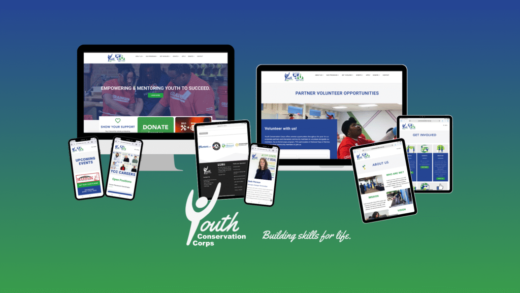
YCC Website
Redesigned YCC’s website to improve navigation for stakeholders and strategically incorporate content tailored to prospective corporate sponsors and donors.
Redesigned YCC’s website to improve navigation for stakeholders and strategically incorporate content tailored to prospective corporate sponsors and donors.
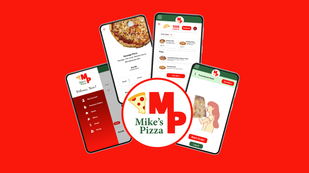
Designed a reliable and fast user experience that allows users to easily schedule a pizza order.