
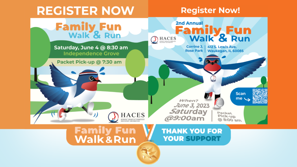
Family Fun Walk & Run
An event held for two consecutive years with the purpose of engaging a younger demographic and cultivating the next generation of supporters.
Family Fun Walk & Run Read More »
An event held for two consecutive years with the purpose of engaging a younger demographic and cultivating the next generation of supporters.
Family Fun Walk & Run Read More »
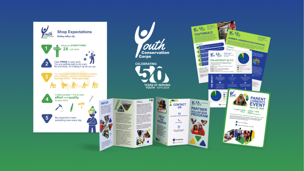
Created cohesive print and digital marketing materials that reinforced the organization’s brand identity and supported audience engagement initiatives.
YCC Print Materials Read More »
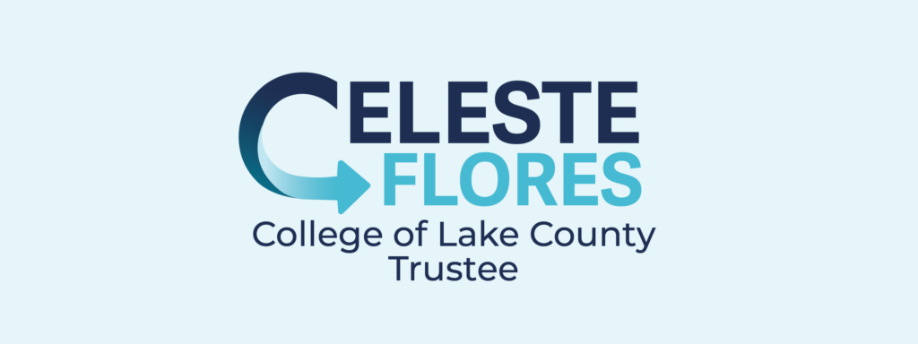
Designed a logo and brand style guide that enhanced candidate recognition and established clear visual standards across campaign communications.
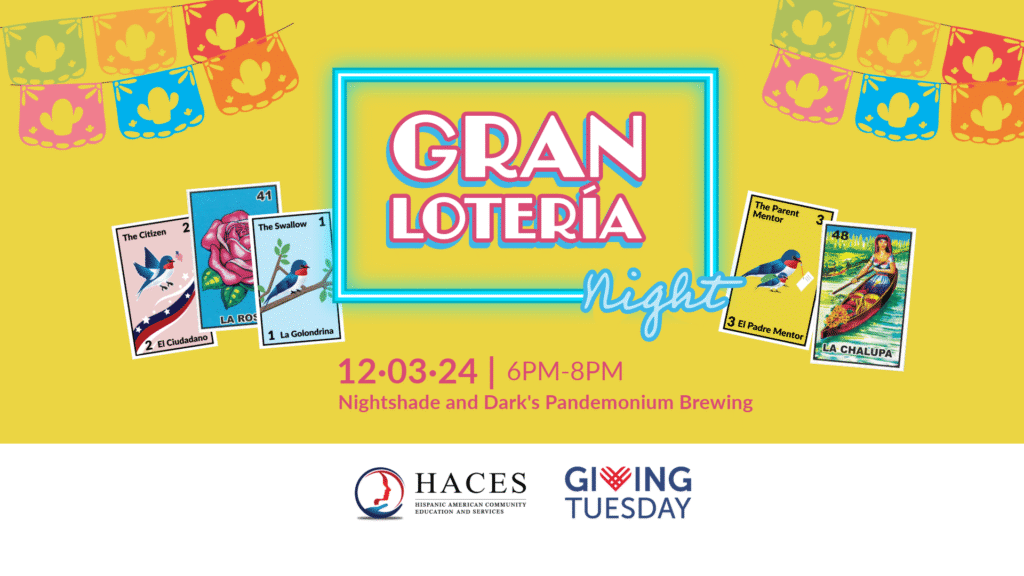
Led branding, marketing, and event planning for a fundraising campaign, exceeding the fundraising goal by 67% and generating $5,000 in net profit.
Gran Lotería Night Read More »
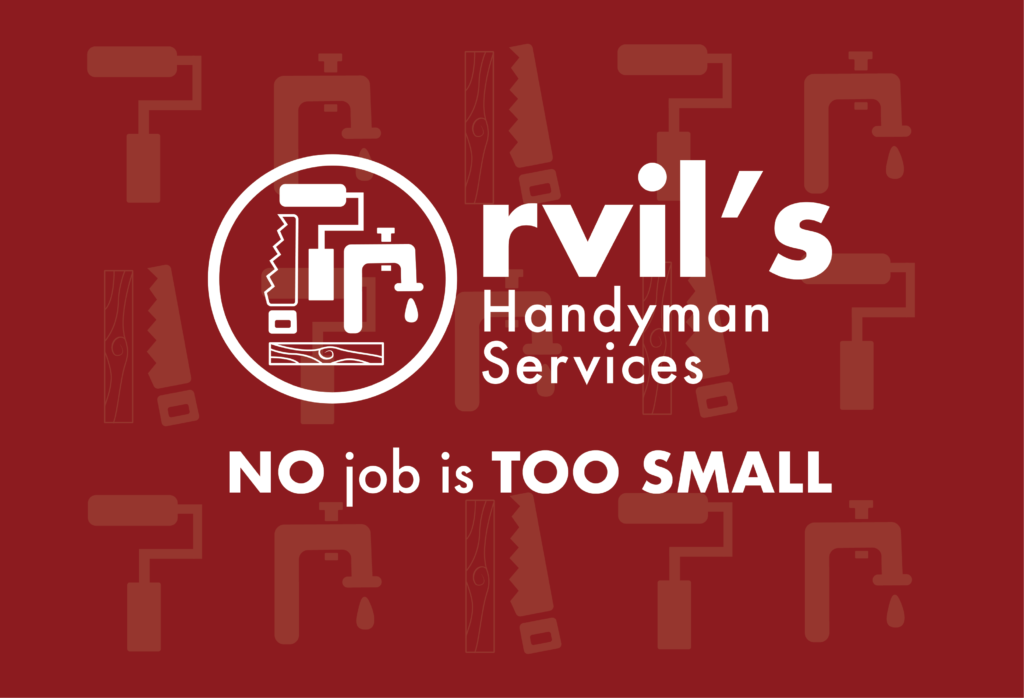
Designed the visual identity for Orvil’s Handyman Service, developing a logo and branded business card to establish a professional and recognizable presence.
Orvil’s Handyman Service Read More »