Diana is a very talented designer and technician who is also delightful to work with. She consistently holds herself to the highest standards of quality and professionalism. Any organization would be lucky to have her on their team.
About the Business
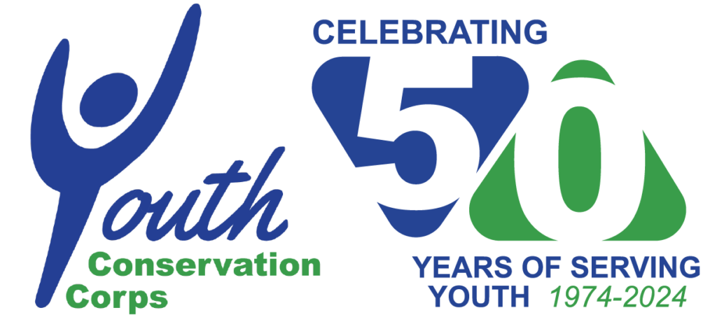
In 2024, the Youth Conservation Corps (YCC) celebrated 50 years of equipping Lake County youth (16-24 years) with lifelong skills. YCC is a nonprofit organization dedicated to helping every young person find a pathway to success. It mentors and empowers young adults through education and training in life skills, career development, and environmental stewardship. The organization offers six core services: life skills and mentoring, education, community service, trades and vocational training, conservation and sustainability, and job placement.
My Role
As a contractor, I independently executed full webpage designs and redesigns, aligning with strategic marketing goals and reinforcing brand identity.
Project Date
March 2024 – August 2024
Duration
Six-Months
Project Overview
Website Design Summary
I worked on eight pages and the site’s footer for the YCC website. I created website pages from scratch and redesigned others to strengthen the site’s brand presence.
- Homepage (Redesigned)
- Footer (Created from Scratch)
- Partner Page (Created from Scratch)
- Events
- General Page (Redesigned)
- Rockegan (Redesigned)
- Golf Outing (Redesigned)
- Summer Campaign (Created from Scratch)
- Career (Created from Scratch)
- About Us (Redesigned)
- Get Involved (Redesigned)
- Staff (Redesigned)
- Sitemap (Created from Scratch)
The Problem
The YCC website needs to easily communicate it's objectives and services to its target audience.
The Goal
To improve access and clearly communicate with the target audience.
The Solution
The YCC website redesign improved communication and the navigational experience between different target audiences.
Empathizing with the User
Pain Points
Under the direction of the Director of Development & Communications, I was asked to design or redesign webpage. She expressed the following pain points.
01. Clarity
The website pages do not quickly answer the questions of: 1) What am I looking at? 2) What does this organization do? Or what is the purpose of this page?
02. Layout
The layout makes it difficult for the user to digest information and/or distinguish one section from another.
03. Communication
The website excluded key users, including partners, supporters, and alumni. Website pages and forms need to be created and/or added to improve YCC's communication with these specific users.
04. Brand
The current use of brand elements lacks consistency and impact. Strengthening its application would improve visual hierarchy, enhance contrast, and reinforce brand recognition throughout the website.
05. Website Essentials
The website is missing key elements that are essential for usability and credibility, which can negatively impact user trust.
User Stories
Who, what, and why?
Partner
Donor
Board Member
Alumnus
Parent
Prospective YCC Member
Partner
As a corporate company, we want to volunteer, so that we can give back to the community.
Donor
As an sponsor, I want to practice philanthropy at a trustworthy organization, so that I can empower the next generation of young people.
Board Member
As an board member, I want to stay informed about recent activites and events, so that I can support the organization’s growth.
Alumnus
As an alumnus, I want to keep up with upcoming events, so that I can continue being part of the YCC community.
Parent
As an parent, I want to easily understand YCC’s services, so that I can potentially enroll my child.
Prospective YCC Member
As an prospective YCC member, I want to easily understand YCC’s services, so that I can see if it’s a good fit.
Defining the User's Need
Problem Statements
After understanding the pain points users faced, I created problem statements to define how different users specifically experience pain points.
Partner
Donor
Board Member
Alumnus
Parent
Prospective YCC Member
Partner
Grainger is a large-sized business who needs to sign up for volunteer opportunities on the YCC’s website, because they are committed to social responsibility.
Donor
Kim is a retired professional interested in philanthropy who needs to validate YCC’s credibility through its website because she wants to create a lasting legacy with real-world impact.
Board Member
Laurence is a real estate agent and board member who needs to easily find YCC fundraising initiatives on its website because he wants to contribute to YCC’s mission.
Alumnus
Jerry is a YCC alumnus who needs to effortlessly find YCC alumni opportunities via website communication because he wants to continue being involved with the YCC mission.
Parent
Veronica is a busy single working mom who needs to quickly find information about YCC services on its website because she has limited time to help her son find a career path.
Prospective YCC Member
Enrique is a prospective YCC member who needs to determine if YCC’s services, as communicated on its website, will help him achieve his GED because he wants to return to school via a non-traditional school system.
Summary
It is challenging for users to navigate webpages and interpret the information due to the website’s layout. The website is missing key elements that are essential for establishing credibility like a footer. In addition, specific target audiences like alumni and partners do not have the tools to directly communicate or receive communications from YCC.
The Solution
YCC’s website layout was improved to clarify each page’s purpose and reinforce consistent branding. Key elements such as a sitemap and footer were added to build user trust. Communication tools, including a redesigned partner page with a contact form and updated events pages, were developed to enhance engagement and facilitate easier connection with the YCC team.
Scroll to Section
01
Homepage
Before
After
Project summary
Redesigned layout to improve clarity between sections and strengthen brand presence.
Pain Points + Solutions
Image above the fold
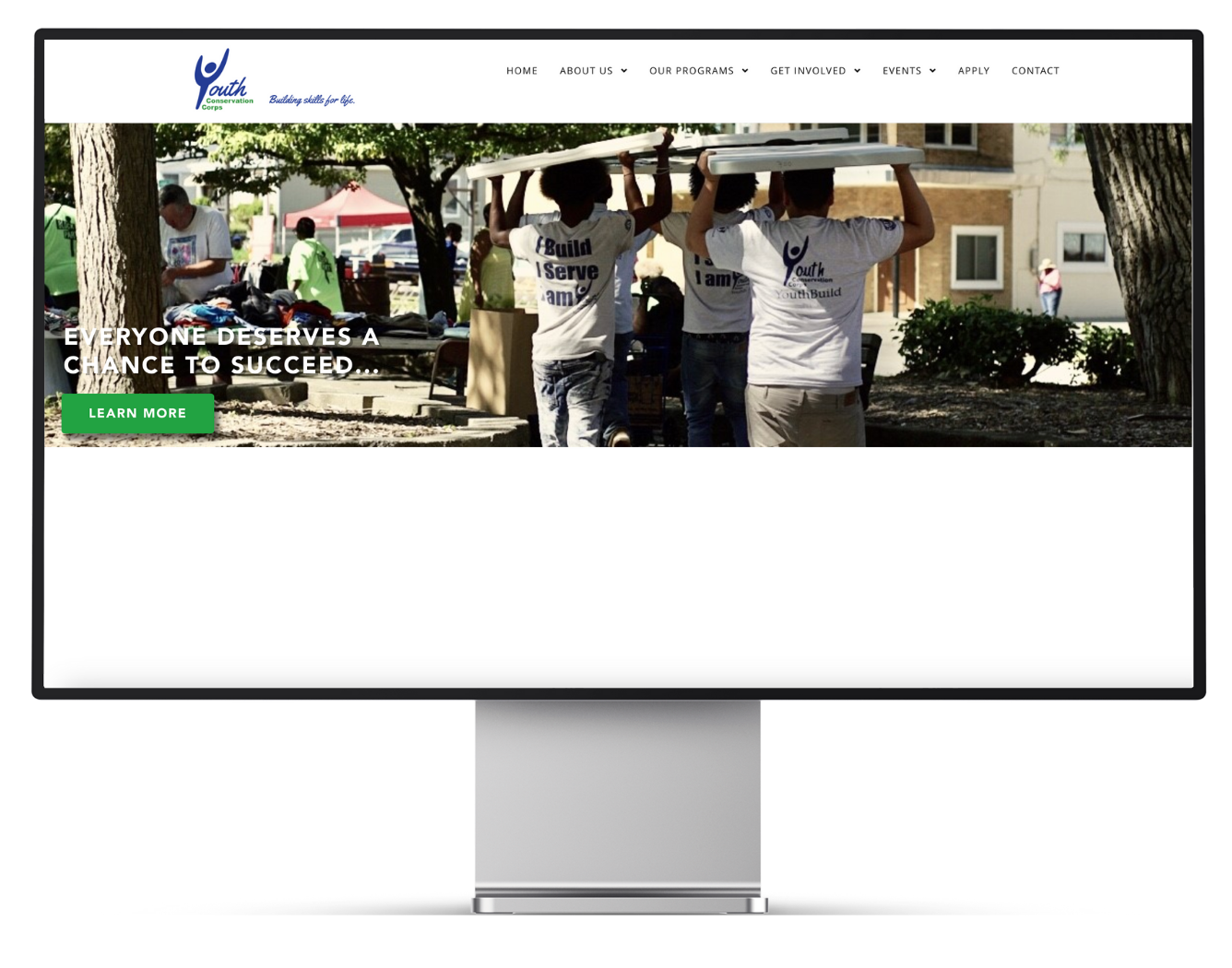
- Outdated.
- Does not quickly answer the questions of:
- What am I looking at?
- What does this organization do?
- The call to action could be a more prominent focal point, showcasing current campaigns.
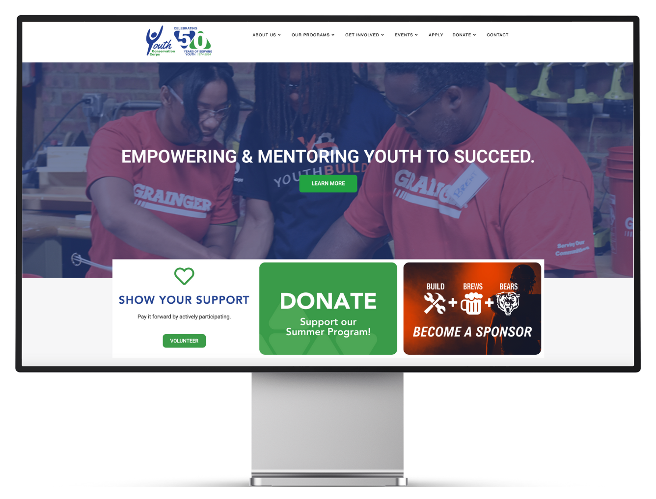
- Modern.
- Quickly informs viewers of what YCC does.
- Emphasizes the call to action. Can be updated accordingly.
Layout
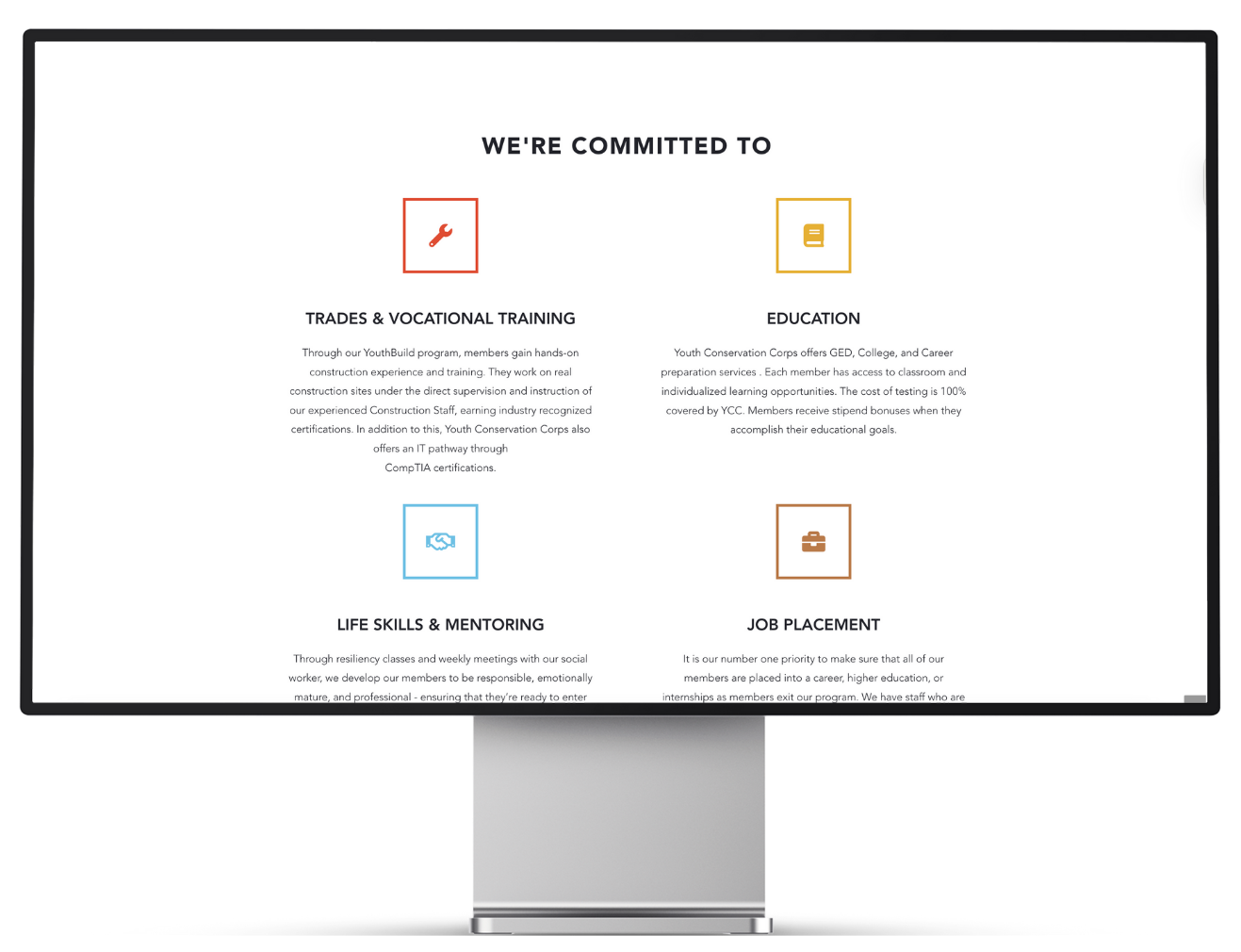
- The layout is lengthy and requires extensive scrolling. There are three columns of two.
- Does not follow brand colors.
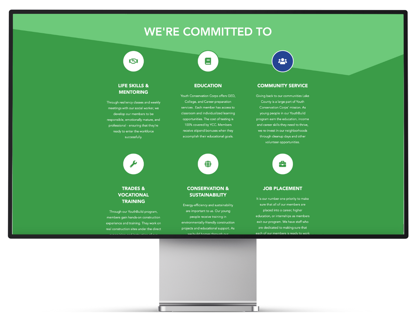
- The layout is shortened into two columns of three.
- The color scheme is attractive, effectively emphasizing the brand’s identity.
- The lack of clear separation between sections makes the layout confusing.
- Unclear visual hierarchy; viewers may not immediately understand what they’re looking at.
- The form blends into the design and doesn’t stand out.
- Separated sections using titles, triangular shapes, and appropriate spacing.
- Added shadow to the form to create visual interest and encourage engagement.
02
Website Essentials
Project summary
Improved the website’s credibility and navigation by adding website essentials.
Pain Points + Solutions
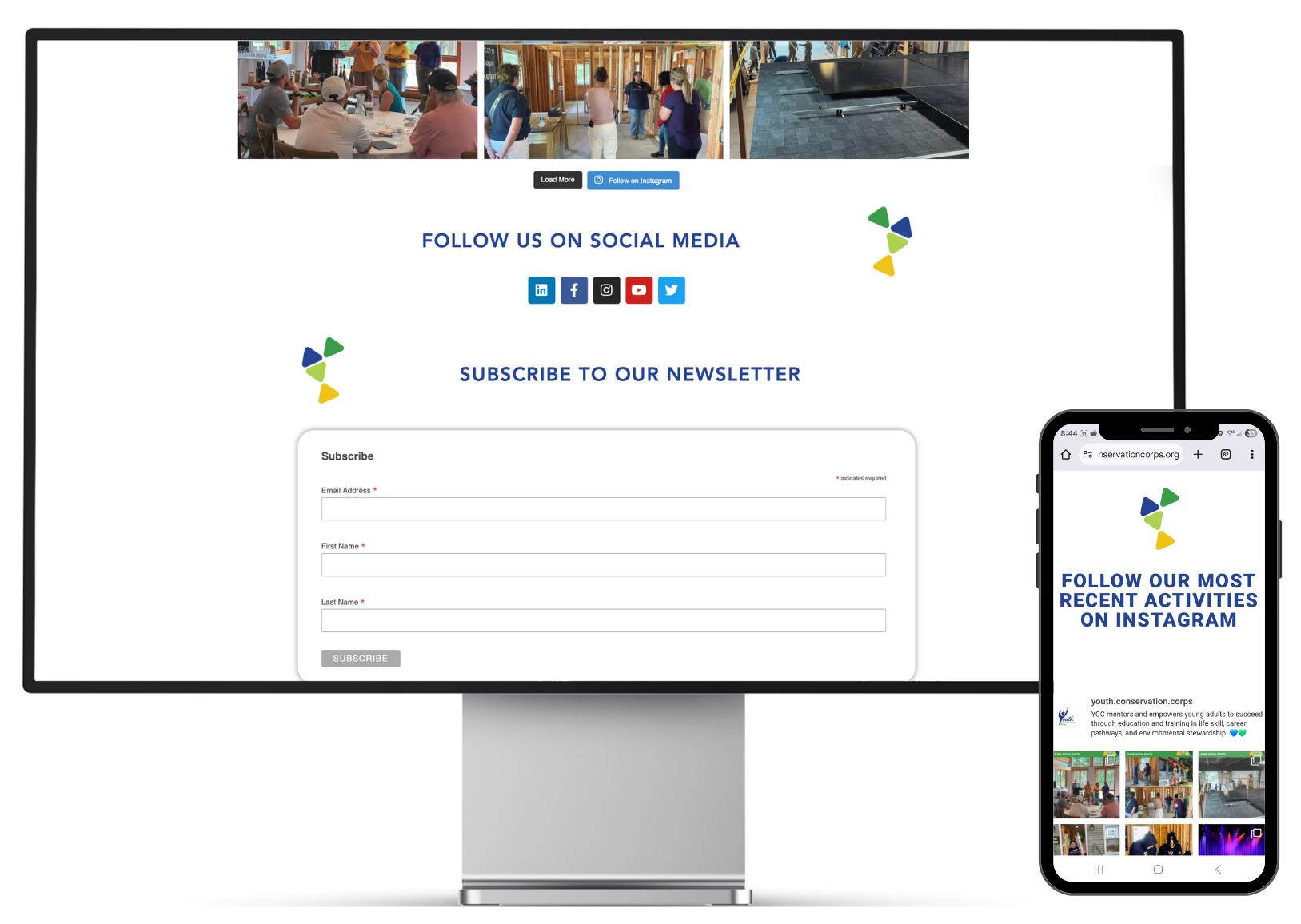
Footer
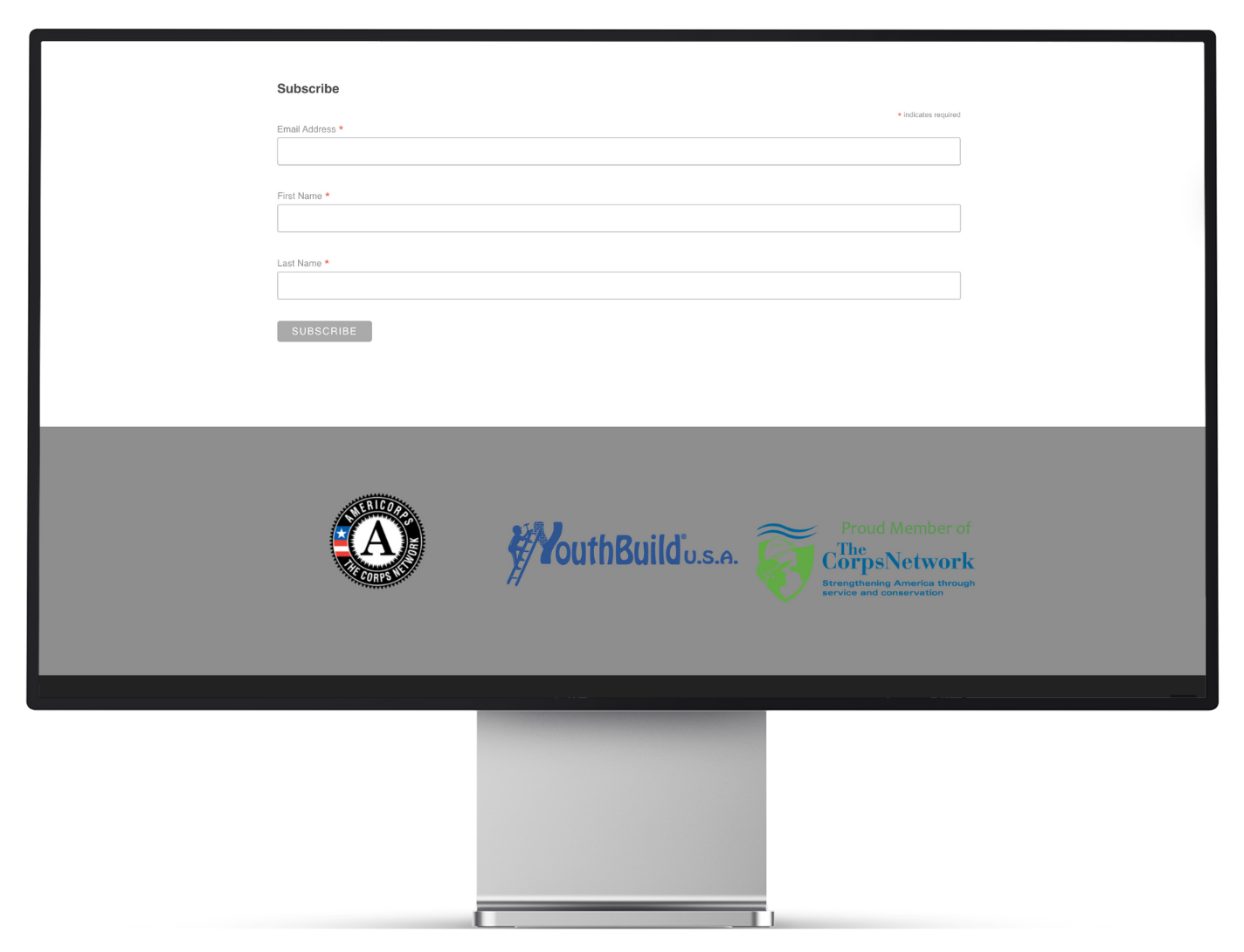
- Hard to read logos.
- No footer.
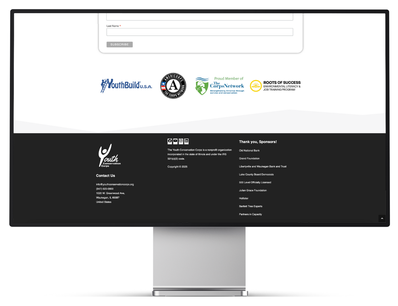
- Logos are easy to read.
- The footer displays a copyright notice, and incorporation details were added for credibility.
Sitemap
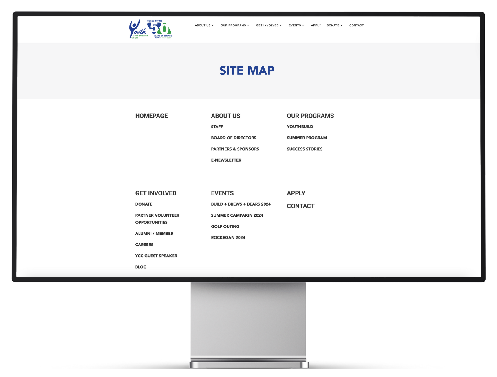
- There was no webpage where users could view all available pages, making it easy to miss important information or resources.
- The website’s navigation experience was improved. By visiting the sitemap, users can easily find what they are looking for.
03
Partner Page
Project summary
Interested partners can view volunteer opportunities and sign up to participate at this dedicated page.
Pain Points + Solutions
- An interested potential partner cannot view volunteer opportunities at YCC or easily communicate with YCC staff to sign up for them.
- The webpage included a form for interested potential partners to fill out along with descriptions of each volunteer opportunity.
04
Event Pages
Project summary
YCC’s brand elements were consistently used on the event page to strengthen brand recognition. For individual events (ex. Rockegan, etc.), page layouts were refined and each event’s unique brand identity was emphasized.
Pain Points + Solutions
Before
After
- The elements on the pages need to be aligned. The dealignment makes it difficult to read.
- On each event page, the theme of the event is not carried through the design of the page. This gives each event page a standard instead of branded look and feel.
- The event page showcasing all of YCC’s ongoing events is tailored to YCC’s brand.
- Each individual event page has its typography and visual elements aligned enhancing its readability.
- Each individual event page is designed using the event’s brand identity, creating visual interest and generating enthusiasm for the viewer.
05
Career Page
Project summary
Improved YCC’s communication with potential talent interested in joining the team.
Pain Points + Solutions
- YCC does not have an official job posting page, making it difficult to communicate open positions and attract potential talent.
- Website visitors interested in working with YCC are left unsure whether any job opportunities are currently available.
- YCC can now post job openings directly on its website as they become available.
- Because the postings are on YCC’s official site, users can trust their legitimacy and feel confident applying.
- Interested website visitors are no longer left wondering. They can now easily see when positions are open.
06
About Us Page
Project summary
Updated the webpage layout to make the information easier to read.
Pain Points + Solutions
Before
After
- YCC does not have an official job posting page, making it difficult to communicate open positions and attract potential talent.
- Website visitors interested in working with YCC are left unsure whether any job opportunities are currently available.
- YCC can now post job openings directly on its website as they become available.
- Because the postings are on YCC’s official site, users can trust their legitimacy and feel confident applying.
- Interested website visitors are no longer left wondering. They can now easily see when positions are open.
07
Get Involved Page
Project summary
Strengthened the branding through the use of personalized YCC graphics.
Pain Points + Solutions
Before
After
- There are no descriptions under each picture, making it unclear what the call to action is.
- The chosen images are generic and not tailored graphics that represent the YCC brand.
- Follows YCC’s color scheme in the website’s layout and graphics, strengthening the brand identity.
- Consistently uses the imaging of people, once again, strengthening the brand.
- Includes description under each section clarifying the call to action.
08
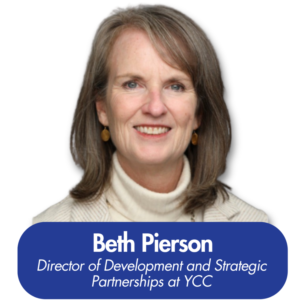
Staff Page
Project summary
Enhanced the page’s branding by taking staff profile photos beside the YCC slogan, creating a consistent and unified look
Pain Points + Solutions
Before
After
- Towards the end, staff members were missing profile photos.
- The existing images had inconsistent backgrounds, which undermined a cohesive team presentation.
-
- Using the same background in all staff profile photos highlighted the brand slogan, reinforced the brand identity and created a cohesive, professional appearance.
The Conclusion
Final Results
I worked on eight pages and the site’s footer for the YCC website. I created website pages from scratch and redesigned others to strengthen the site’s brand presence.
Testimonial