About the Business
My Role
As the Lead UX Designer, I conducted user research, created wireframes, developed low-fidelity prototypes, synthesized insights using affinity diagramming, and delivered a high-fidelity prototype.
Project Date
January 30, 2023 – November 19, 2023
Duration
Eleven Months
Project Overview
App Summary
I designed a new Mike’s Pizza app for busy professionals who need a fast, reliable way to order food.
The Problem
The Goal
Scroll to Section
Empathizing with the User
Mike’s Pizza conducted user interviews. It was discovered that Mike’s pizza attracts working single professionals who work in medium to large companies and need pizza delivered for themselves and for everyone at the office 2-3 times a week. Mike’s pizza also attracts busy individuals on a tight schedule who multitask and wear multiple hats in their day-to-day lives. This individual prefers pickup.
Before conducting the research, it was assumed that single individuals under the age of 30 would be the user group who would order pizza the most. After the research it became clear age was not the deciding factor but lack of time, whether people were in groups, and an individual’s energy level. People who are in a group (whether it’s a family or coworkers) are likely to order pizza for everyone. Individuals who are busy and do not have time to cook will also order pizza. Lastly, individuals who do a lot throughout their day become hungry around dinner time but do not have the energy to cook; they, too, will order pizza.
01. Time
Users are busy and do not have time to cook. Users need a FAST, EASY, and EFFECTIVE solution.
02. Accessibility
Users do not enjoy an app that is not optimized and does not work well with assistive technology or alongside other apps. Users do not enjoy having a language barrier that makes it difficult to use the app.
03. UX
Users have a difficult time ordering from food apps that do not have a friendly, logical, navigational experience. Food apps are inconvenient when users have to reorder the same order or go through a long series of steps that do not follow a logical order.
04. Communication
User do not like how difficult it is to communicate with an actual person when problems arise. User also feel uncertain when ordering food without speaking to an individual. They dislike not knowing the progress of their order.
Based on user research findings, two personas — George (Group 1) and Natalia (Group 2) — were developed to represent the primary user segments identified through shared behaviors and needs during interviews.

Age: 26
Education: College-Graduate
Hometown: North Chicago, IL
Family: Single, Lives Alone
Occupation: Mid-Level Researcher
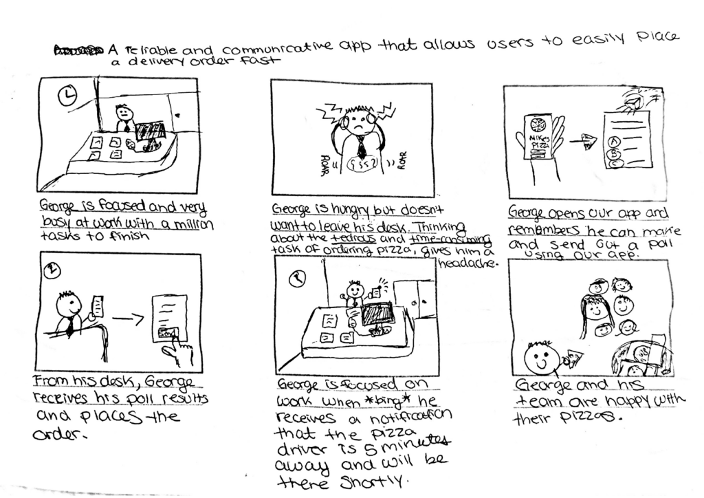
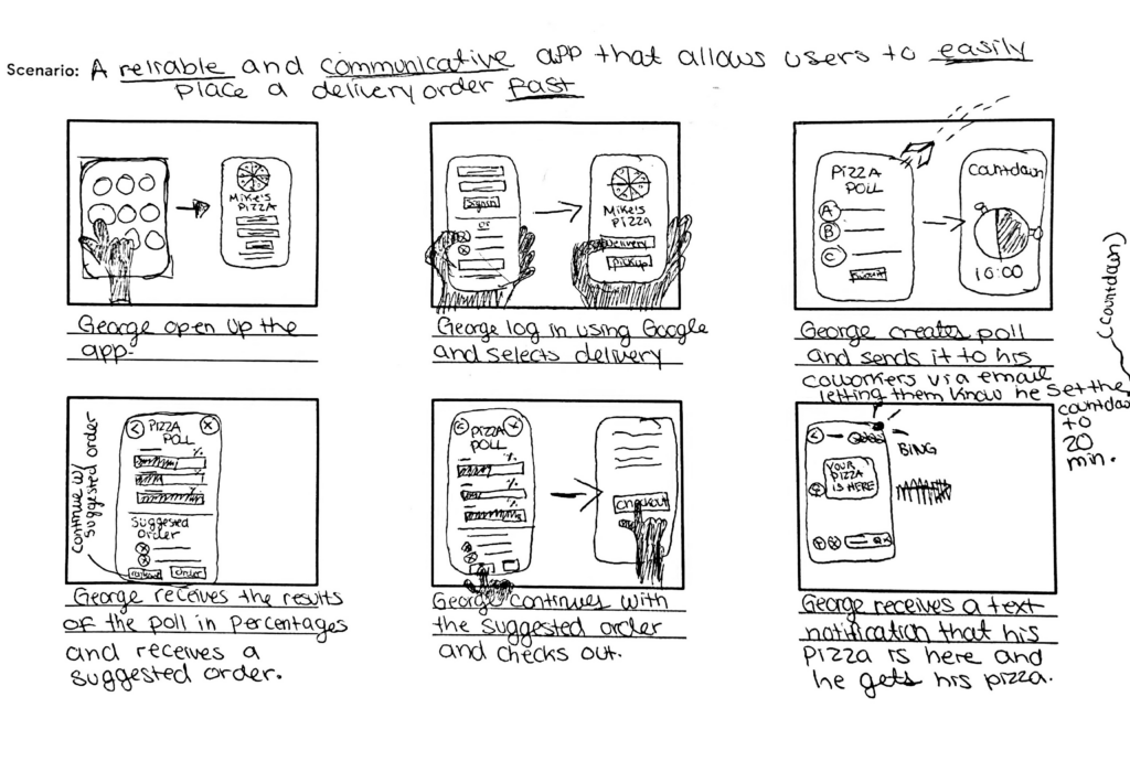
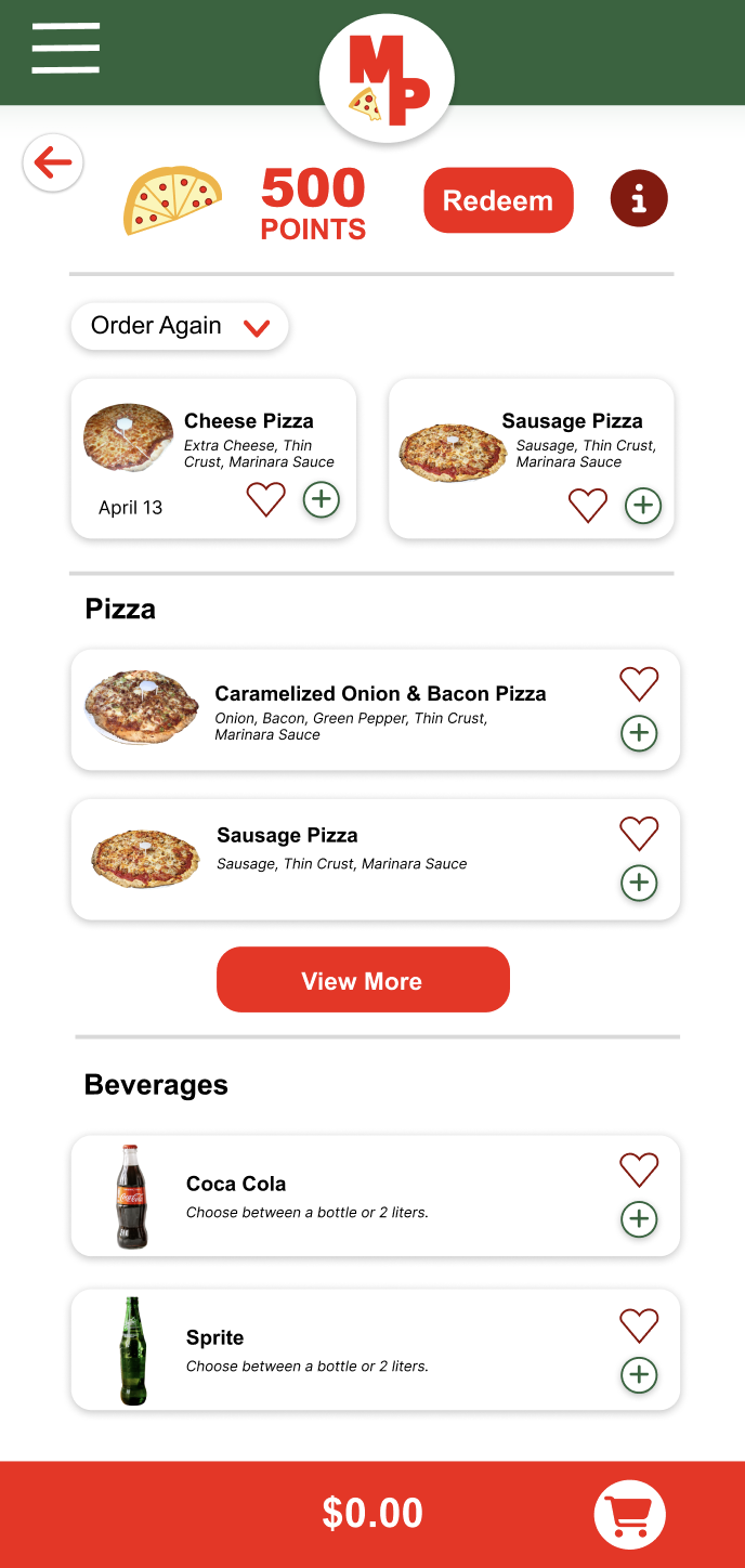
George is a mid-level researcher at a large biopharmaceutical company and often orders pizza for everyone to show his commitment to the team. His days are very busy especially because he wants to get a promotion soon. Due to this, George values efficient and effective food service. He does not want to worry about yet another responsibility. A smooth, easy, and reliable service is what George needs.
“At work, I always have a lot to do. I love efficiency. The more efficient I can be, the more I can cross off my checklist.”
Goals
- George likes to focus on work as much as possible without any distraction.
- He wants to receive a promotion soon and is taking on extra responsibilities.
Frustrations
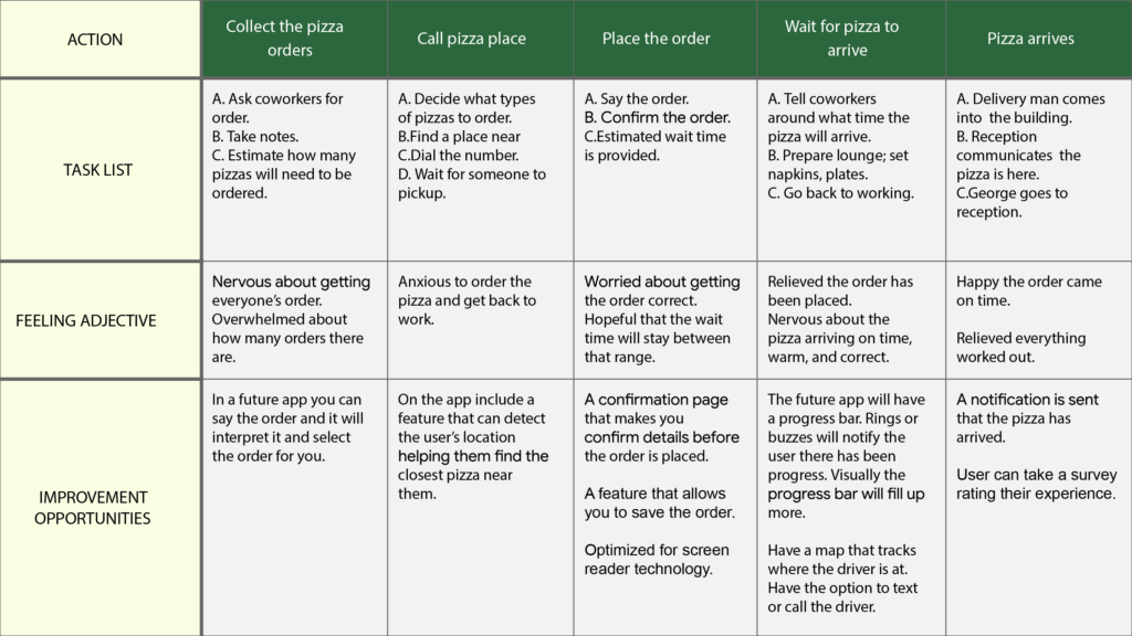
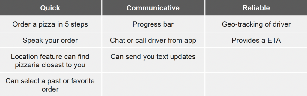
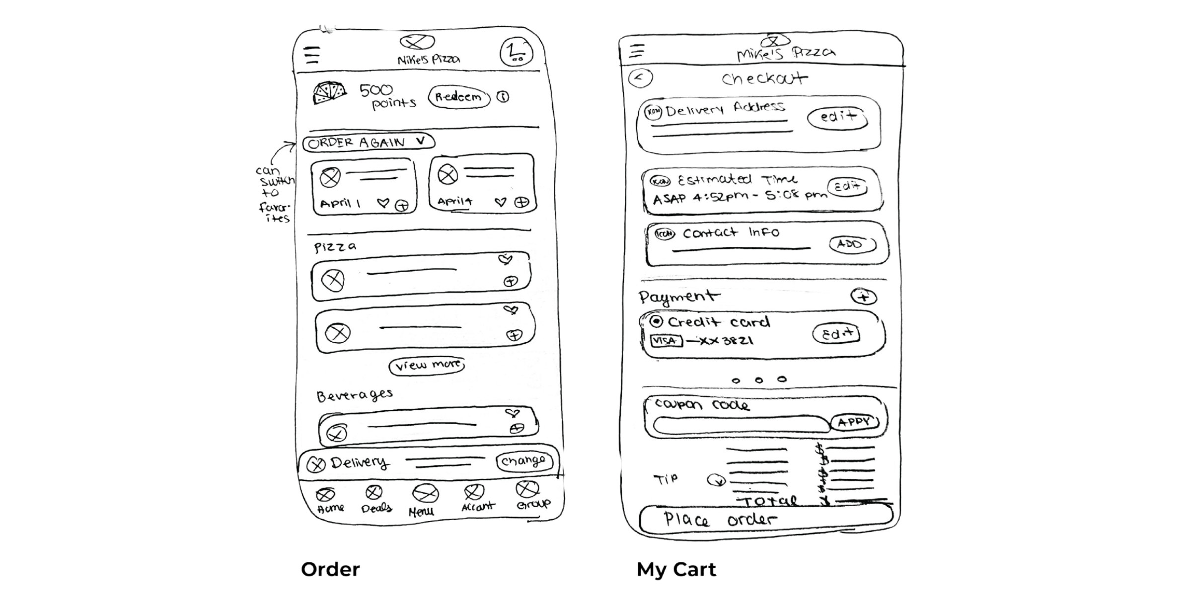
- “I often order food for myself and coworkers. I dislike the tediousness and find it time consuming. I reorder the same order three times a week and have to reselect all my options each time.”
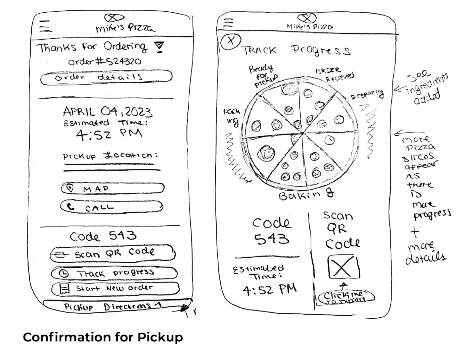
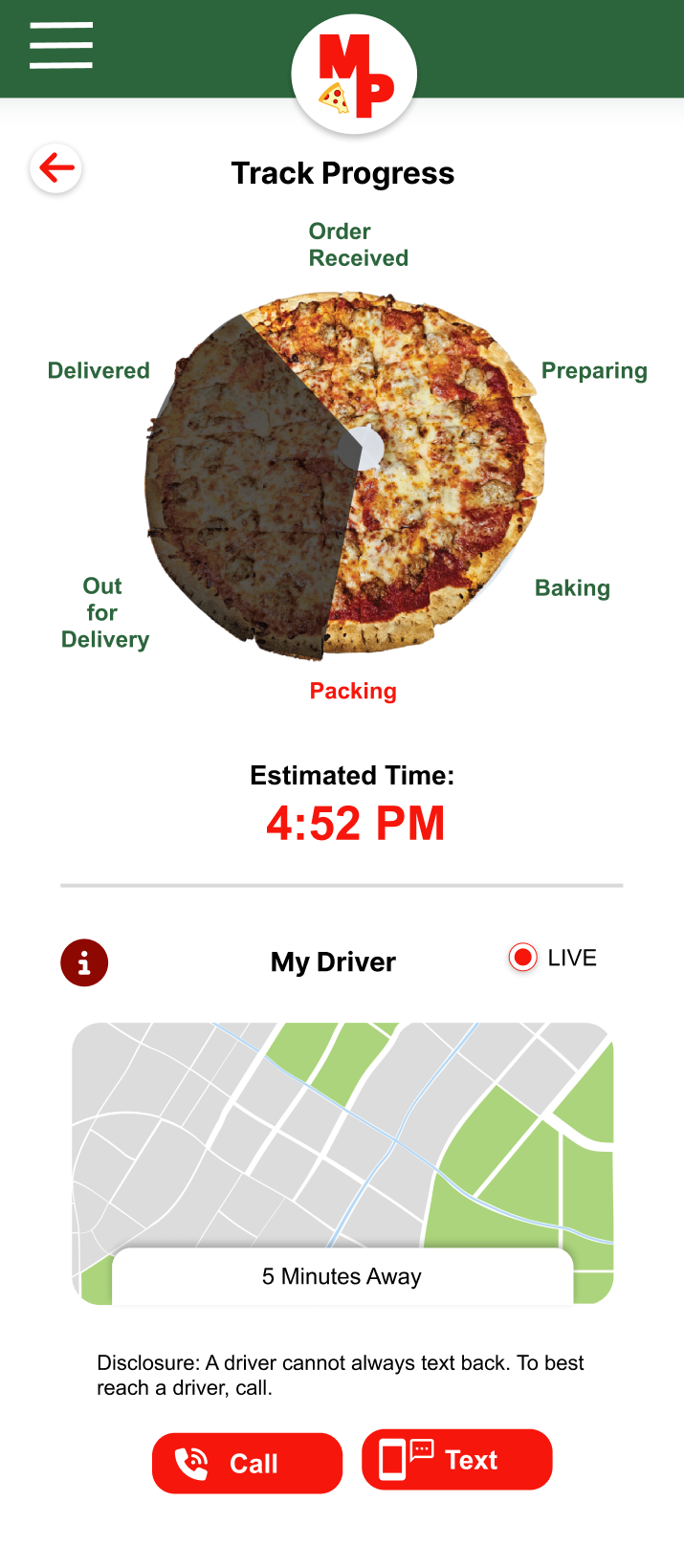
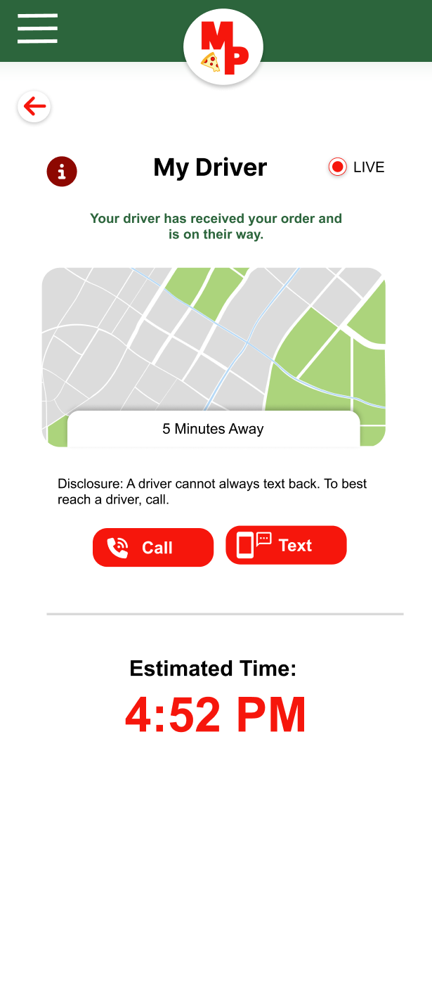
- “It’s difficult to estimate when the pizza will arrive to the office. It often gives a range and it’s frustrating to not know when the driver is close. I wish communication could improve.”
- “It’s frustrating when the pizza does not arrive on time or arrives cold.”

Age: 39
Education: Online College Classes
Hometown: Grayslake, IL
Family: 4 Children, 2 Pets
Occupation: Stay at home mom
As a busy mom of four and two pets, Natalia’s time is precious. Natalia orders food during dinner time when she does not have anymore energy from her very busy day or lunch time when she is deep in her studies. In both scenarios she is looking for a quick and easy option to obtain food. Natalia needs an application that is easy to use, works with supportive apps, and is effective.
“Being a mom and a student is like having two full time jobs. I only use tools that are effective.“
Goals
- Go back to school now that her kids are all in school.
- To earn a degree by the time her kids go to college.
- To care for her family and ensure they feel supported.
Frustrations
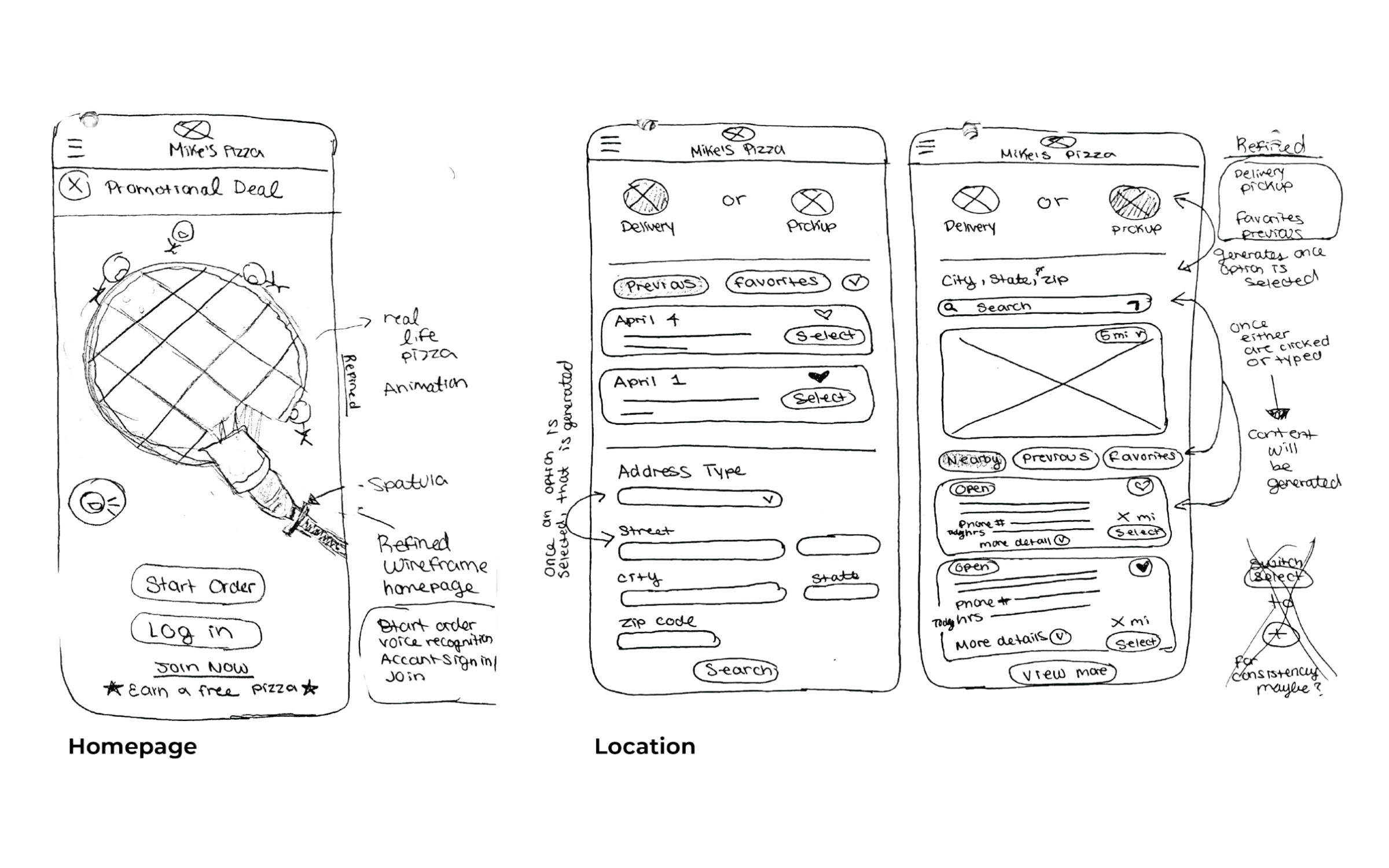
- “I have a visual impairment. It’s frustrating when my screen reader app cannot work with food apps because they are not optimized.”
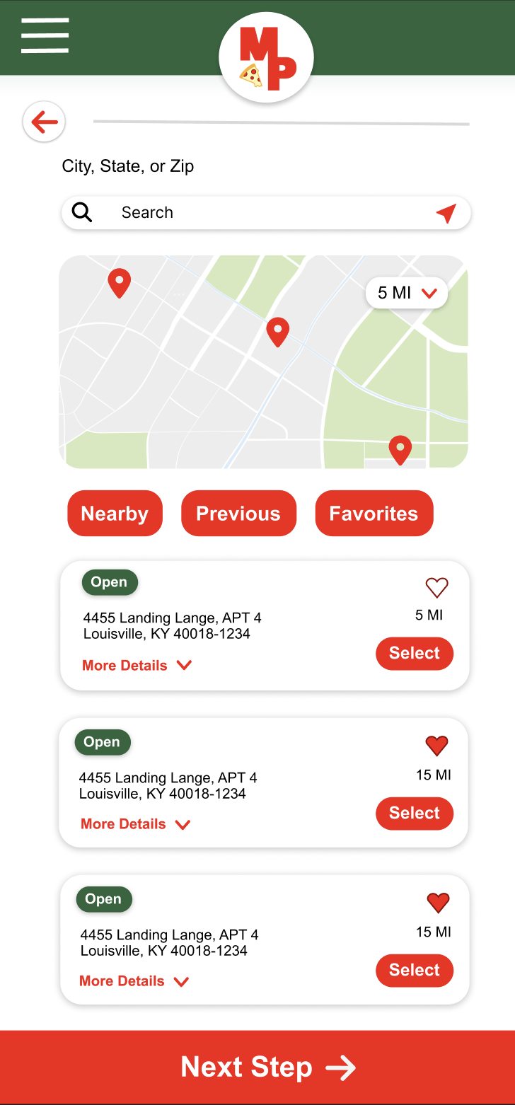
- “Picking up food can be tricky. Sometimes I come earlier and have to wait or other times I come later and the food is cold.”
- “As a russian immigrant, it can be difficult to communicate, I enjoy apps that are efficient / effective and straight to the point.”
Who, what, and why?
As a working professional who frequently orders pizza for my team, I want to track my order and communicate with the driver if needed, so that I can better plan for its arrival.
As a busy adult with a disability and language barrier who orders pizza at least twice a week, I want to easily place advance orders and track them, so that I can better coordinate pickup.
Defining the user problem
To focus the design strategy, I prioritized Group 1 — represented by the George persona. Early user research revealed key pain points, which I translated into a problem statement, If/Then statement, and goal statement to ensure the solution remained grounded in user needs.
George is a busy working professional who needs a fast, communicative, and reliable food delivery experience, because he needs to easily plan his pizza delivery to keep his focus on work.
If George downloads the Mike’s Pizza App then he will be able to access a quick, communicative and reliable delivery experience.
Our Mike’s Pizza App will let users place a pizza order in advance which will affect busy individuals who place orders for pickup or delivery, by making their ordering experience fast and easy to coordinate.
We will measure effectiveness by monitoring increases in daily and weekly order volume.
Ideate
Conducted competitive research to evaluate how nearby businesses were meeting user needs and identify gaps in the market. These insights helped shape our design strategy and clarify our value proposition.
Interact with the embedded competitive audit below by scrolling horizontally and vertically.
Prototype
The cart interface allows users to easily add, edit, or remove items. Product information is organized into clearly defined sections using visual separators and rounded rectangular components, improving readability and user interaction.
Research revealed that customers in work environments need an easy way to quickly access and reorder previous purchases.
This low-fidelity prototype allows users to start a new pizza order, select a cheese pizza, confirm order details, submit the order, and track its delivery progress.
Two rounds of usability testing were conducted. Insights from the first round informed the transition from wireframes to mockups. The second round, conducted with a high-fidelity prototype, identified areas that required further refinement.
- Users want to easily check out
- Users want to smoothly interact with buttons
- Users want clear next steps
- Users want an app that’s developed in its written communication, front-end graphics, and button functionality
- Users indicated a need for clearer buttons leading to checkout
- Users want to eliminate unnecessary features like the pizza wheel to simplify the experience
- Users want to smoothly interact with the hamburger menu
The second usability study revealed that the “Add the Order” button confused users. Participants were unsure of the next step because the button label was unclear. To improve clarity, the label was changed to “Add to Cart.”
Before the Second Usability Study
After – Improved Design
Before the Second Usability Study
After – Improved Design
Research indicated that users preferred a simpler interface with fewer options. Participants found the pizza wheel to be unnecessary and distracting from key features such as “My Driver” and “Estimated Time.” Users expressed a strong interest in communicating directly with their driver and valued having a clear estimate of their delivery time.
Before the Second Usability Study
After – Improved Design
The high-fidelity prototype streamlines the ordering experience by providing a clear flow for customization, order review, checkout, and real-time updates on order readiness or driver location.
A large, consistent bottom call-to-action button helps guide users through the ordering process, improving accessibility for users whose first language may not be English and those with visual impairments.
A strong use of icons improves communication universally, allowing those who are not English speakers to place a pizza order.
It has a lot of animated things, like the characters eating the pizza. It's very attractive. It looks user-friendly. It's also very simple. There are huge buttons you can't miss wherever you're going to need or use to order the pizza. I think it was good, it's appealing, quick, and easy to use.
Participant C - Usability Study
Simplicity and fewer options provided users with greater clarity and direction, making the available tools more valuable and easier to use.
I also learned that clear affordances are essential for helping users understand how to interact with an interface and for making an experience feel intuitive.
Finally, intentionally designing with accessibility in mind—such as using clear icons and larger typography to guide users through buttons and headers—improved the experience for all users.
The second usability revealed that users continued to desire clarity in the buttons leading to checkout. To further guide the user, the red button will animate when they are ready to proceed to the next step.
During the second usability study, it was found that users want to smoothly interact with the hamburger menu. To improve the hamburger menu usability, the button will be highlighted on click. The button text will be displayed in uppercase for better visibility.
The UI will continue to be refined by increasing button size and testing the app across multiple mobile devices to ensure responsiveness.
