About the Business

Orvil’s Handyman Service provides a wide range of services, including carpentry, painting, and plumbing. The owner, Orvil, emphasized that no job is too small, a message he wants to convey clearly to all potential clients.

My Role

Contrator

Project Date

July 2023

Duration

One-Month Project

Week 1:Initial Consult 

Week 2: Present Sketches + Color Palette

Week 3: Present Vectored Logo

Week 4: Revisions + Logo Kit

Project Brief

To develop a brand identity, logo, and business card for the business, Orvil’s Handyman Service. Having both physical business cards and a conveniently shareable digital version was essential to the client’s branding needs, as the client wanted to raise brand awareness. A t-shirt was also designed for this purpose.

01

Initial Sketches

When discussing the logo and branding, Orvil expressed a desire for imagery that would instantly communicate the nature of his work—he was particularly drawn to the idea of incorporating tools and evoking the image of a “fixer.” He was open to exploring multiple creative directions.

One idea we explored was using the “O” in Orvil as a distinctive logomark integrated into the company name. During our initial consultation, we also discussed color options. Orvil was initially interested in a red, green, and black palette. However, after reviewing the logo concept, we moved forward with red and black. The green proved more distracting than helpful, especially when paired with the detailed elements inside the “O,” which, along with the vibrant color scheme, made the overall design feel too busy.

Drawn by hand and pulled from the pages of my sketchbook, these elements were created to serve as building blocks for custom logo mockups when paired with typography.

Tools

Sketched four tools to represent the three services offered through Orvil’s Handyman Service: plumbing, painting, and carpentry.

SuperHero

Created two versions of a potential superhero that would be used within the companies’ branding. This superhero would be used in the logo and could also act as a future mascot. 

02

Mockup

Quick mockups were created using my hand-drawn sketches paired with the ‘Futura’ typeface. Designed in Illustrator and shared with the client for review before proceeding.

Possible graphic if either concept 1 or concept 2 were chosen.
Concept #1
Concept #2
Concept #3
Concept #4
Concept #5

03

Final Black and White Logo

After the client reviewed the mockups, we decided to move forward with Concept 2. Instead of placing the superhero inside the ‘O,’ we chose to feature the tools within it. This change made the visual elements more direct and effective in representing the company’s services. The client wanted to proceed with the initial color palette we had spoken about green, red, and black. 

04

Color Logo Version #1

After adding the colors red, green, and black to the logo, the green didn’t integrate visually as we had anticipated. We initially chose green to represent the company’s commitment to growth and continuous improvement. However, in practice, it stood out too much and didn’t feel cohesive with the overall design. The elements it highlighted lacked communicative purpose, making them more distracting than effective. As a result, we decided to move forward without the green.

05

Final Logo Version

The final logo uses ‘Futura’ as its typeface and features a black and red color scheme. Its simplicity, combined with playful visual elements within the circle, clearly communicates the company’s services in a visually appealing and straightforward manner.

The red was intentionally chosen to convey energy, passion, and to draw attention. Orvil wants his company to be recognized as one that handles tasks efficiently and effortlessly. When you need them, they show up—ready to tackle any problem with enthusiasm and energy.

To further emphasize this commitment, the client included a tagline: “NO job is TOO SMALL.” This added branding element reinforces the company’s “can-do” attitude and dedication to serving customers with positivity and professionalism.

06

Additional Marketing Products

After creating the logo and brand, my client was ready to build brand awareness. The tools they included in their toolbox were a physical business card, a digital business card, and a t-shirt for workers.

Client Testimonial

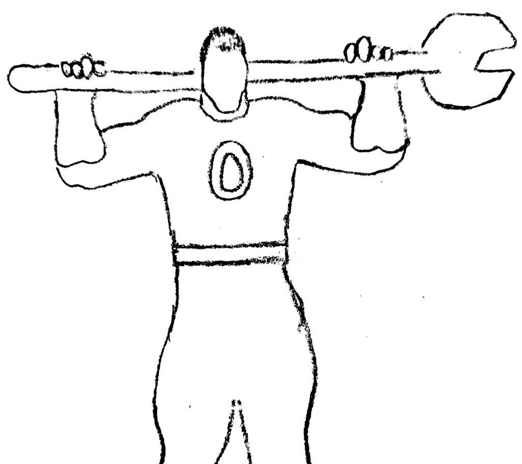
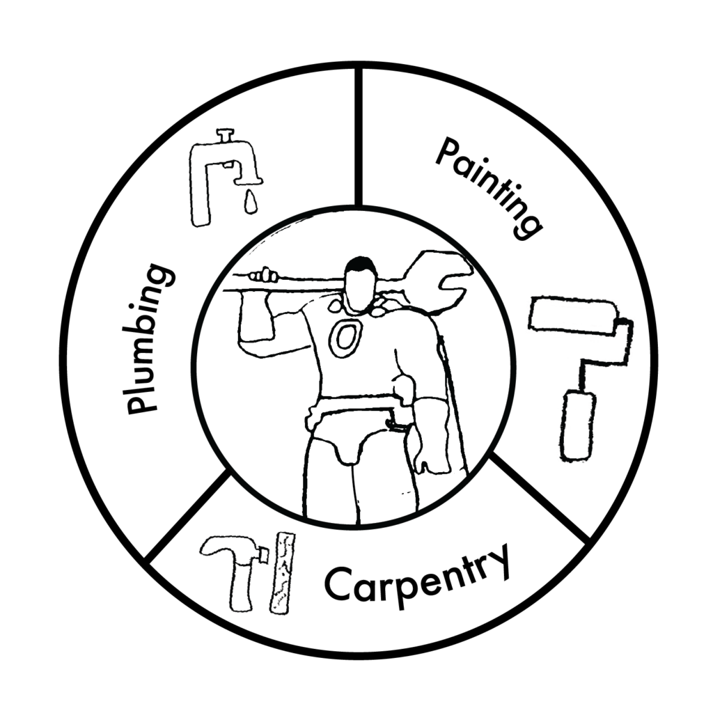
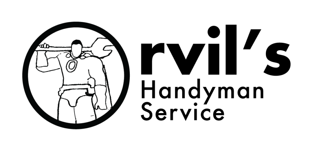
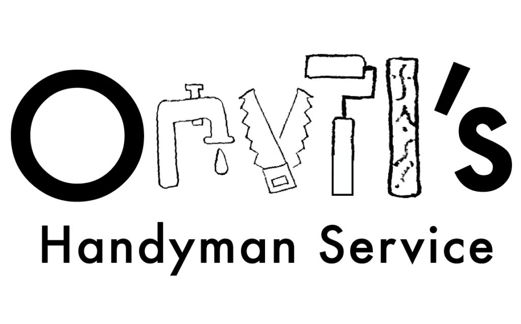
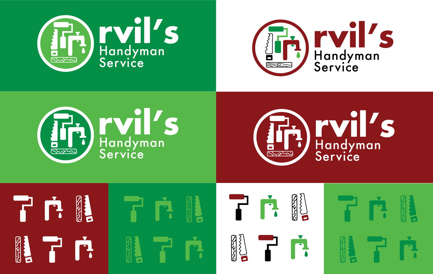
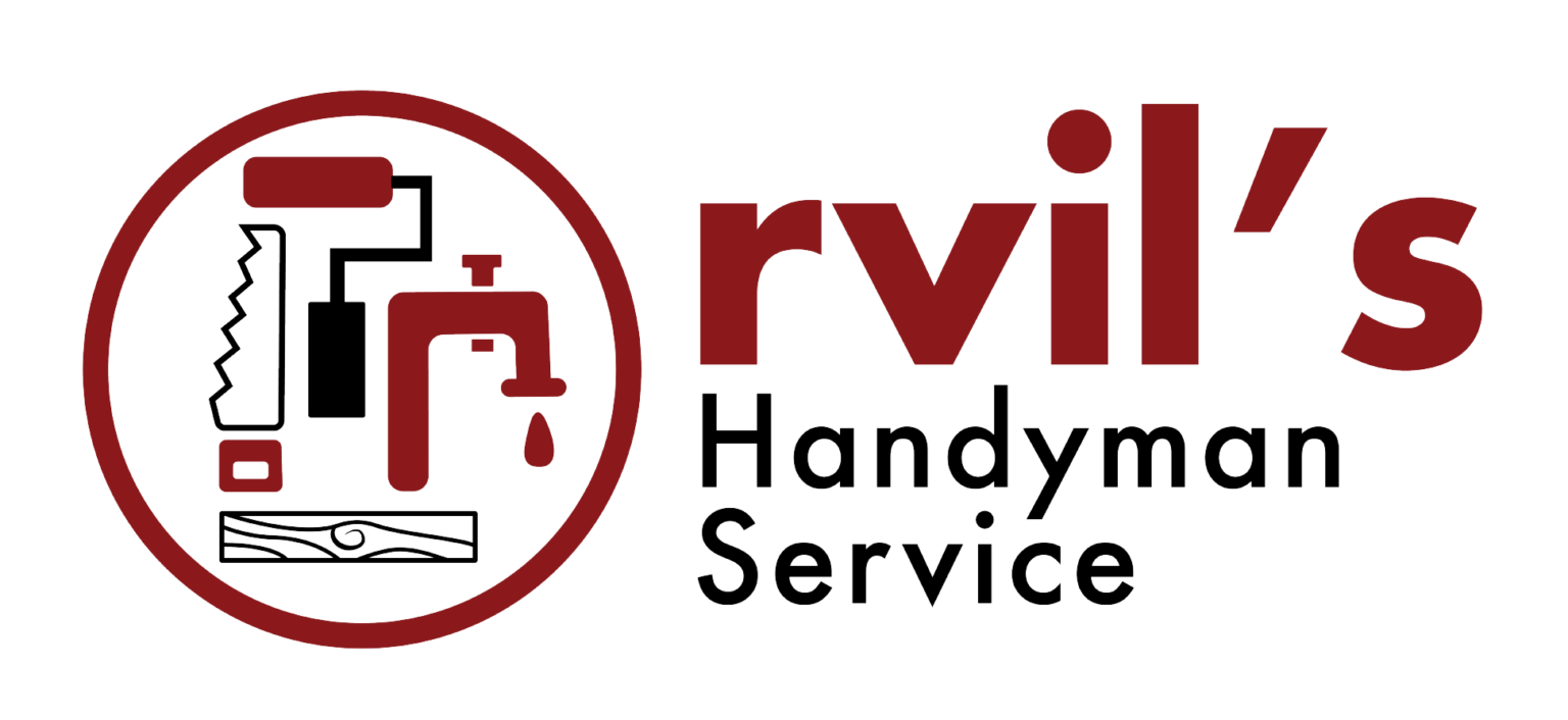
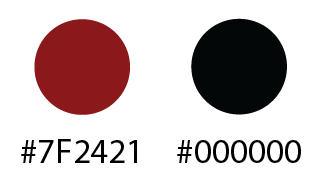
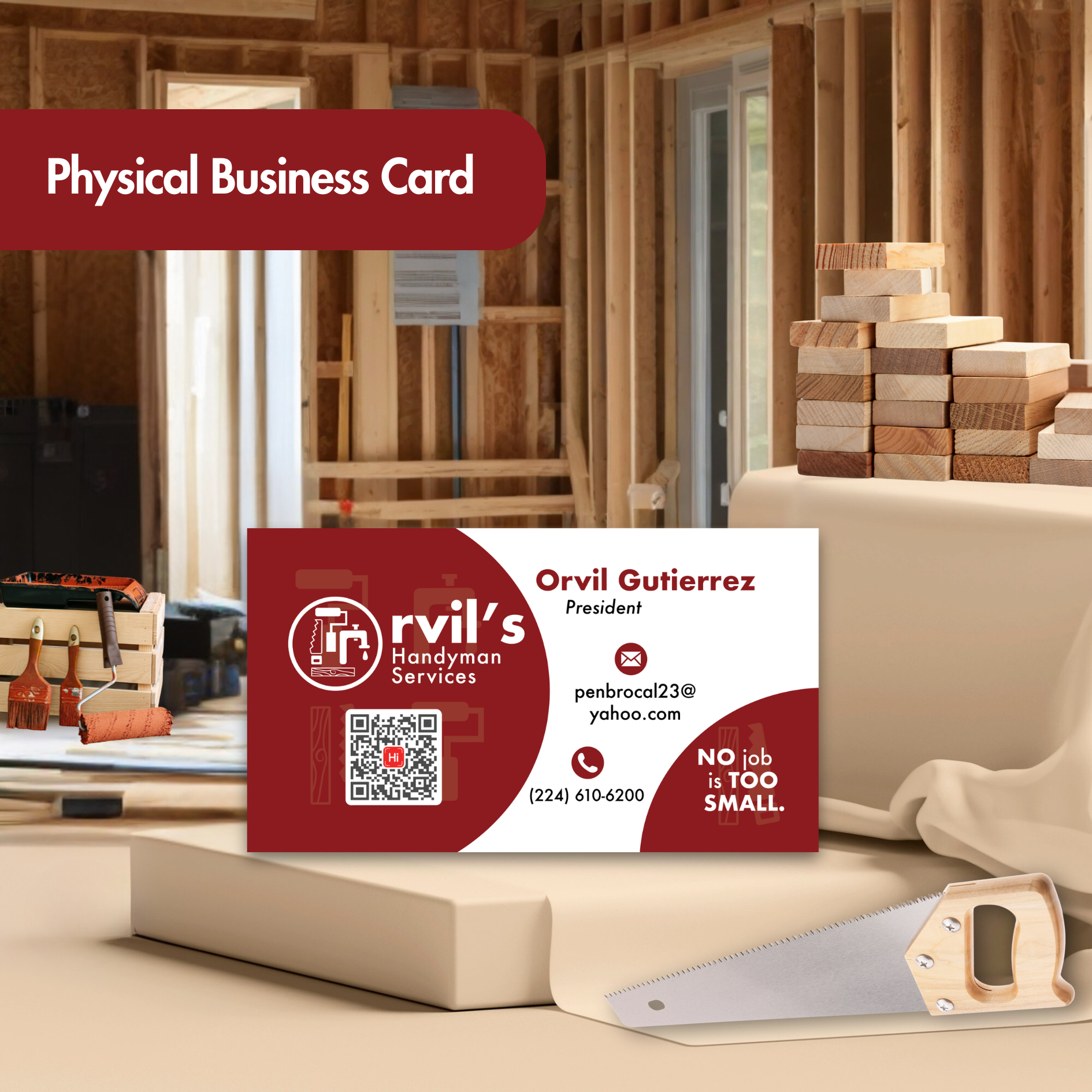
I highly recommend Diana. She is young, talented, driven and very passionate about her work. Diana go about her work with a big smile on her face at all times. She is very professional and patient. My husband and I had the honor of hiring Diana to assist us is creating a business logo for my husband’s new business. Diana made it very easy by providing guidance on the graphic design, and colors based on the business type. We got setup for digital cards and were able to order physical cards with our QR code, thanks to Diana’s talents. We are now looking forward to working with Diana on my husband’s website . Promise you will not be disappointed.