In 2024, the Youth Conservation Corps (YCC) celebrated 50 years of equipping Lake County youth (16-24 years) with lifelong skills. YCC is a nonprofit organization dedicated to helping every young person find a pathway to success. It mentors and empowers young adults through education and training in life skills, career development, and environmental stewardship. The organization offers six core services: life skills and mentoring, education, community service, trades and vocational training, conservation and sustainability, and job placement.
My Role
Contractor
Project Date
March 2024 – July 2024
Duration
Six-Month Project A monthly newsletter was designed over six months.
Project Brief
Monthly newsletters are vital for maintaining business transparency and building trust among sponsors, partners, and volunteers. YCC’s goal is to keep stakeholders informed about its ongoing activities in order to increase trust and foster generosity.
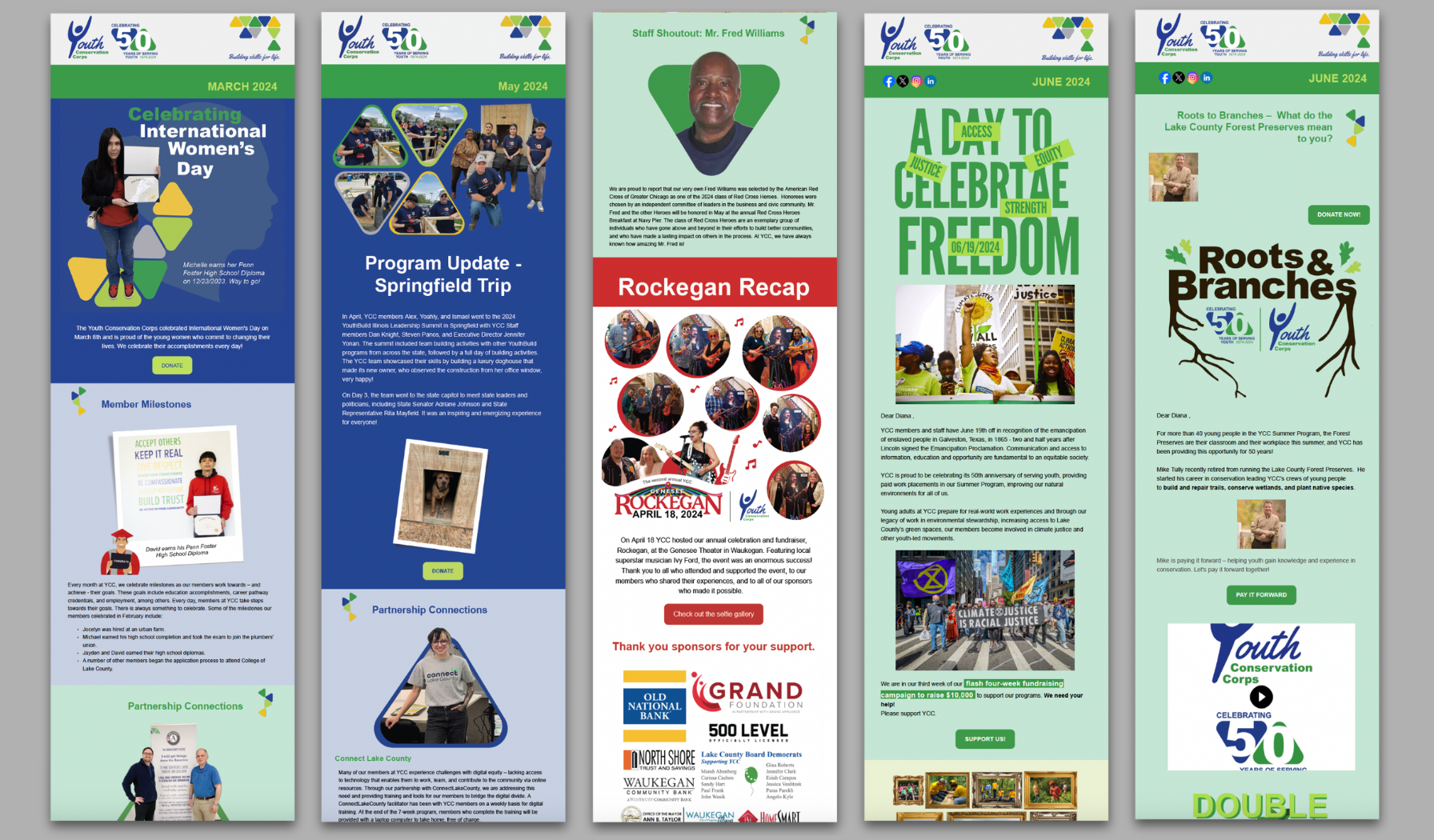
Each monthly issue, written from March to July 2024, featured stories highlighting a youth member’s story, a partner collaboration, a staff spotlight, a program update, a conservation or sustainability project, and upcoming events. My coworker created the content, while I designed the newsletter using Network for Good, ensuring it reflected YCC’s brand and clearly communicated the desired message.
01
Visual Brand Identity
YCC is a vibrant, youth-focused brand that champions inclusivity and a supportive learning environment. It is built on mutual respect and driven by a cycle of empowerment. The brand is fun while showcasing the seriousness of their mission and commitment to removing barriers that young people face.
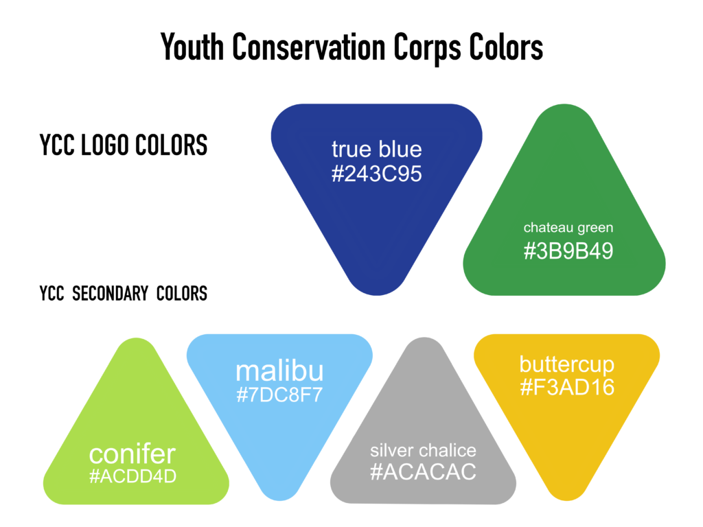
Color Scheme
YCC’s color scheme consists of two primary colors and four secondary colors. All designs consistently incorporate the primary colors, while the secondary colors are used selectively to differentiate topics or draw attention to lower-priority elements within the visual hierarchy.
Visual Brand Elements
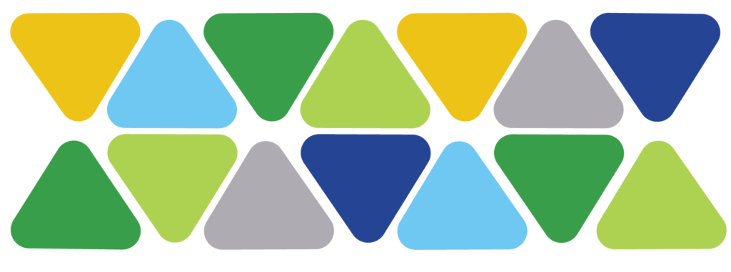
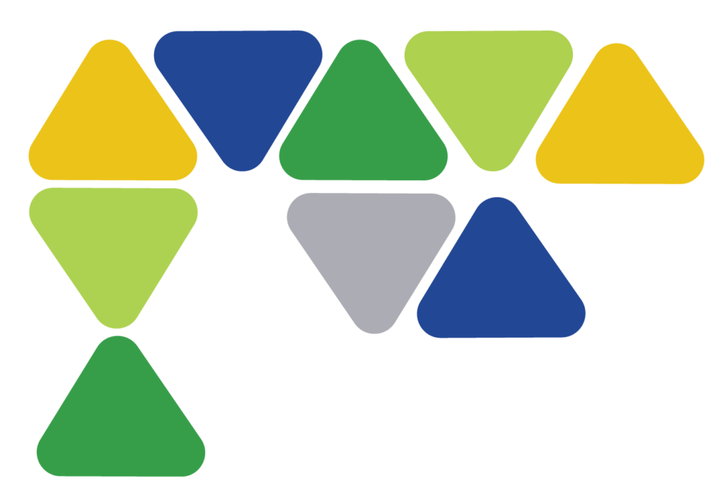
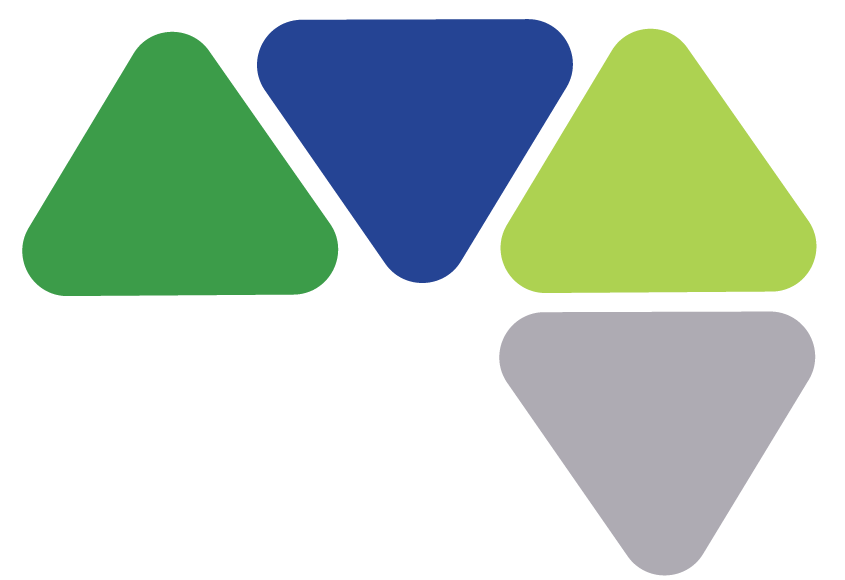
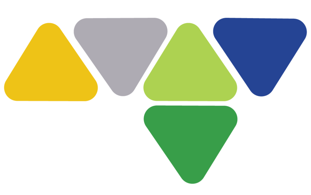
Rounded-edge triangles are key players in YCC’s visual communications. They’re arranged in various fun patterns and playfully alternate in color to create visual interest. The triangles serve as symbolic building blocks, reflecting the inner foundation members begin to construct—skills, habits, and values that shape their journey toward lifelong learning and personal fulfillment.
Pattern 1
Pattern 2
Pattern 3
Pattern 4
Pattern 5
02
Imagery
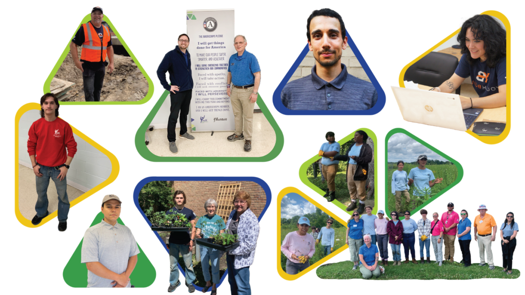
When creating the newsletters, YCC’s brand tone and visual identity were always top of mind. Fun, repeating design elements were used to enhance brand recognition and visual consistency. These elements included:
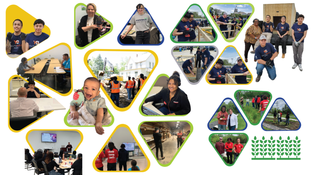
Triangular images with a pop-out effect to grab attention and spark interest in the content;
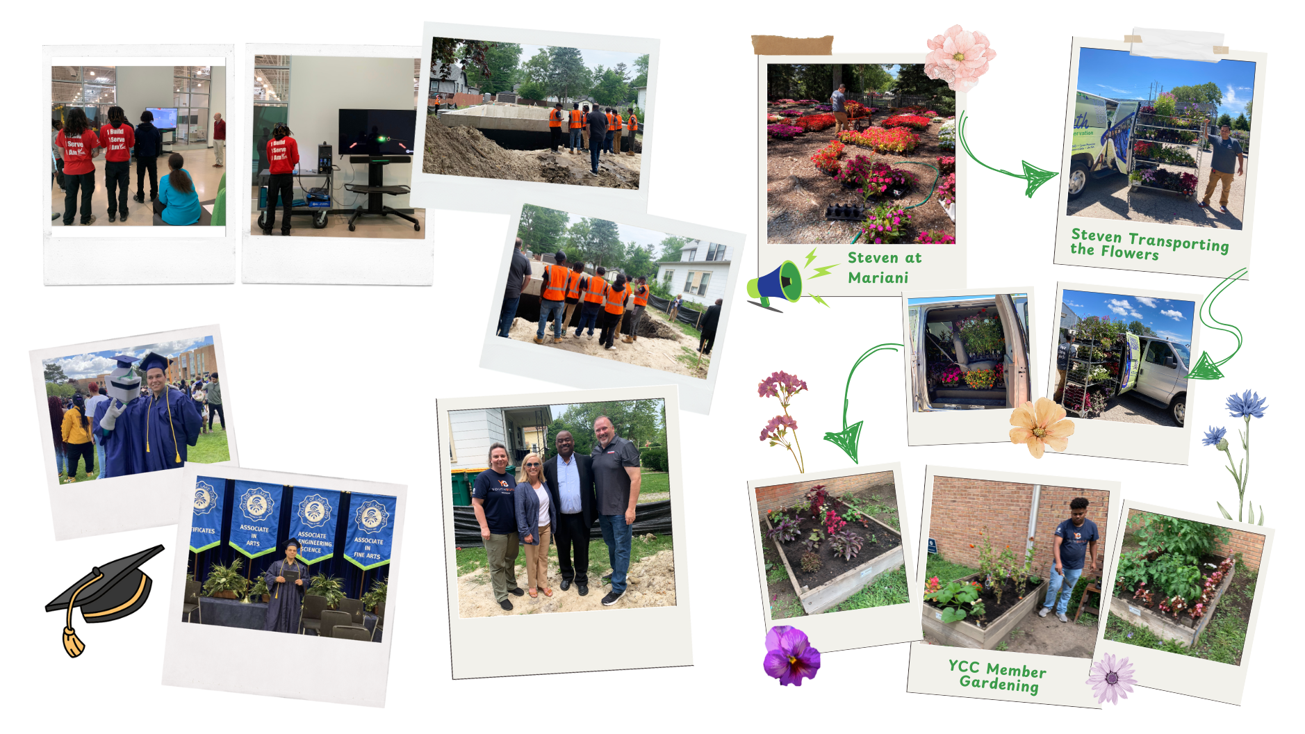
Polaroid-style photographs to highlight meaningful moments within the YCC community, adding a personal and sentimental touch;
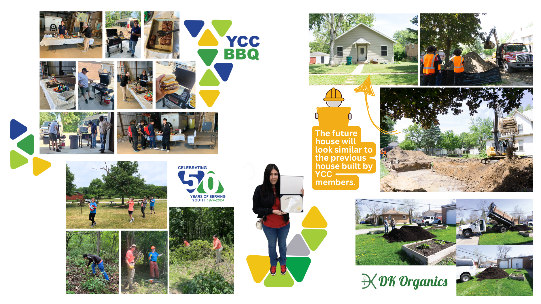
Photo collages to reflect the busy, hands-on nature of YCC’s programs. By combining multiple images into a single layout, the collages visually conveyed the variety and intensity of activities taking place—showing that there’s always something happening and highlighting the active, engaged environment YCC fosters.
Triangular Images
Polaroid Photographs
Photo Collages
04
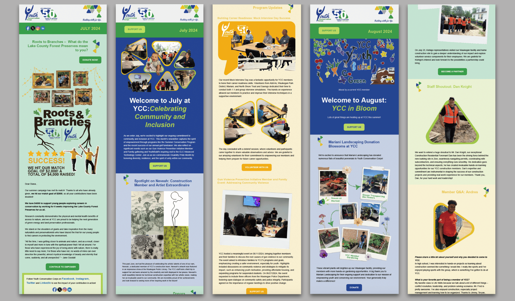
Email Newsletters
A total of eight newsletters were created during a six-month period. Every month, a newsletter recapped YCC’s monthly activity. Additional newsletters were created during the months of June and July to promote the Roots & Branches summer campaign.
Diana is a very talented designer and technician who is also delightful to work with. She consistently holds herself to the highest standards of quality and professionalism. Any organization would be lucky to have her on their team.