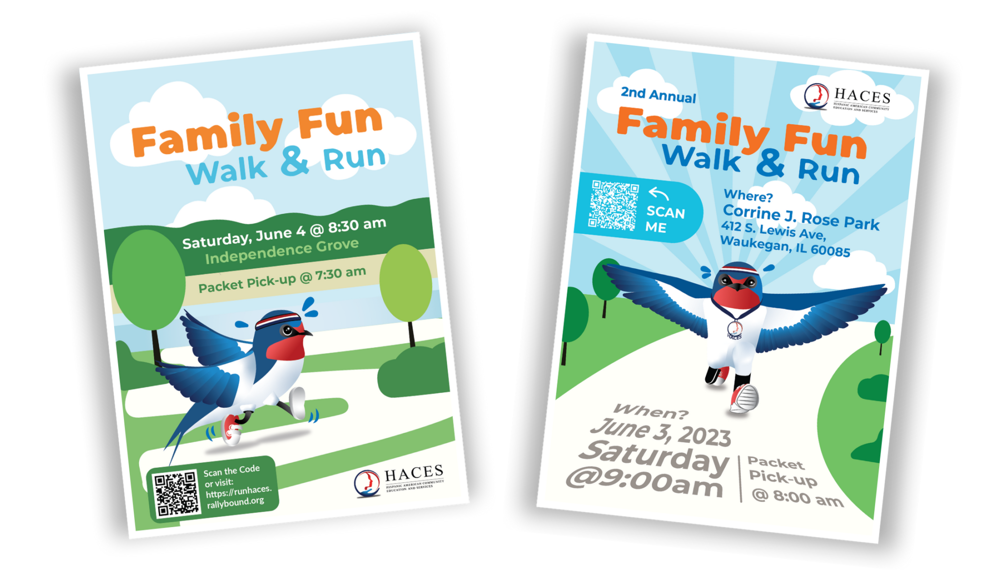
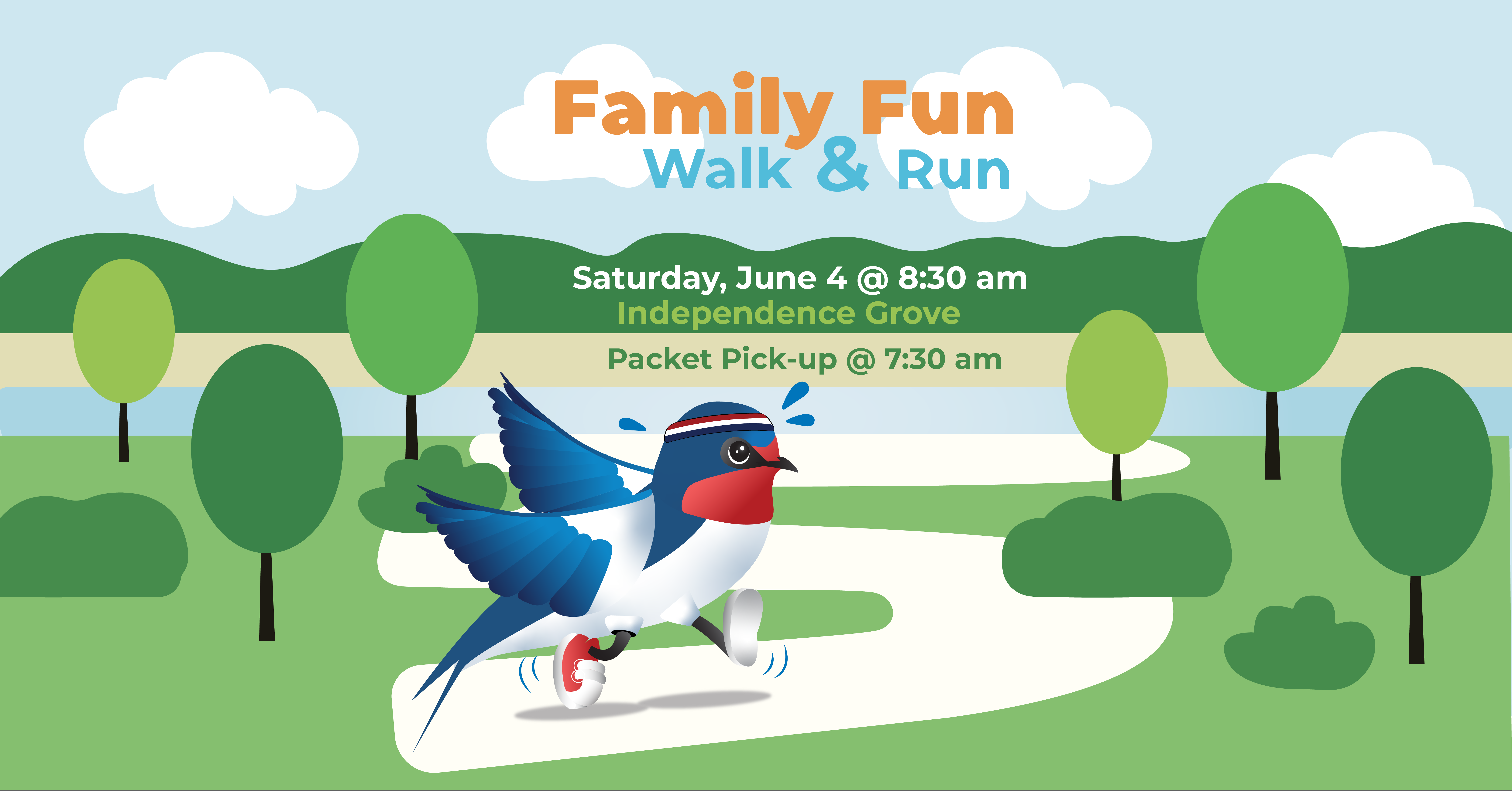
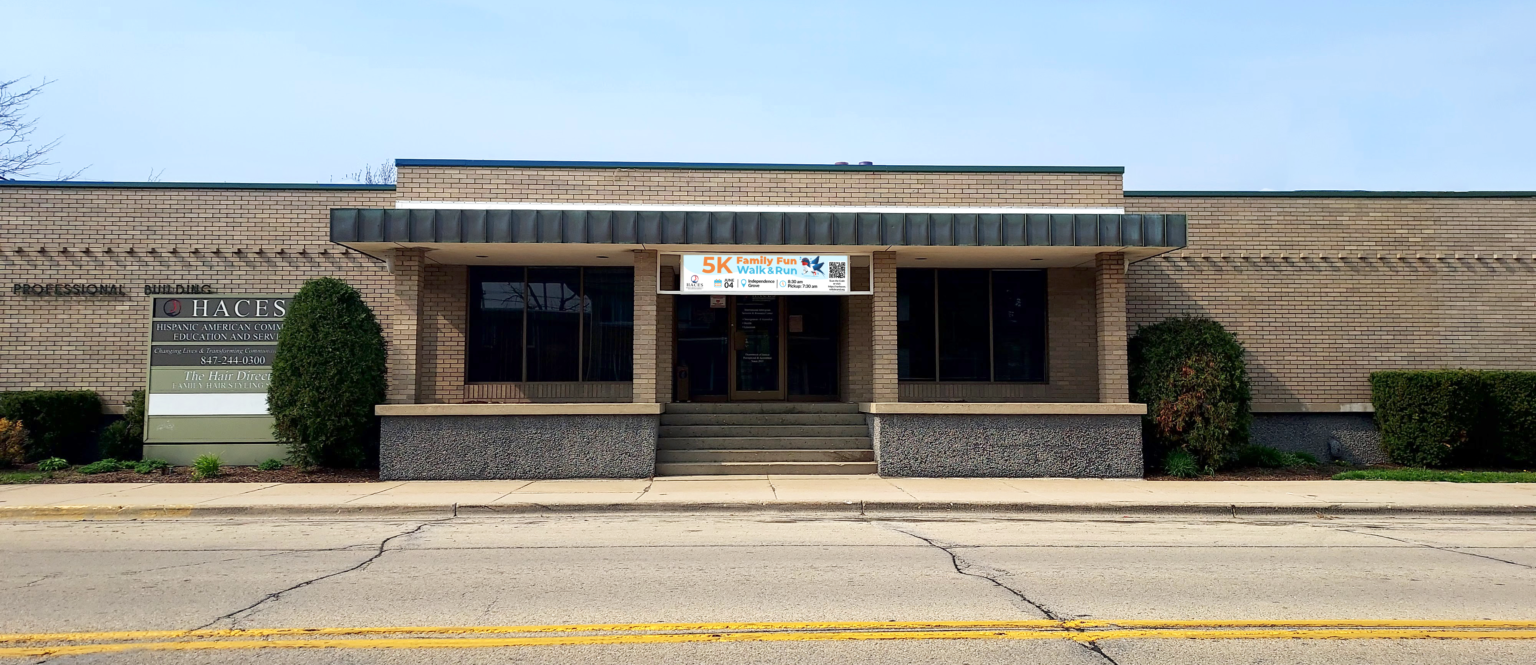
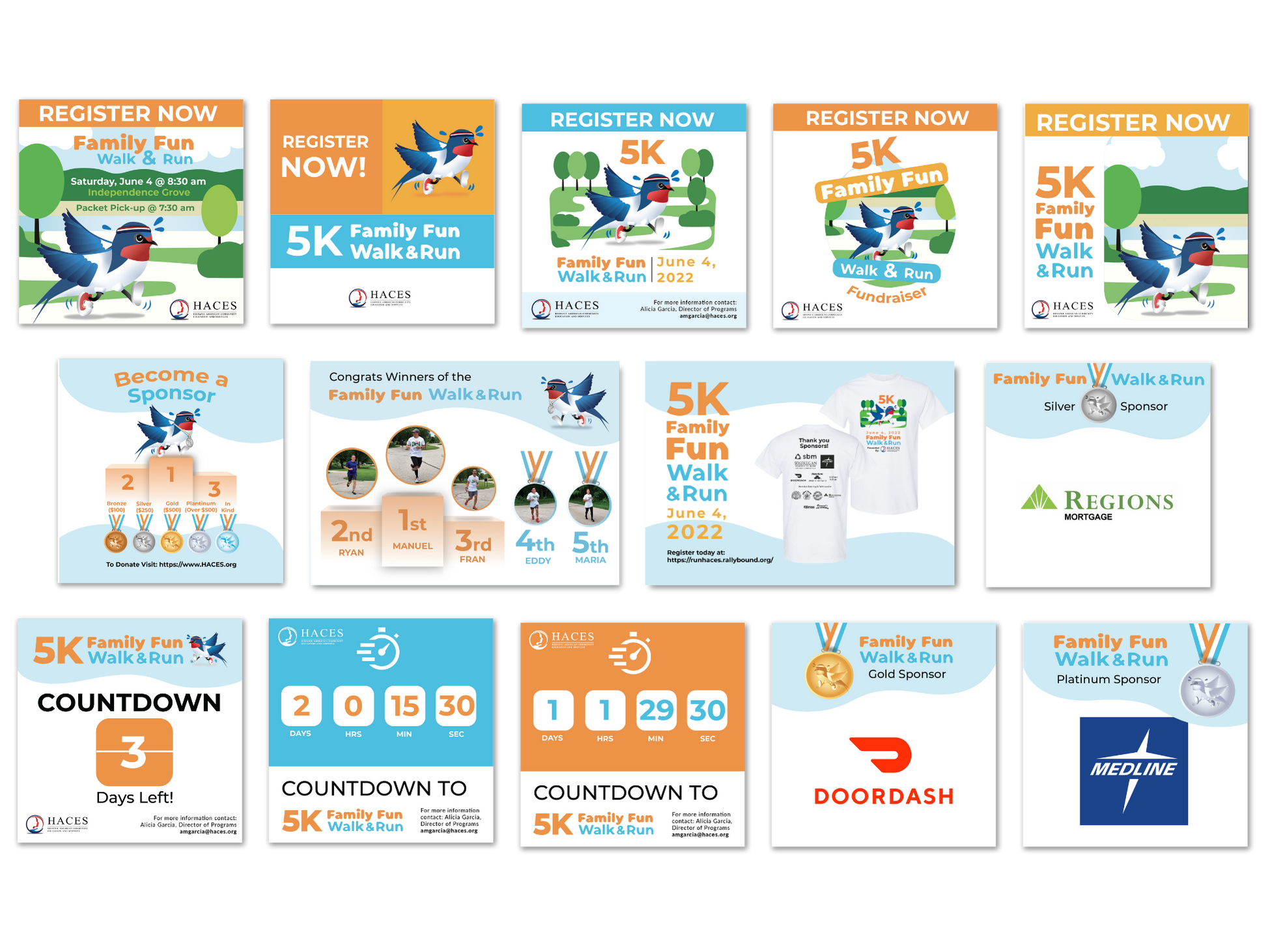
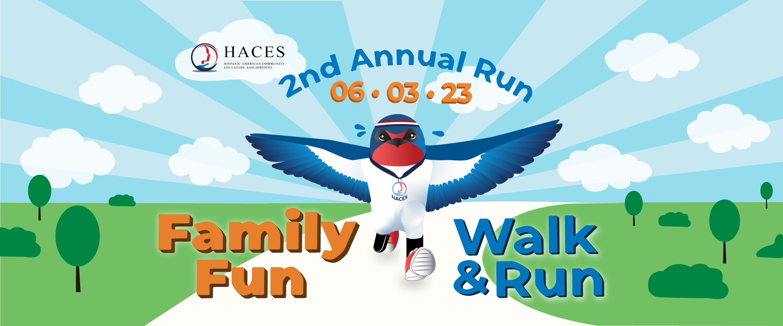
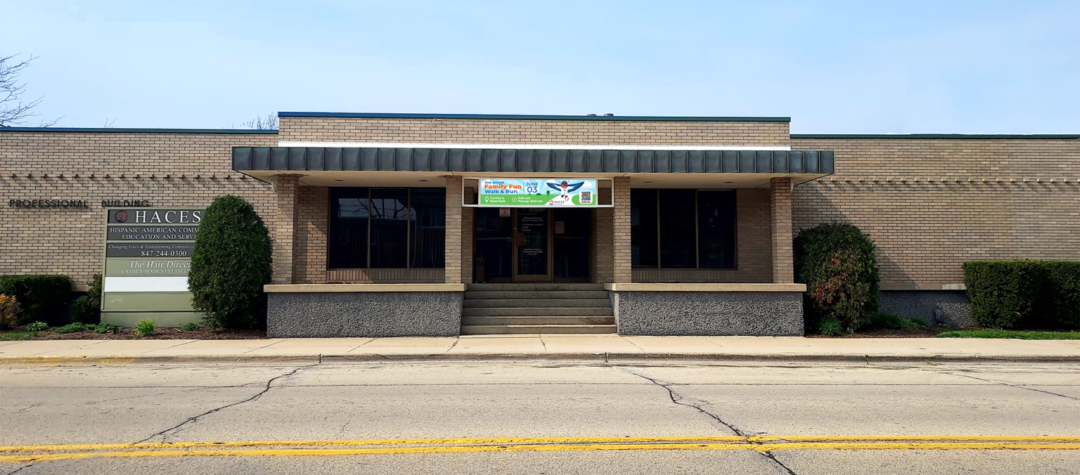
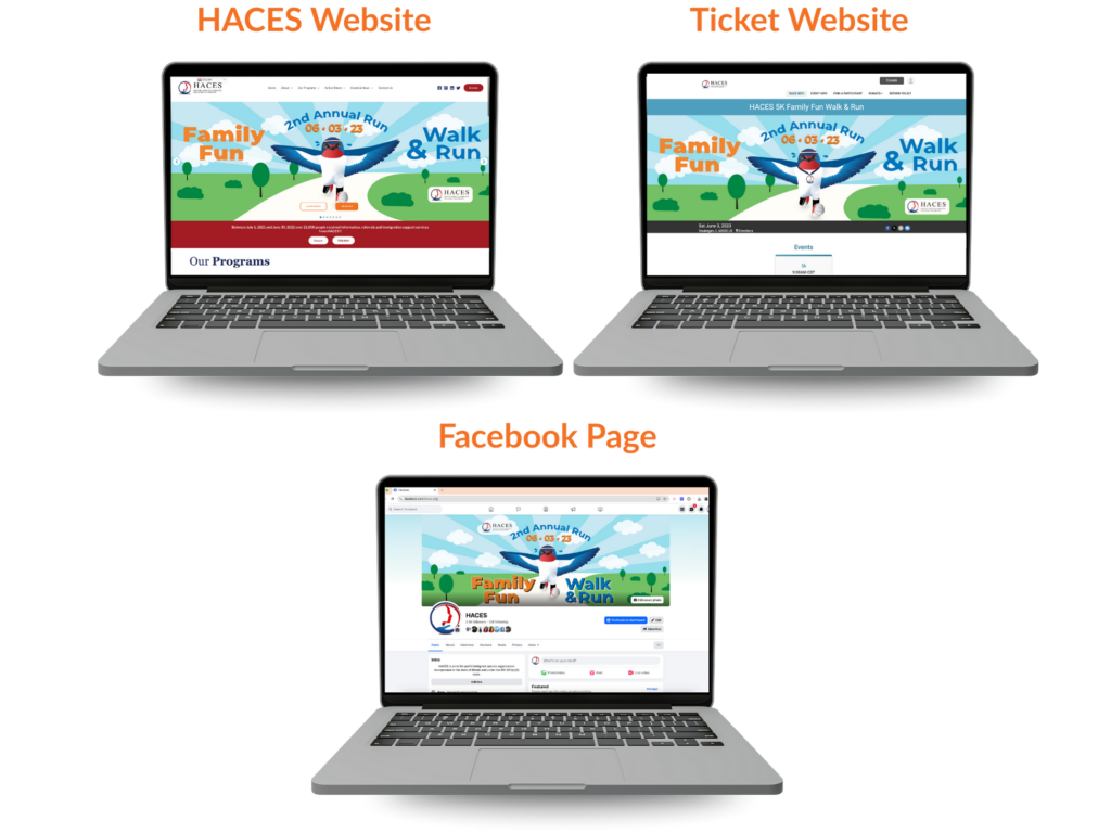
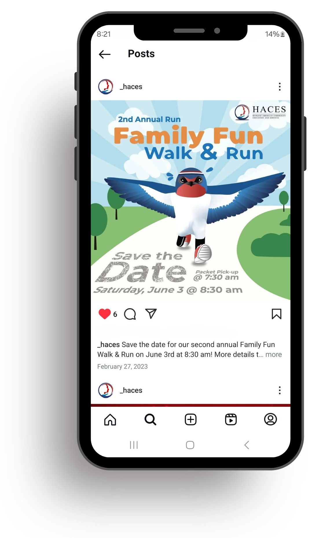
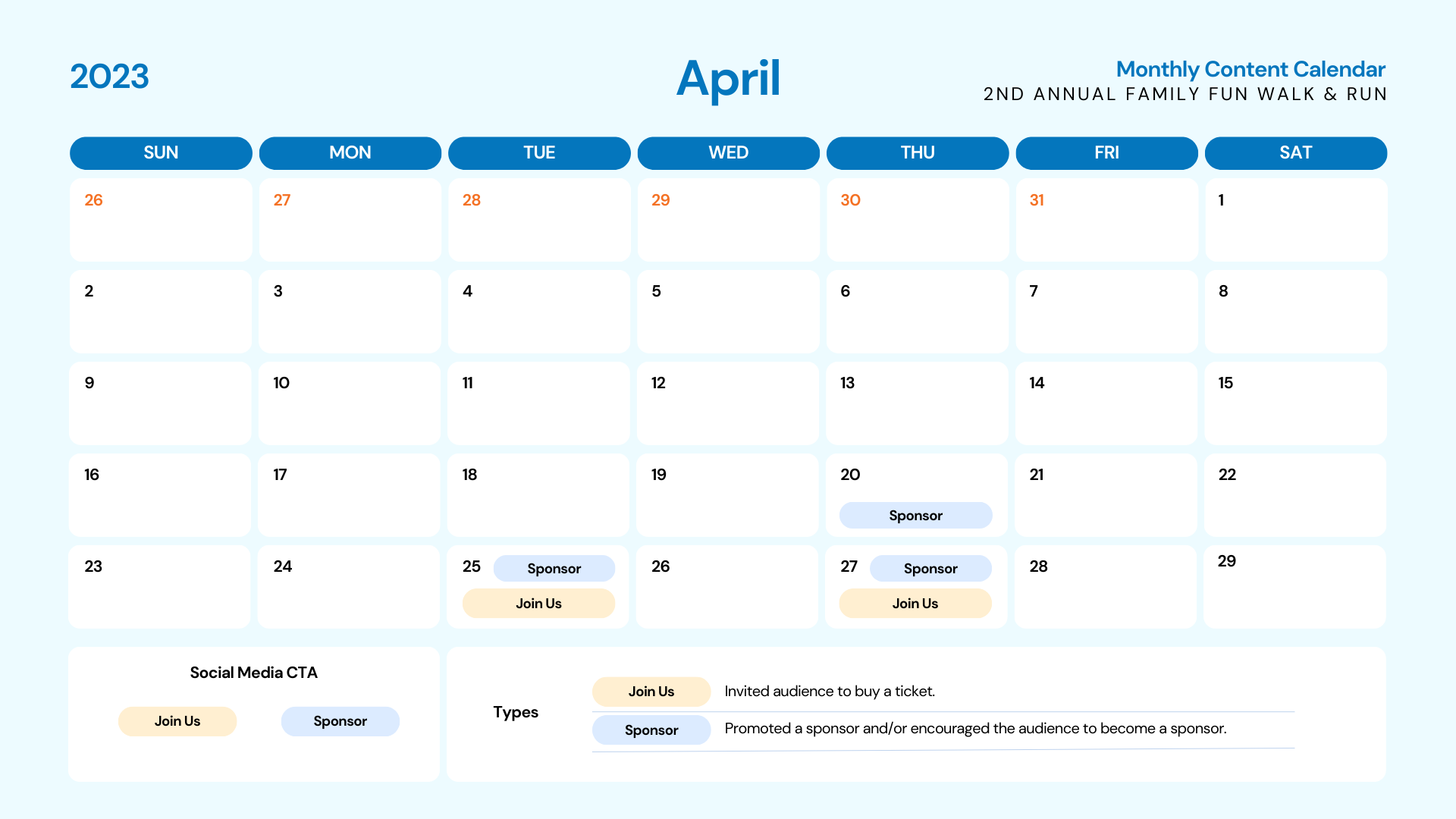
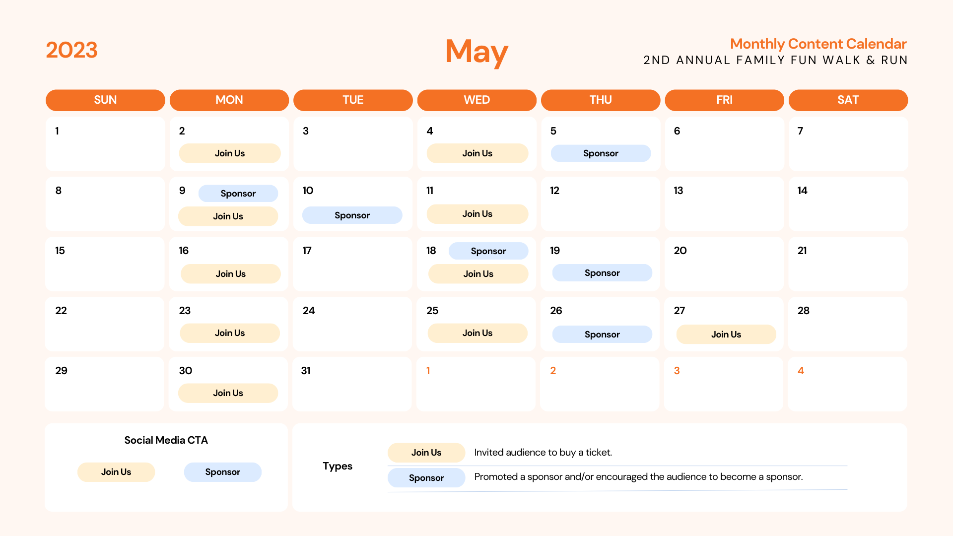
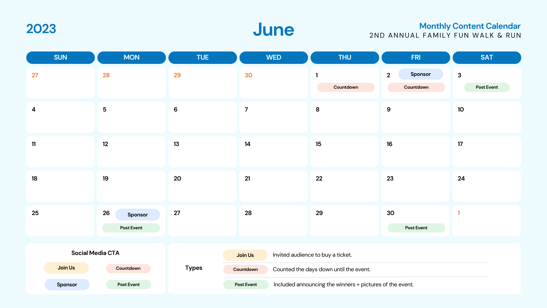
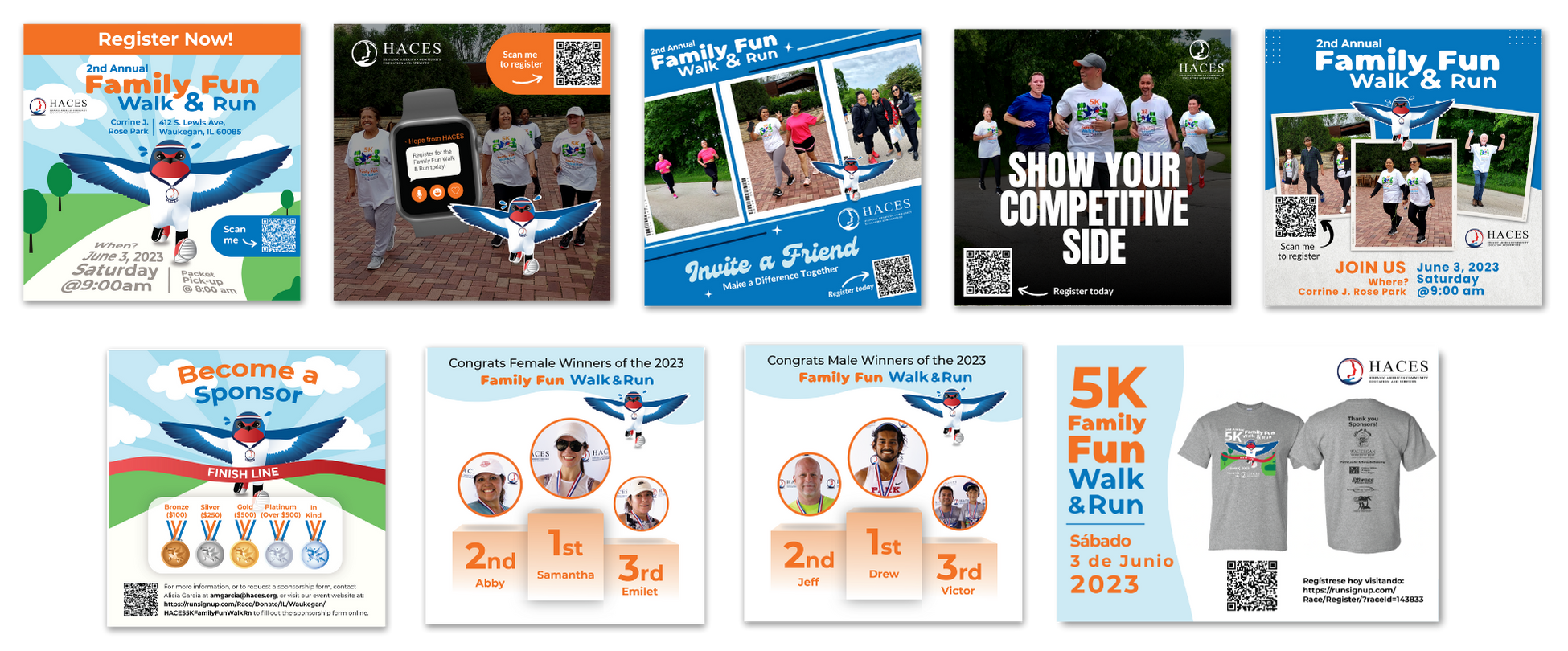
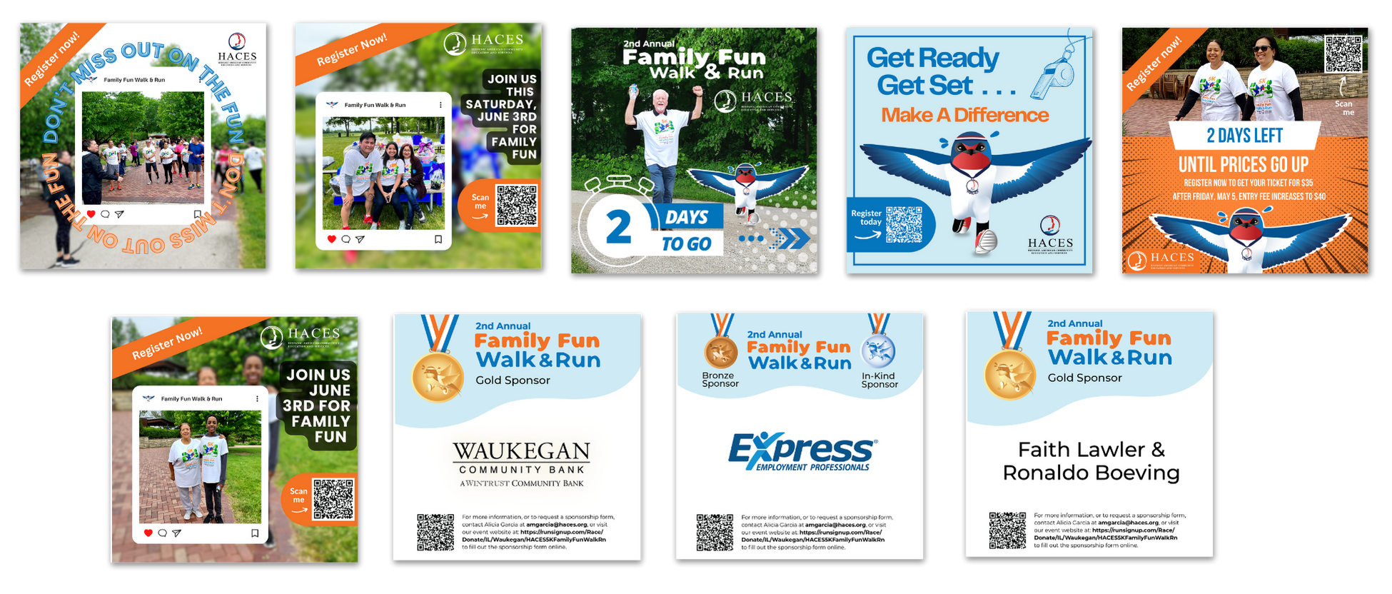
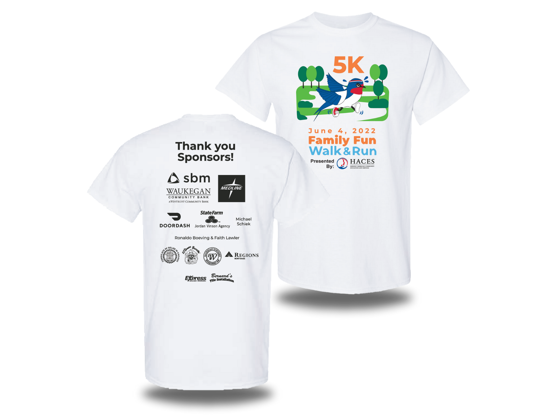
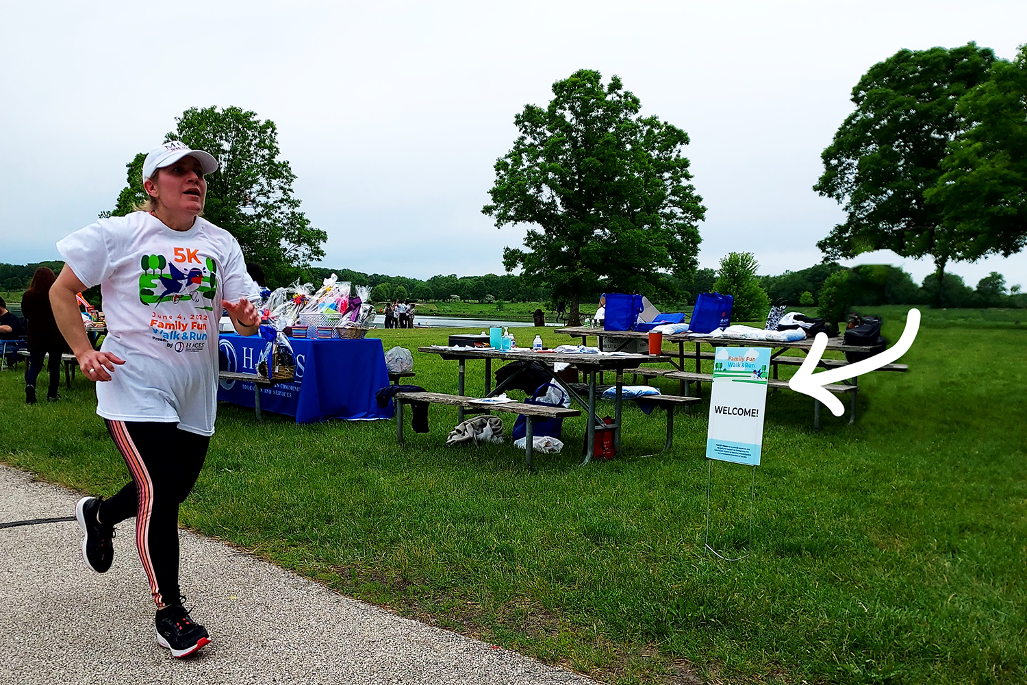
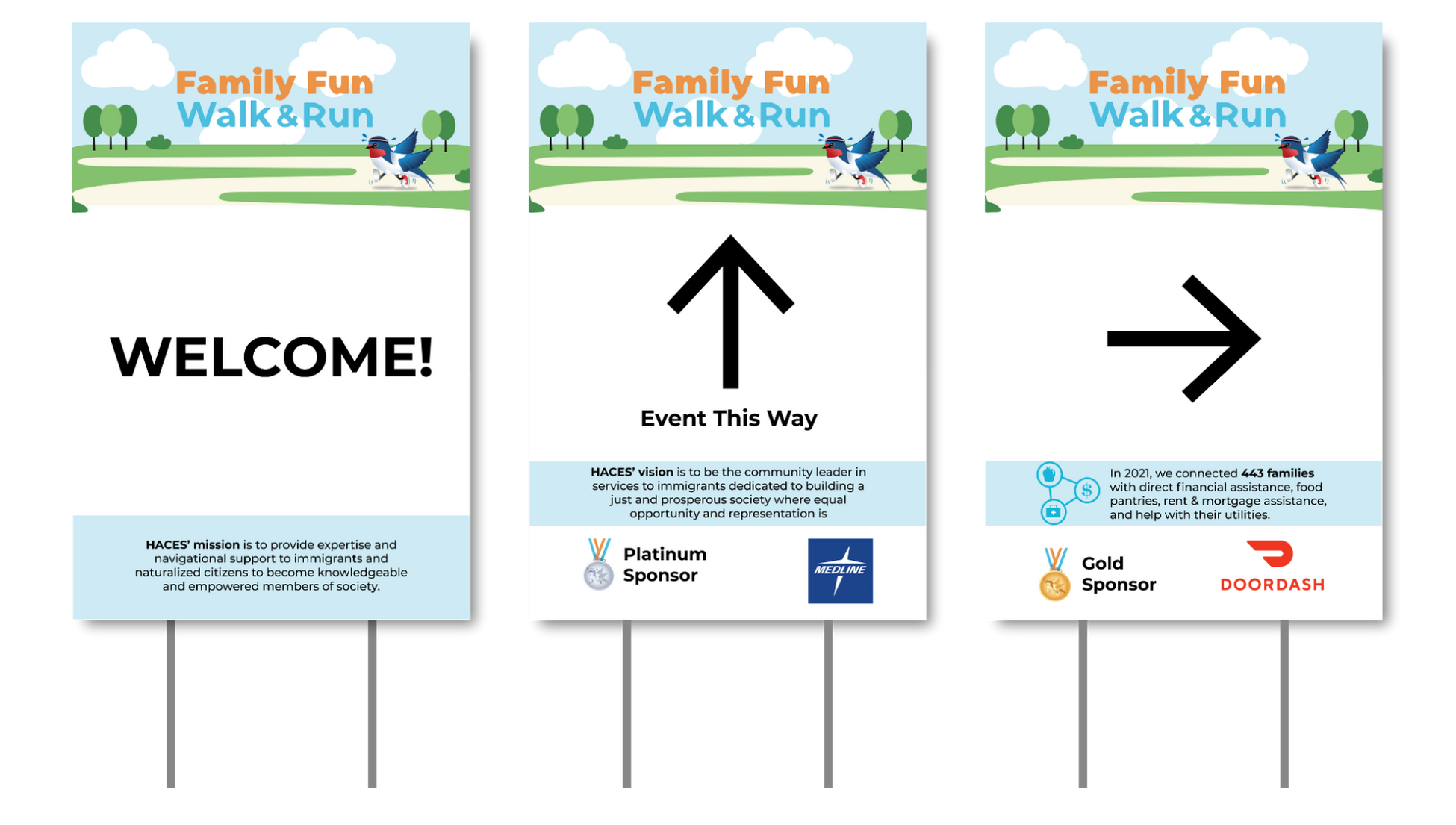
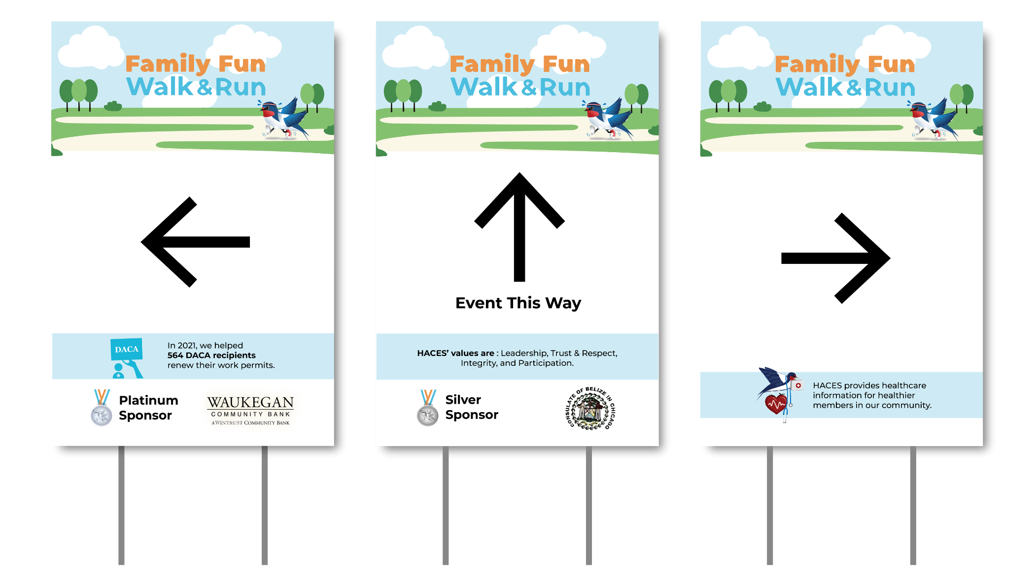
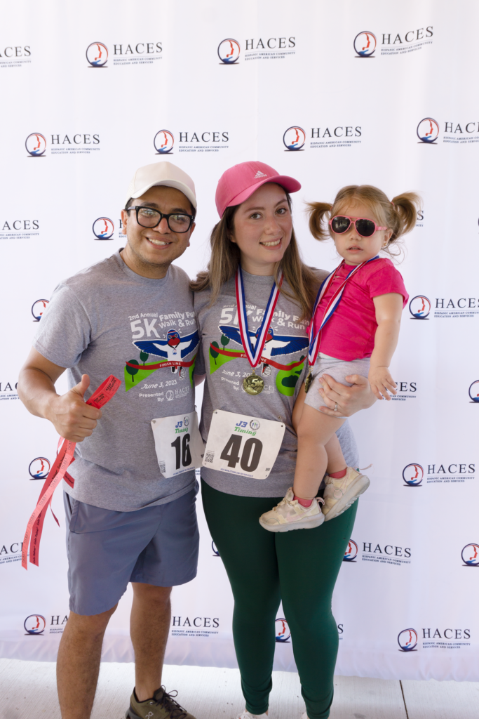
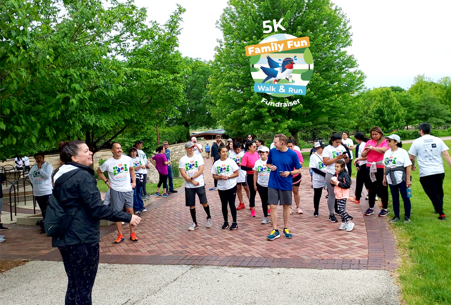
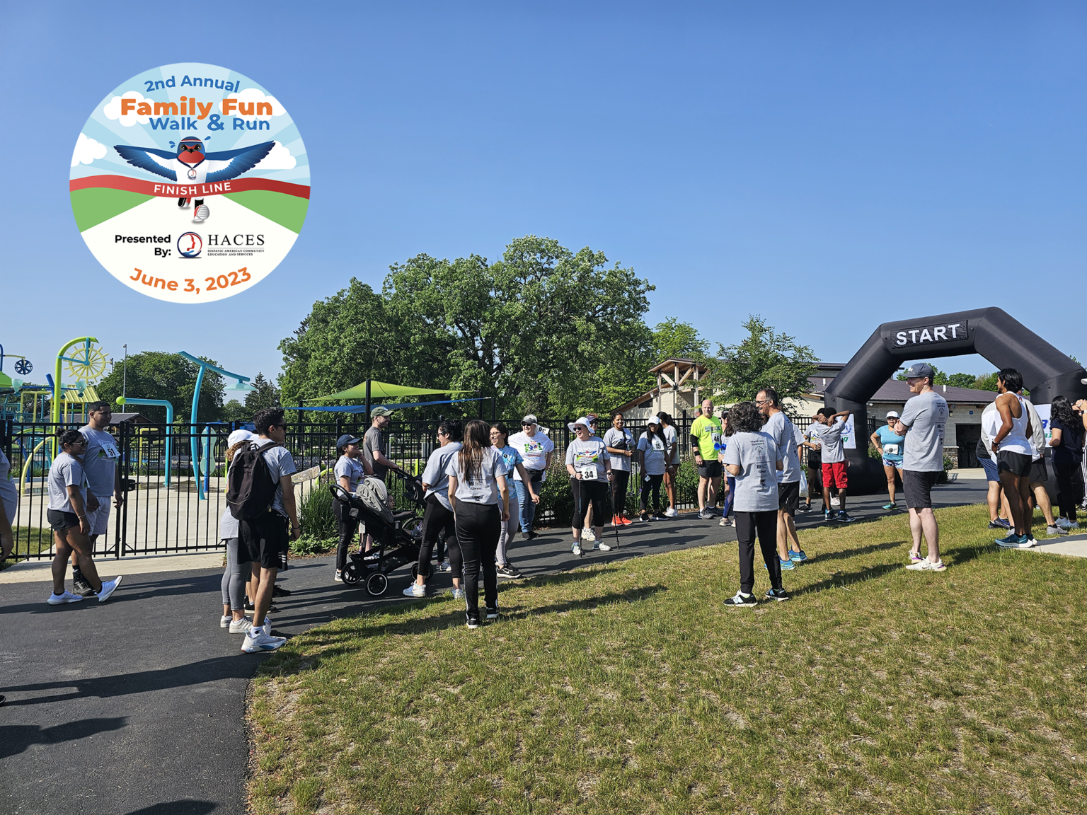
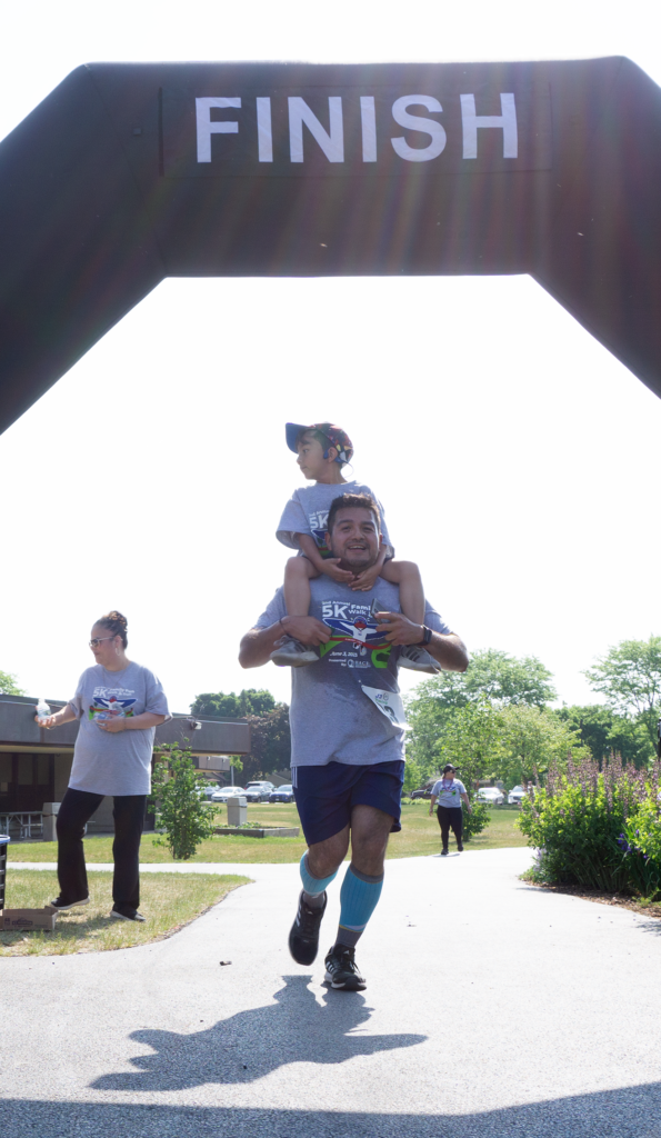
About the Business

HACES is a nonprofit based in Lake County with 20 years of experience providing navigational support and expertise. Department of Justice-accredited, HACES specializes in immigration law and offers expert guidance on immigration cases. Operating on three pillars—legal, education, and health—HACES divides its services to address different aspects of clients’ lives, aiming to improve their overall quality of life.

My Role

Contractor
Graphic Design Services

Project Date

1st Annual Family Fun Walk & Run
February 2022 – June 2022

2nd Annual Family Fun Walk & Run
February 2023 – June 2023

Project Duration

5 months

Project Brief

HACES introduced the annual Family Fun Walk & Run with three primary objectives: to engage a younger demographic and cultivate the next generation of supporters; to increase awareness of HACES and its services among local families and community members; and to create a small fundraiser event to support the organization’s mission. Designed as a more affordable and inclusive alternative to the formal gala, the event provided an enjoyable and accessible opportunity for the community to connect with HACES and its cause. While targeting a different audience, the Family Fun Walk & Run offered sponsorship opportunities, ensuring continued support from partners and stakeholders.

The event was held for two consecutive years, with the next annual event scheduled for June 2026. A unique and much-anticipated feature was the annual debut of a new version of Hope, HACES’ swallow mascot. Her evolving design reflected not only the organization’s continued growth but also its innovative approach to community engagement—making its brand more approachable, relatable, and visually compelling. The first Family Fun Walk & Run served as the catalyst for reimagining Hope, transitioning her from a realistic depiction of a swallow to the vibrant, friendlier, and more animated character she is today—a design that draws attention, resonates with families, and has become a beloved symbol of the HACES brand.

Project Overview

As a contractor, I was hired for five months each year to support HACES with their Family Fun Walk & Run, providing graphic design and marketing services.

Graphic Design
  • Visual Design
  • Postcard Invitation
  • Building Banner 
  • Sponsorship Form 
  • Yard Signs
  • T-shirts
  • Event Signage 
Marketing
  • Social Media Marketing 
  • Email Marketing 
  • Sponsor Form 
  • Above the Fold Image on Website
  • Facebook Event Cover Graphic

Stakeholders

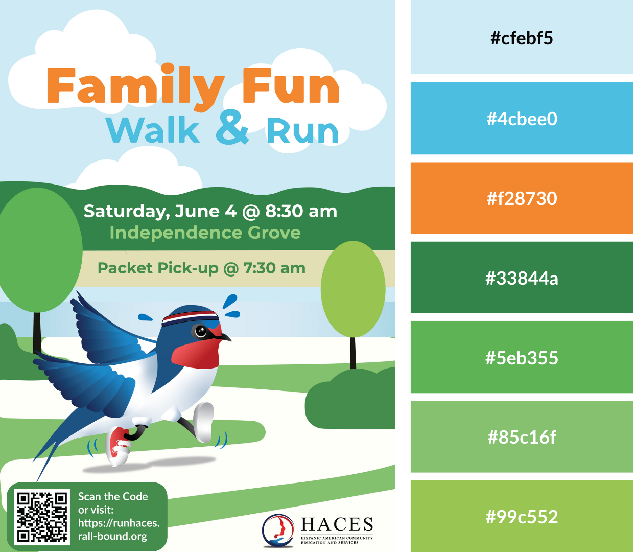
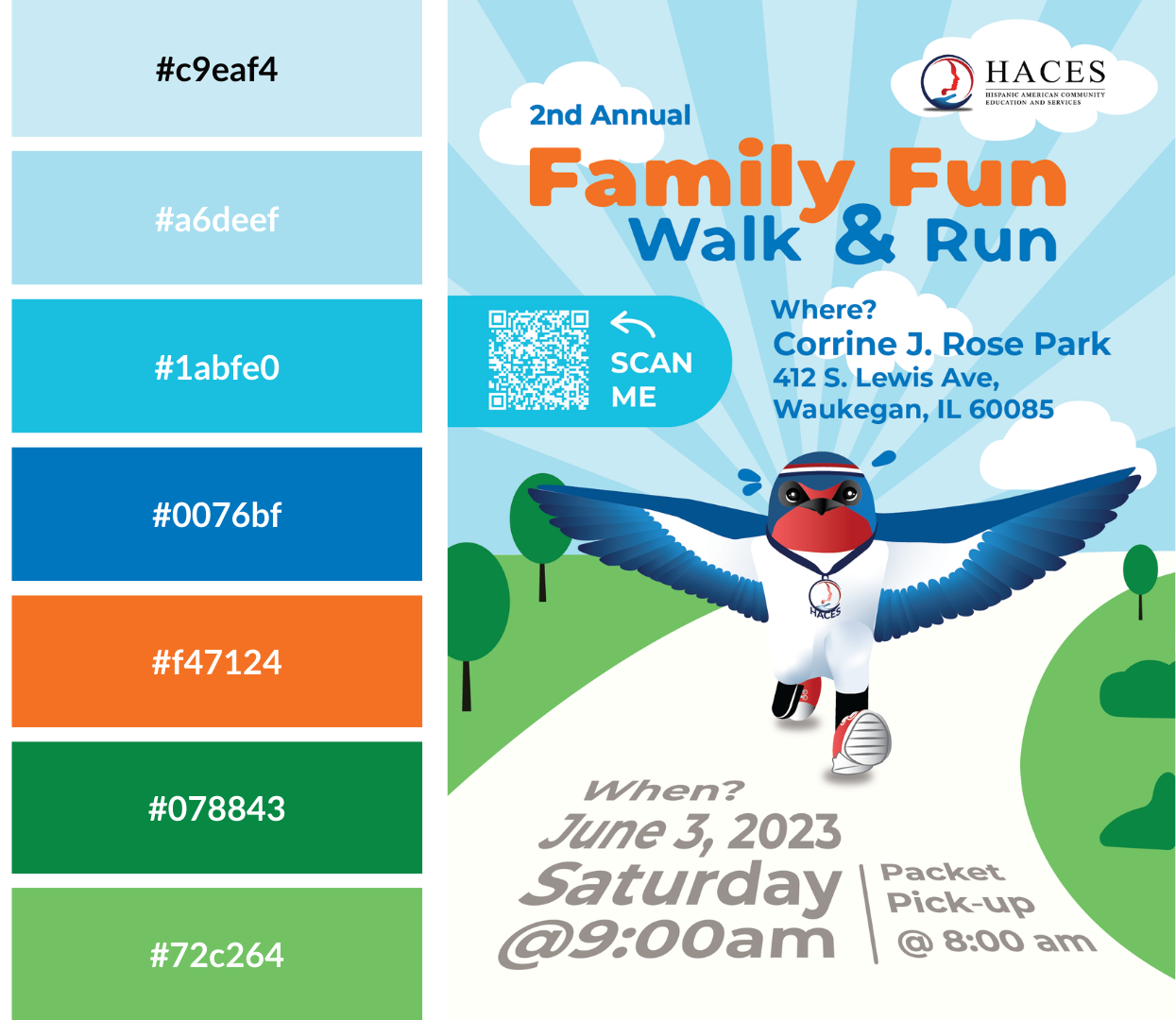
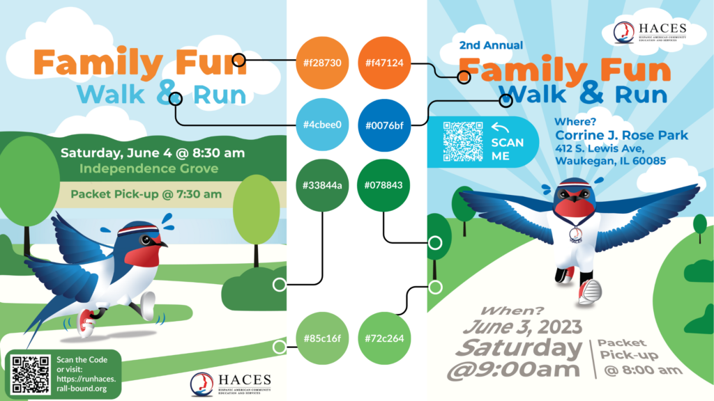
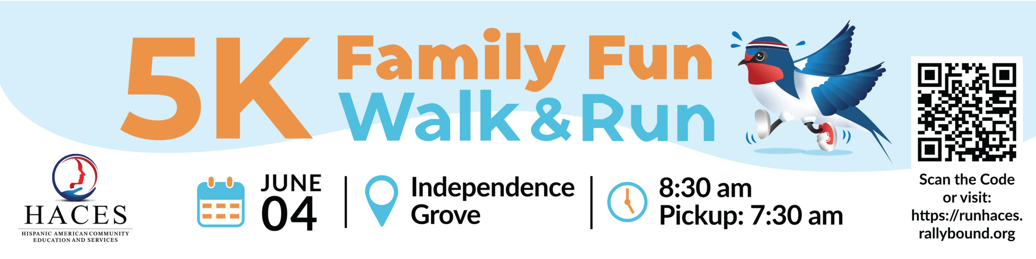
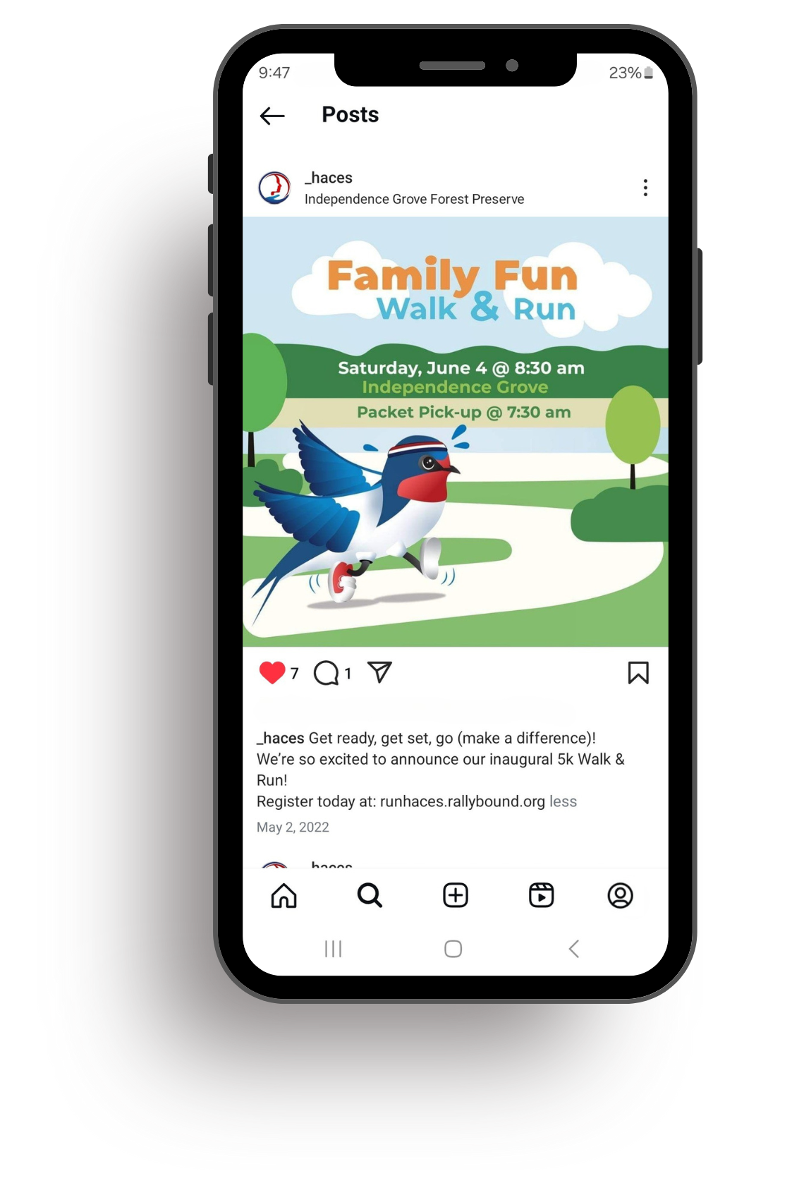
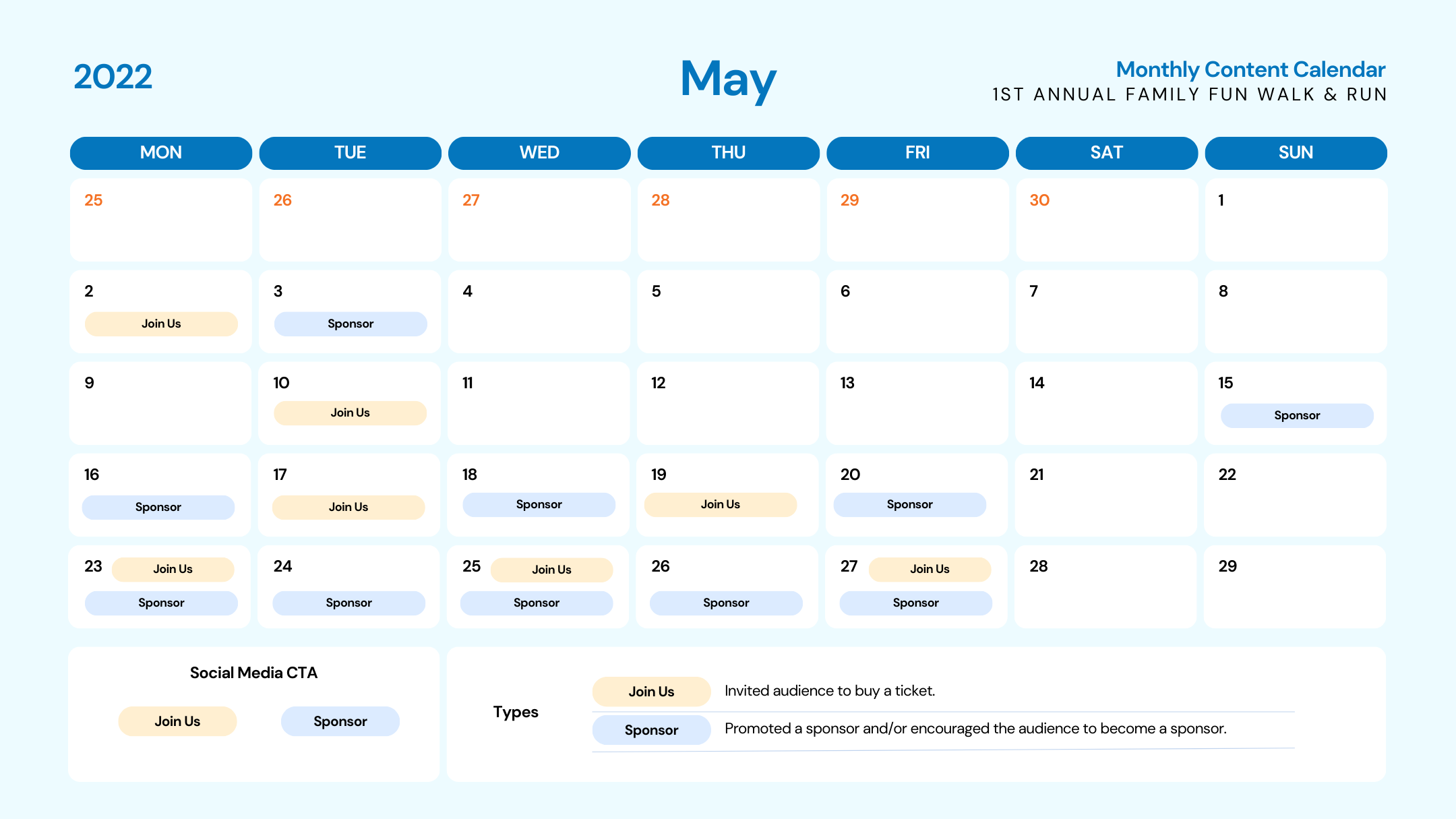
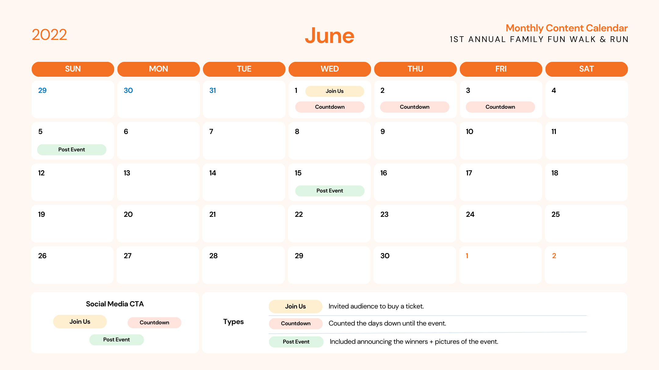
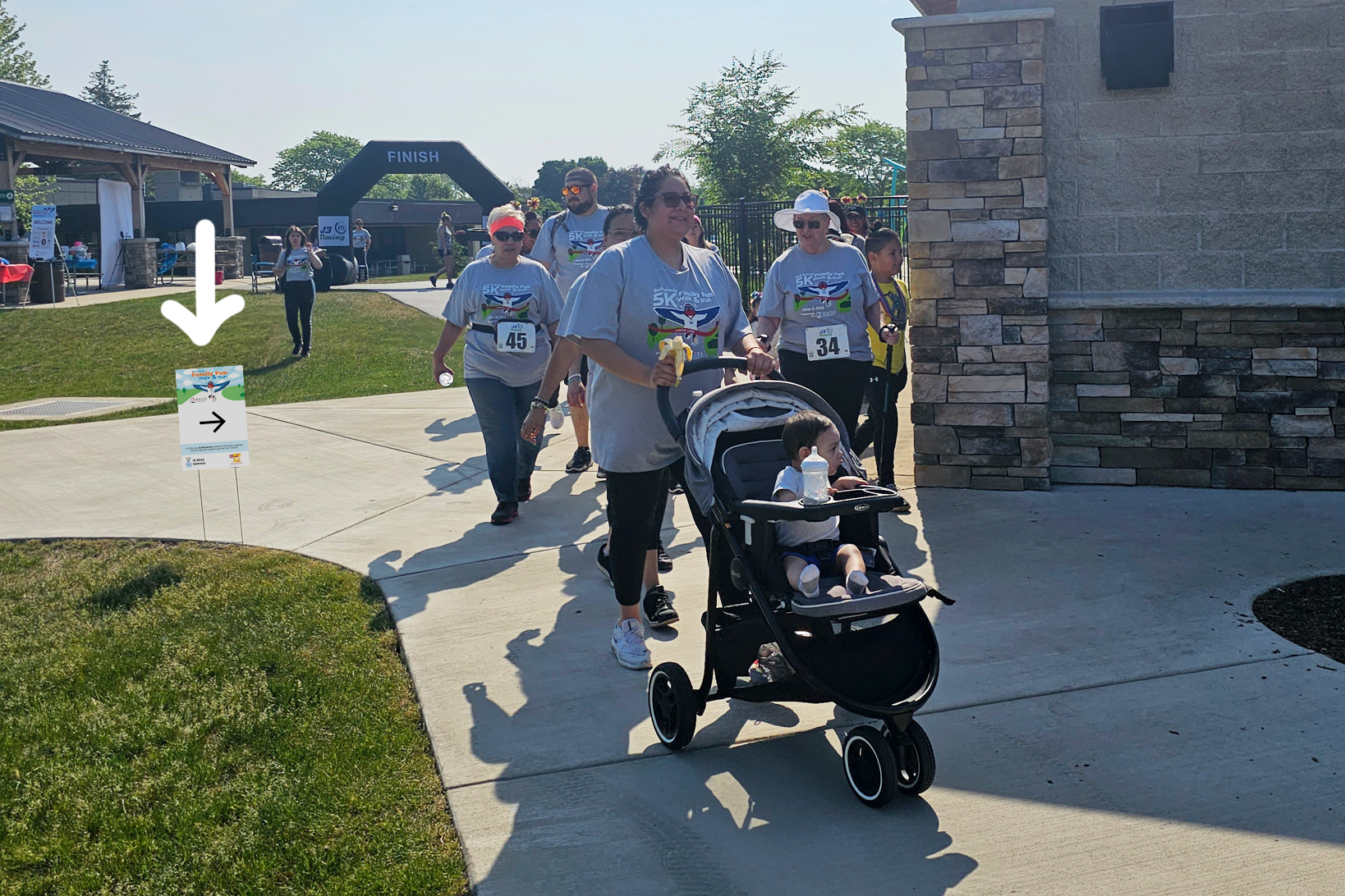
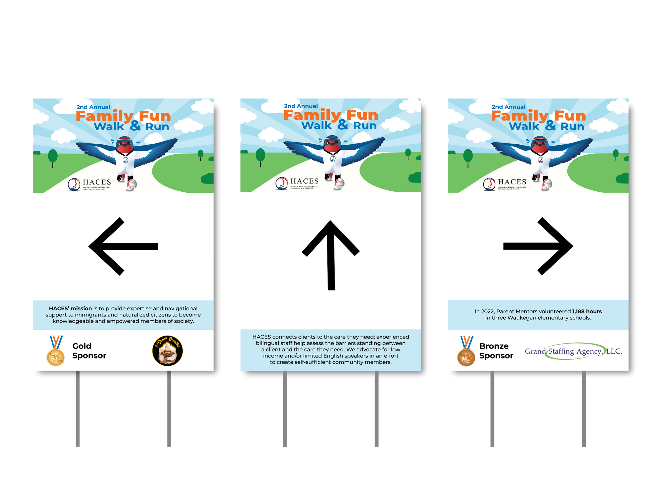
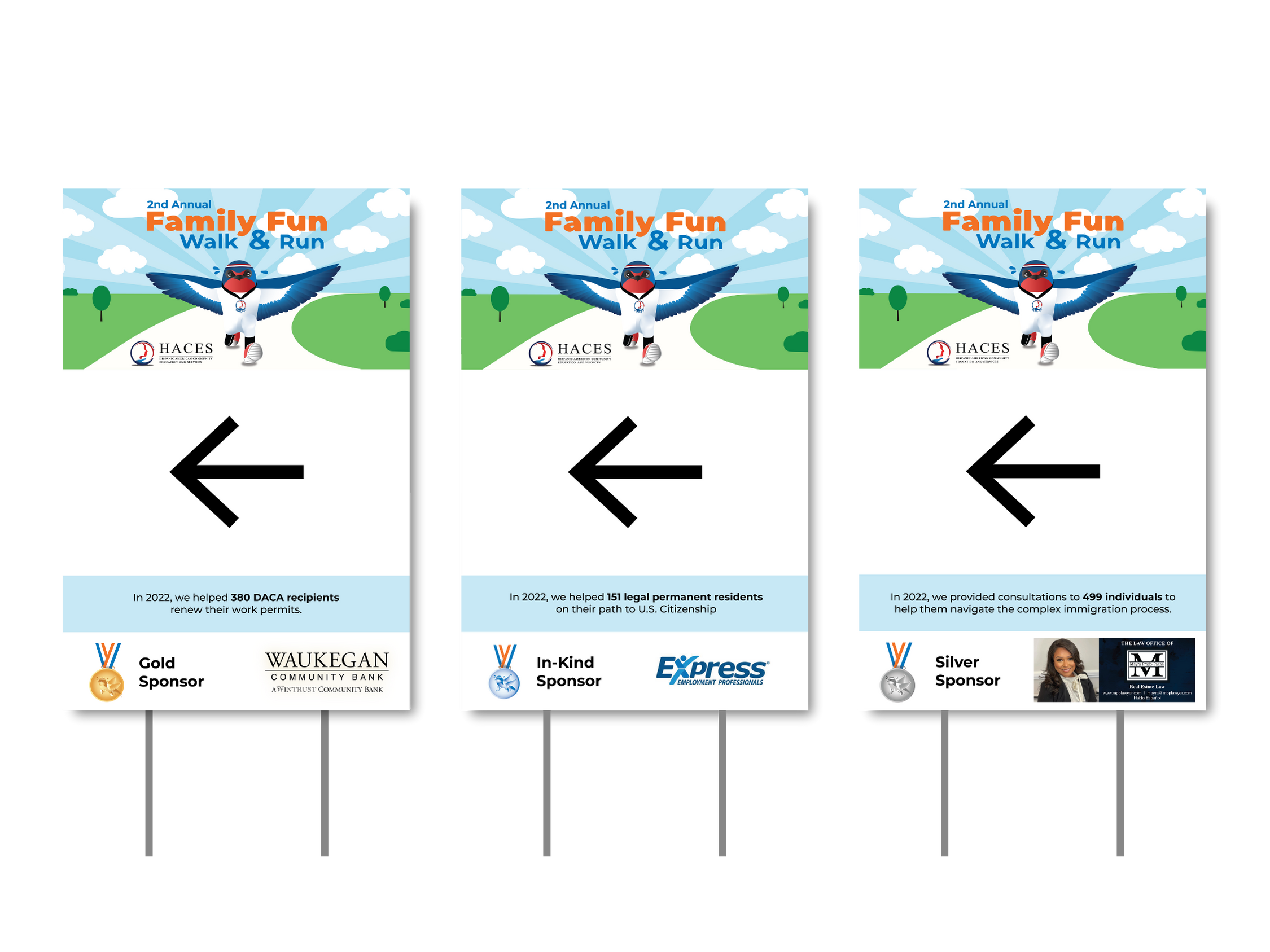
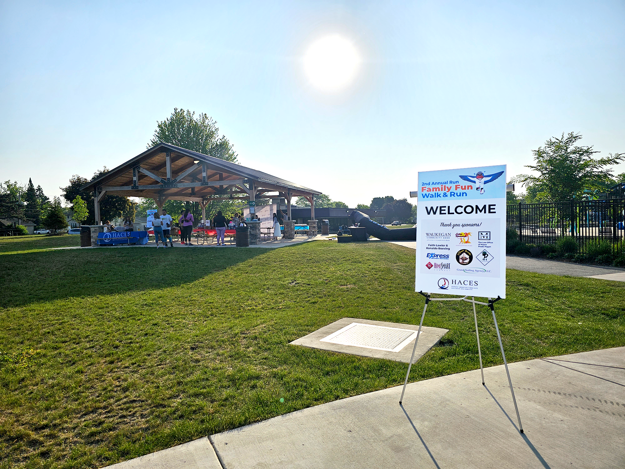
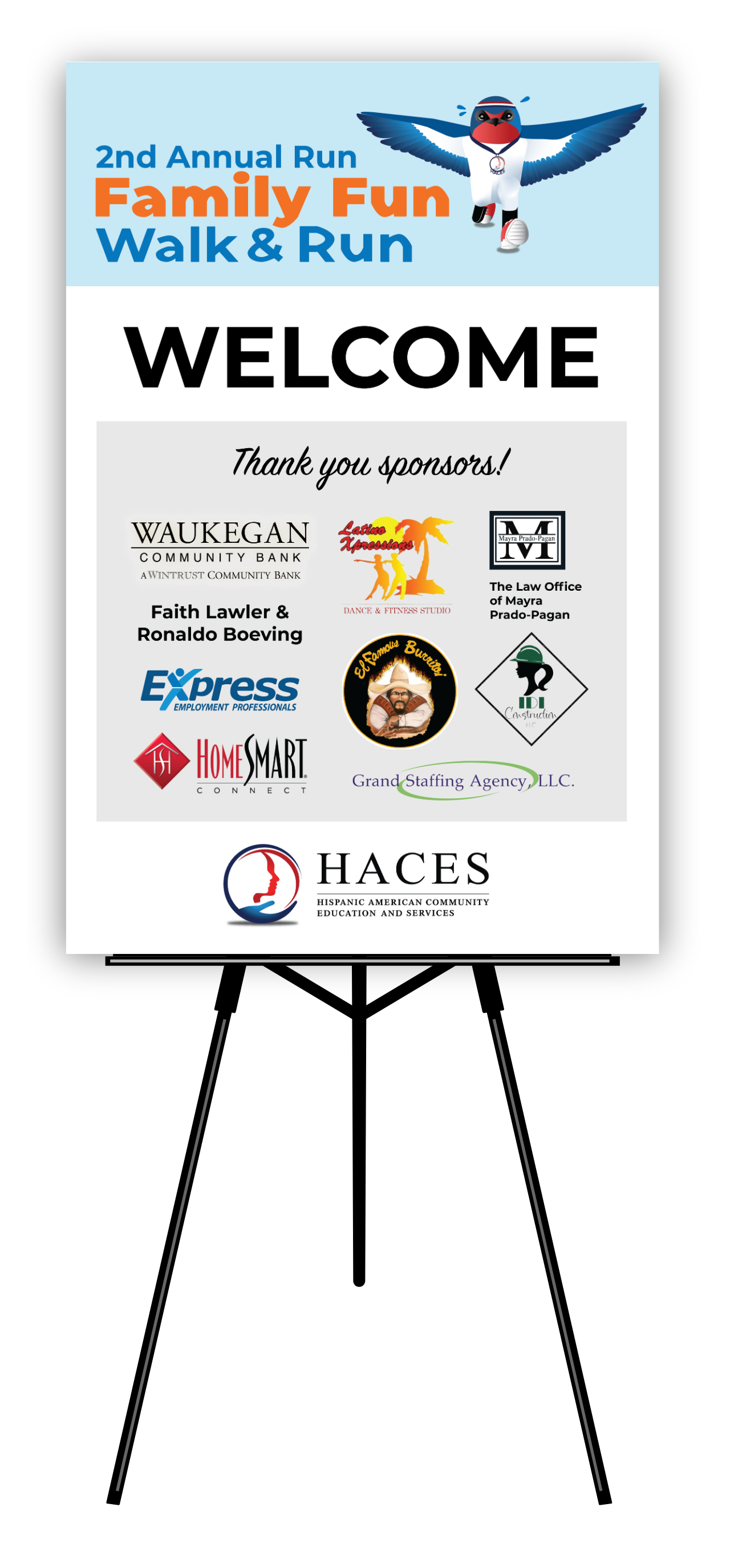
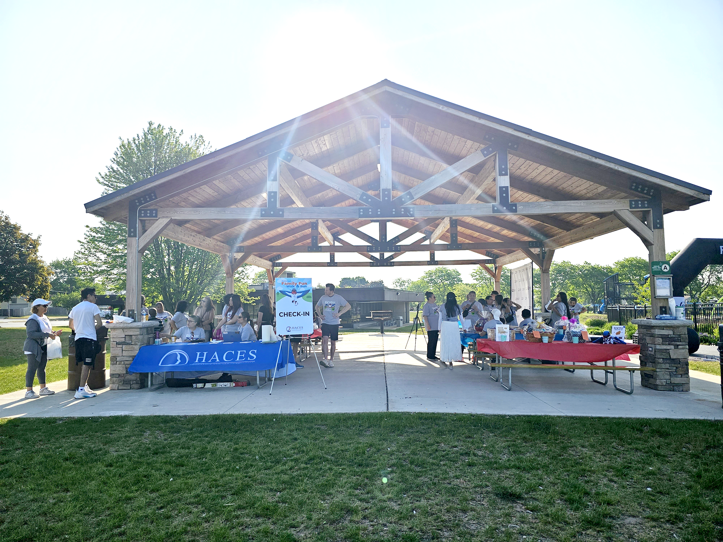
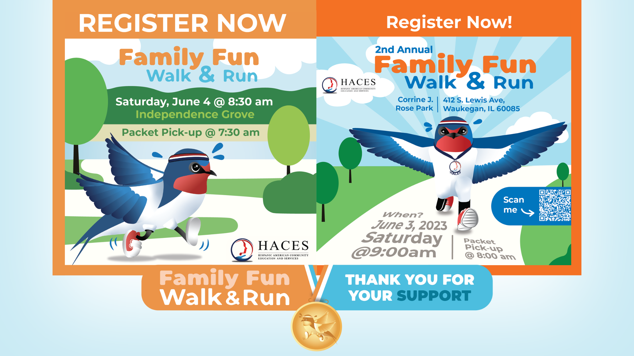
The Family Fun Walk & Run was collaboratively organized by HACES staff and the Board of Directors. A dedicated fundraising committee was established to oversee the planning and execution of the event. All graphic design materials were subject to committee review and approval to ensure consistency with organizational objectives. Throughout the design and marketing process, careful consideration was given to the target audience, including families, local community members, young adults, board members, staff, sponsoring organizations and individual donors.

Sketches

2022- hope reimagined

The initial Hope was made to look like a 2D version of a swallow. The proportions were correctly made to resemble those of a real-life swallow. After being assigned to create Hope running, I asked, “What would Hope look like with more cartoon-like proportions?”Hope’s appearance was revised to be more cartoon-like. 

2023- FACING THE FUN

During the second annual Family Fun Walk & Run, Hope was once again redrawn. As a designer, I wanted to keep the theme of Hope running in nature consistent, while introducing a slight variation from the previous year. To maintain continuity with the event’s imagery and still add something new to build excitement, Hope was illustrated from a frontal perspective for the first time.

hope reimagined

To refresh Hope’s look for 2022, gradients were applied across her body to achieve a clean, vibrant finish. Final refinements were made to Hope’s eyes and feet to enhance expressiveness and visual balance. Jogging accessories—including tennis shoes, a running bandana, and sweat droplets—were added to reinforce the event’s athletic theme. Additionally, her feathers were pulled back to convey motion and give the impression of running, completing the dynamic character redesign.

Facing the fun

While reviewing the 2022 Family Fun Walk & Run invitation, I decided to depict Hope from a frontal perspective in the 2023 design to help maintain visual interest. Additionally, I noticed that the printed version of the 2022 invitation appeared less vibrant and lacked the contrast seen on screen, which presented an opportunity for improvement in the 2023 edition.

Color Scheme & Visual Composition

The color scheme for the Family Fun Walk & Run incorporates vibrant oranges, blues, and greens. The visual compositions for the First and Second Annual Family Fun Walk & Run feature subtle variations to keep each year’s design fresh, while maintaining a consistent look and feel. This approach ensures that both editions are visually connected, clearly indicating they belong to the same event series, while offering a new and engaging experience for the audience each year.

2022: First Annual Family fun walk & Run

The First Annual Family Fun Walk & Run design used more shades of green than the Second. The four shades in this design are strategically placed to create a depth of field, with the darkest shade in the background, a slightly lighter green in the middle ground, and the lightest green in the foreground. Additionally, the varied greens add visual interest to the nature scene and make it more engaging.

2023: Second annual Family Fun Walk & Run

The design for the Second Annual Family Fun Walk & Run used fewer shades of green, shifting the approach to depth by introducing dynamic perspective. Instead of relying solely on color variation to suggest spatial depth, the composition uses movement and linear perspective to create visual interest. For example, two alternating shades of blue form a spiral-like motion in the sky. Hope is illustrated running directly toward the viewer, creating the illusion that she might burst out of the frame. To amplify this effect, I applied linear perspective to the typography—words positioned closer to the viewer appear larger, while those further away are scaled down—making it feel as though the viewer is also moving forward, directly toward Hope.

The Annual Family Fun Walk & Run is promoted through print and digital media. In the first year, the printed event postcard had a readability issue: the words “Walk & Run” were difficult to see against the sky-blue background in low lighting or from a distance. As the designer, I recognized that the contrast needed improvement. However, due to tight deadlines and the time already dedicated to redesigning Hope, I addressed the issue in the following year’s materials.

For the second annual event, I conducted a comprehensive assessment of the design using a Web Content Accessibility Guidelines (WCAG) color contrast checker. The results confirmed my concern. The blue color text against the sky blue background scored below the recommended 3:1 contrast ratio for large text. Surprisingly, the orange also failed to meet the standard. I was also unsatisfied with the appearance of the green hues I had chosen for the First Family Fun Walk and Run. When printed, the green hues appeared less vibrant than I had anticipated. 

As the graphic above shows, the new palette enhanced legibility by improving the contrast between the orange and blue on the sky-blue background. Additionally, I adjusted the green shades, increasing the vibrancy in printed media.

The Final Design

In conclusion, the Annual Family Fun Walk & Run designs featured slight variations while remaining true to the overall theme. Both designs resemble different editions of the same event. Hope is depicted in a side view in the first design, while in the second design, she is shown running from a frontal perspective. The two designs have similar color palettes with slight differences in the shades of each color. Lastly, both designs incorporate depth in the visual composition, but the Second Annual Family Fun Walk & Run adds movement and visual interest through linear perspective. 

Marketing

The First and Second Annual Family Fun Walk & Run digital marketing included social media, email marketing, and showcasing a digital banner. The digital banner was advertised to numerous outlets, informing users of the upcoming event. It also created consistency, increasing the event’s brand recognition. For example, the HACES website displayed the digital banner on its slider above the fold. When users clicked on it, it took them to the online ticket site, which displayed the banner again. In addition, I created print marketing items like the sponsorship letter and outside banners each year. This section is split into two to showcase the First and Second Annual Family Fun Walk & Run materials.

Outside Banner

Sponsorship Letter

A fillable PDF was made for sponsors to fill out and send via email, or print out and bring in person.

Digital Banner

Reaching all audiences invested in the HACES mission was essential to me and my team. I marketed to all the digital outlets where we had an existing presence, including the HACES website, ticket site, the company’s Facebook business page, and a Facebook event page. When marketing on the HACES website, I created a call to action so that users would click on the image and be directed to the ticket site to purchase a ticket or sponsor electronically. On Facebook, I wrote a description that included the link to the ticket site.

Email Marketing

March, 3 Months Away
April, 2 Months Away
June, Post Event

Interact with the newsletter above! Hover near the bottom right corner of the newsletter to zoom in, zoom out, or enter full screen.

HACES publishes monthly newsletters via email. In the March and April issues, the First Family Fun Walk & Run was featured with a “Save the Date” call to action. Since this was a smaller fundraiser and the event was still weeks away, and because the newsletter’s primary purpose was to highlight HACES’ recent activities, I chose to use the organization’s brand colors for consistency. The HACES brand colors were used again in the June edition, which was published after the event. This edition marked the conclusion of the campaign and signaled a return to the regular monthly newsletter format.
March, 3 Months Away
April, 2 Months Away
June, Post Event

Interact with the newsletter above! Hover near the bottom right corner of the newsletter to zoom in, zoom out, or enter full screen.

The two newsletters above were sent to the HACES constituents solely to promote the First Annual Family Fun Walk & Run. For this reason, the newsletter used the branding colors of the event instead of the HACES brand colors. 

May, 1 Month Away
June, 2 Days Away

Social Media Marketing

4 months of a social media marketing campaign with varying posting frequency:

  • 3 months prior: 2 posts
  • 2 months prior: 1 post
  • 4 weeks prior: 2 posts/week
  • 3 weeks prior: 2 posts/week
  • 2 weeks prior: 5 posts/week
  • 1 week prior: 8 posts/week
  • Final posts: 3 days, 2 days, and 1 day before the event
  • 2 posts after the event

Posted a total of 23 posts.

Outside Banner

Sponsorship Letter

A fillable PDF was made for sponsors to fill out and send via email, or print out and bring in person.

Digital Banner

Reaching all audiences invested in the HACES mission was essential to me and my team. I marketed to all the digital outlets where we had an existing presence, including the HACES website, ticket site, the company’s Facebook business page, and a Facebook event page. When marketing on the HACES website, I created a clear call to action so that users would click on the image or button and be directed to the ticket site to purchase a ticket or sponsor electronically. On Facebook, I wrote a description that included the link to the ticket site.

Email Marketing

Interact with the newsletter above! Hover near the bottom right corner of the newsletter to zoom in, zoom out, or enter full screen.

HACES publishes monthly newsletters via email. The March and April issues reported to the audience the HACES activities. Towards the end of the newsletter, it informed the reader of the upcoming Second Family Fun Walk & Run. Since the purpose of these issues was to report on the HACES activities, I continued to use the HACES brand colors.

The March newsletter introduced the event and called the audience to “Save the Date.” The April newsletter gave the audience details of what to expect and encouraged them to buy a ticket or become a sponsor. 

March, 3 Months Away
April, 2 Months Away

Interact with the newsletter above! Hover near the bottom right corner of the newsletter to zoom in, zoom out, or enter full screen.

The three newsletters above were sent to the HACES constituents solely to promote or report on the First Annual Family Fun Walk & Run. For this reason, the newsletter used the branding colors of the event instead of the HACES brand colors. 

April, 2 Months Away
May, 1 Month Away
June, Post Event

Social Media Marketing

5 months of a social media marketing campaign with varying posting frequency:

  • 4 months prior: 1 post
  • 3 months prior: 1 post
  • 2 months prior: 3 posts
  • 4 weeks prior: 3 posts/week
  • 3 weeks prior: 4 posts/week
  • 2 weeks prior: 4 posts/week
  • 1 week prior: 4 posts/week
  • Final posts: 4 days, 2 days, and 1 day before the event
  • 4 posts after the event

Posted a total of 25 posts.

The Event

This section is split into two to showcase the graphic design materials used in the First and Second Annual Family Fun Walk & Run. 

The First Family Fun Walk & Run included the following Graphic Design material:

  • Customized T-Shirt
  • Yard Signs
  • Thank You Letter

T-Shirt

Every participant who bought a ticket in advance received an event t-shirt.

Yard Signs

Yard signs were placed around the running path to direct runners to the correct path. In total, 15 signs were placed around the running path. The yard signs feature a sponsor and a HACES fact.

Thank you Letter

After the event, I created a letterhead design that was used to thank the sponsors and donors who had supported the event. 

The First Family Fun Walk & Run included the following Graphic Design material:

  • Customized T-Shirt
  • Yard Signs
  • Signage
  • Thank You Letter

T-Shirt

Every participant who bought a ticket in advance received an event t-shirt.

Yard Signs

Yard signs were placed around the running path to direct runners to the correct path. In total, 15 signs were placed around the running path. The yard signs feature a sponsor and a HACES fact.

Signage

A check-in and sponsorship sign was printed 24 in X 36 in and displayed next to the check-in table and at the entrance of the event. 

Thank you Letter

The same letterhead from the previous year was used to thank the sponsors and donors who had supported the event. 

Photography

First Annual Family Fun Walk & Run

Second Annual Family Fun Walk & Run