About the Brand

Celeste Flores is a community leader who ran for College of Lake County Trustee in the April 2025 elections. She was interested in creating a logo that reflects her personal brand.

A first-generation college graduate, Celeste has overcome personal challenges, remains deeply rooted in her Mexican heritage, and enjoys bold, colorful design elements. Celeste is a passionate organizer, a natural connector, and an unstoppable force for transformational change. Known for her strong voice and relentless drive, she constantly attends community events, builds relationships, and rallies others toward meaningful action. Her superpower lies in mobilizing the right people to get things done—she listens, she cares, and she leads with heart.

My Role

Contractor

Project Date

January 2025

Duration

One-Month Project

Week 1:Initial Consult 

Week 2: Present Sketches + Color Palette

Week 3: Present Vectored Logo

Week 4: Revisions + Logo Kit

Project Brief

Celeste needs to create a personal brand identity and logo for her upcoming election. It’s important to her that the logo is highly visible, easy to read, and adaptable across various mediums for her political campaign. She used the logo design and brand identity in her social media campaign, yard signs, website, newspaper ads, and “Vote Celeste” cards. Celeste planned to begin marketing her political campaign in February 2025.

01

Initial Sketches

During Celeste’s initial consultation, she shared her vision for creating a personal brand that authentically reflects who she is and the work she does in the community. Her full name, Celeste Flores, carries symbolic meaning—Celeste translates to “sky blue,” and Flores means “flowers” in Spanish. Inspired by this translation—“Blue Sky Flowers”—Celeste envisioned a logo that incorporated these natural, vibrant elements.

As a candidate for College of Lake County Trustee and a current Vice President of the Warren Newport Public Library Board, Celeste considered incorporating a book into her visual identity to reflect her commitment to education and literacy. She resonated strongly with the image of a butterfly, symbolizing transformation and growth.

Three sketches of the letter “C” were created to reflect Celeste’s personality through the design.

The first “C” showcases a humanistic quality and features flowers, symbolizing Celeste’s commitment to growth and community transformation. The flower theme is especially fitting, as her last name, Flores, means “flowers” in Spanish.

The second “C” incorporates an arrow and a hand reaching toward a star. The hand reaching for the star represents Celeste’s passion for politics and natural leadership, while the arrow reflects her energetic, “on-the-go” attitude. Celeste is constantly moving from one event to another, supporting as many community members as possible.

The third “C” is similar to the second design but features more dynamic movement in the arrow and omits the reaching hand, creating a cleaner and more focused visual.

02

Mockup

The “C” variations were drawn using Illustrator. From there they were integrated into the logo.

Monserrat was used as a typeface. When creating the mockups, the font was personalized by adding rounded edges to each letter.

Concept #1
Concept #2
Concept #3

Outcome

The client expressed a desire for a logo that felt less artistic and more robust and stern. The rounded letterforms appeared too soft and whimsical. While the combination of the “C” and the arrow was appealing, the humanistic qualities gave it a look more suited to a career in the social sciences than someone running for office.

Moving forward, the client was open to exploring how the “C” just being integrated with the arrow. She also wanted to see how a logo would look with minimal alterations to a typeface, particularly one that is bold and strong.

Additionally, we began discussing potential color palettes. In our conversations, Celeste expressed a preference for light blue, sky blue, purple, and red. Politically, purple often symbolizes a bridge between Republican and Democratic values, aligning with Celeste’s inclusive and community-focused approach. We decided to create mockups featuring two primary color schemes: one focused on purple and the other on sky blue.

03

Second Mockup

Various concepts were created with color. 

Outcome

After reviewing the color mockups, the client decided to move forward with the sky blue version of mockup “F.”

Sky blue was chosen as the primary color for its associations with trust, honesty, and calm strength. Compared to the other mockups, mockup “F” introduces an arrow—a distinctive element that draws attention to the logo and reinforces the brand’s message. The design reflects Celeste’s forward-thinking, progress-driven approach.

Although she was drawn to mockup “F,” Celeste requested that the arrow point directly toward the position she is running for, giving this element more purpose within the design. She also expressed interest in exploring alternative placements for the arrow, potentially integrating it more directly through the “C” or “F.”

04

Additional Sketches

These additional sketches portray several concepts that were explored by merging the “C,” “F,” and arrow:

  • What if the “C” swooped under “Flores” and pointed toward the elected position she was running for?

  • What if the “C” and “F” combined to form an arrow together? How would the remaining letters in her first and last names be positioned?

  • What if we played with the principle of white space, allowing an arrow shape to emerge from the negative space between the two horizontal bars of the “F”? Could we apply the same idea to the letter “C”?

  • And so on.

05

Third Mockup

A sky-blue gradient was added to the arrow, while a deep aqua blue and navy blue gradient was applied to the “C.” Together, these gradients add depth and dimensionality to the logo.

In the first and second mockups, the “C” and “F” are combined to form the arrow. The first mockup features a sky-blue tip at the top of the “C,” whereas the second does not. The third mockup takes a different approach: only the “C” incorporates the arrow, which is used to point either at “Flores” or at the elected position, “For College of Lake County Board.”

Outcome

The client was very pleased with the revisions and selected mockup three as the final logo. Celeste requested the removal of the separating line and asked to change the wording from “For College of Lake County Board” to “College of Lake County Trustee.”

06

Final Logos

Vertical Version

Horizontal Version

The client received a horizontal and vertical version of their logo as PNG and AI files for deliverables. Each logo version includes a full-color version, a black logo, a white logo, and three solid colored logos ( #48B9D1, #006E88, #1D2E52). In addition, a mini brand style guide was given to the client so they could use it for future development use. 

07

Additional Marketing Products

The client used the logo design and brand identity in her social media campaign, yard signs, website, newspaper ads, and “Vote Celeste” cards.

Client Testimonial

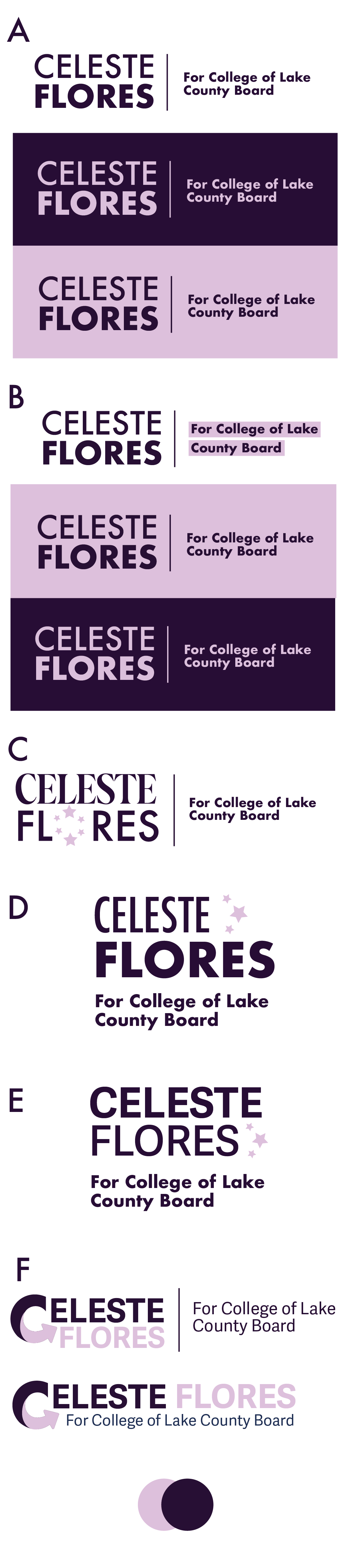
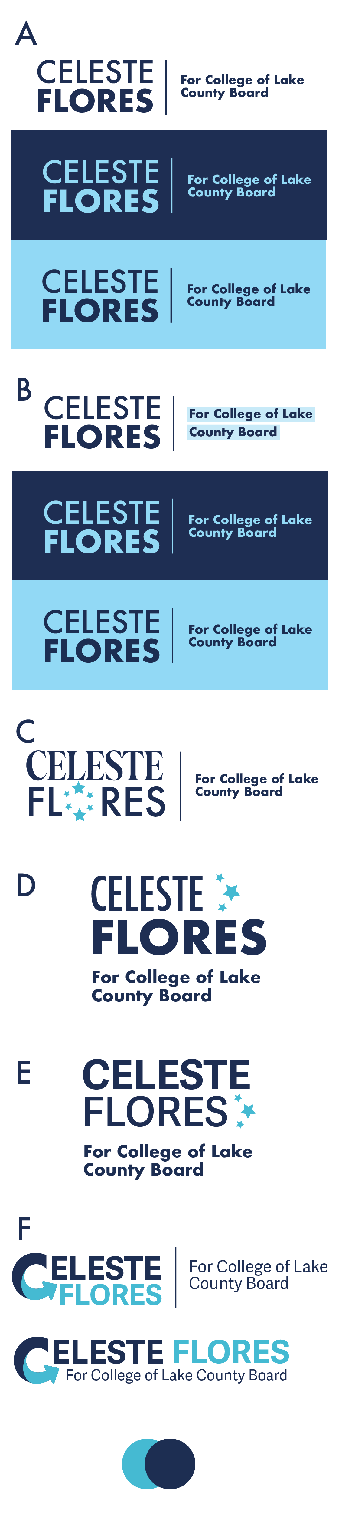
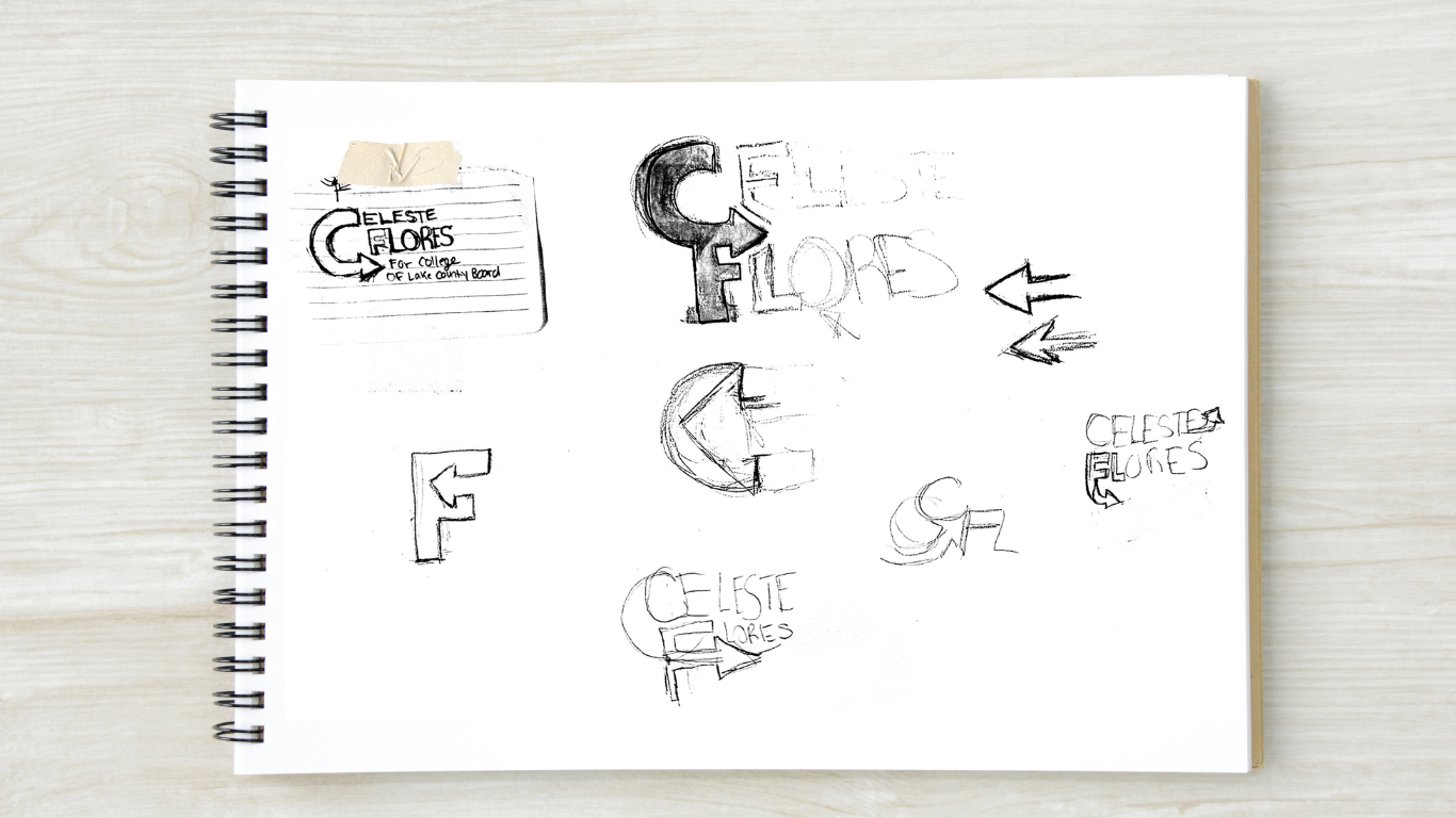
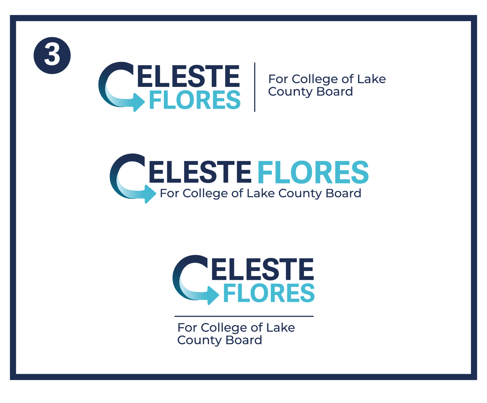
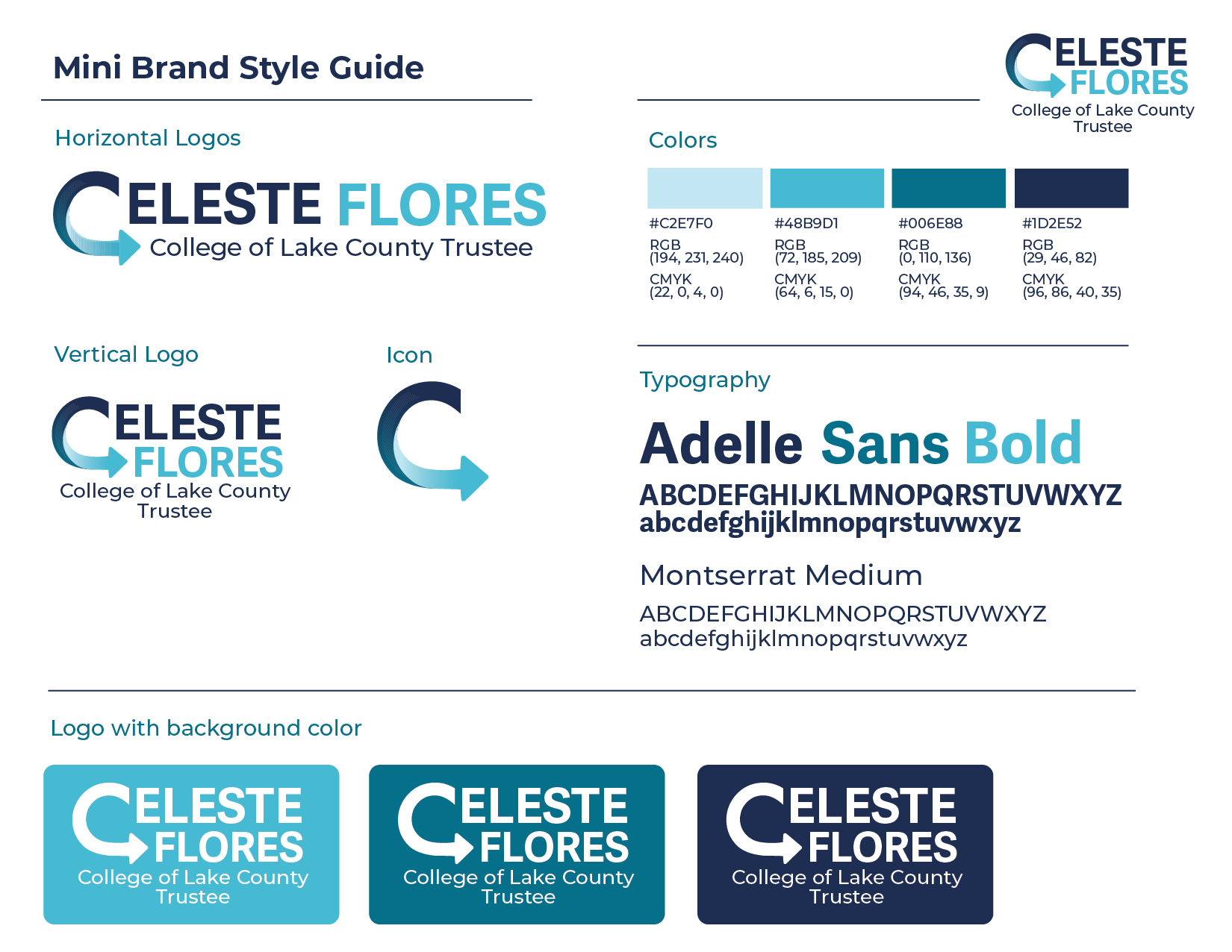
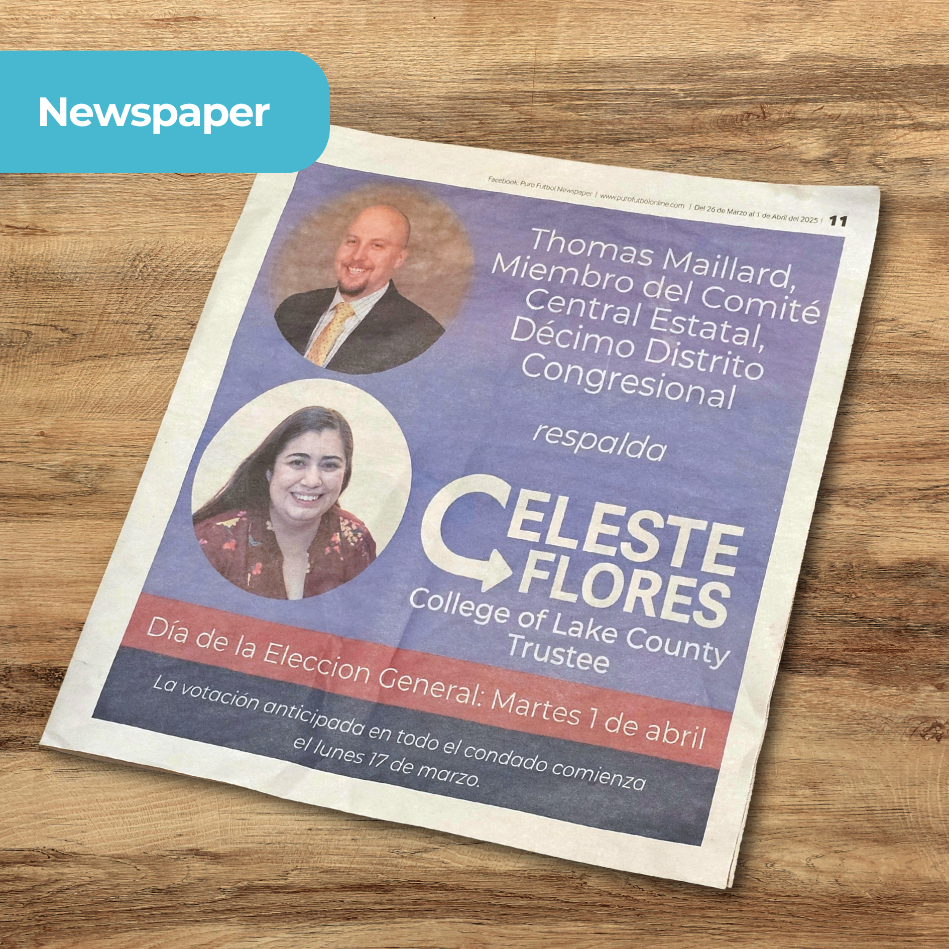
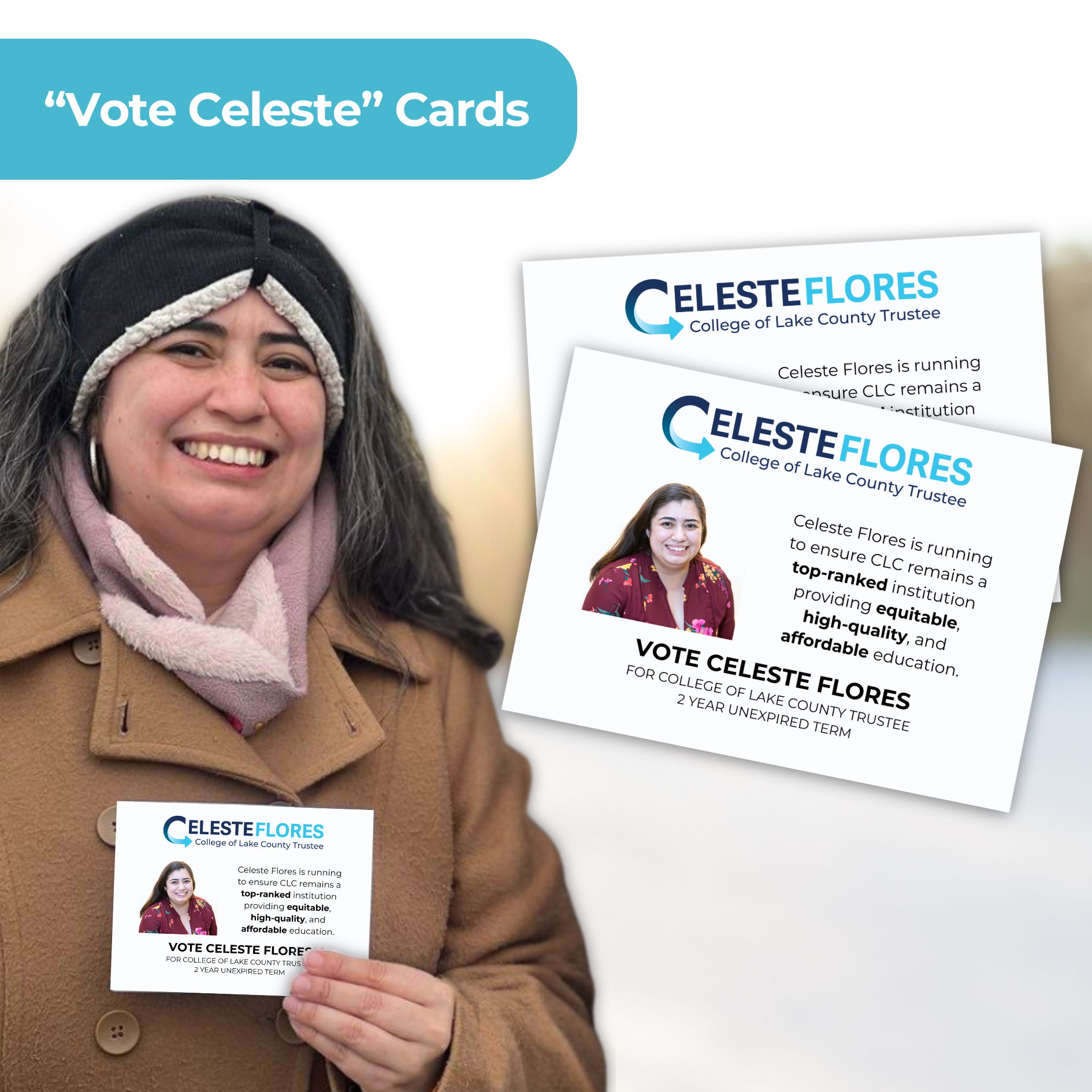
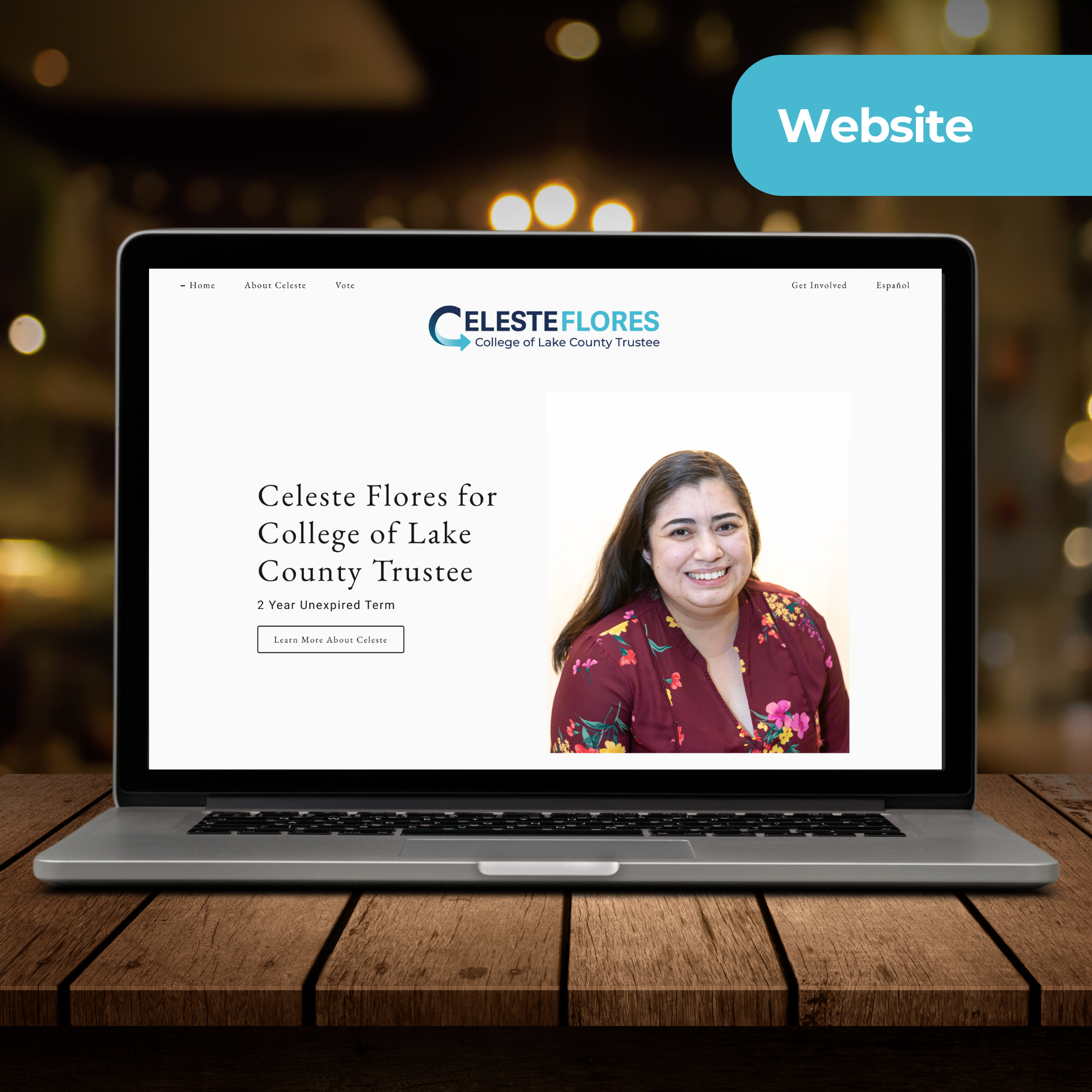
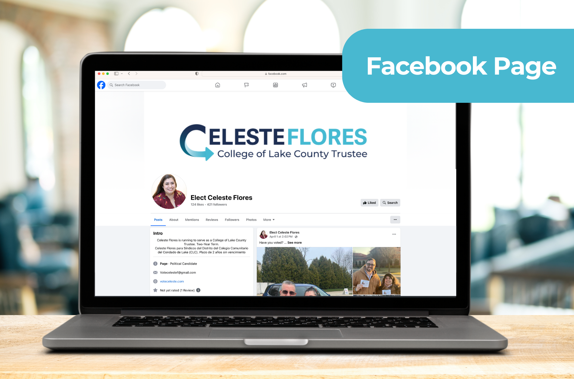
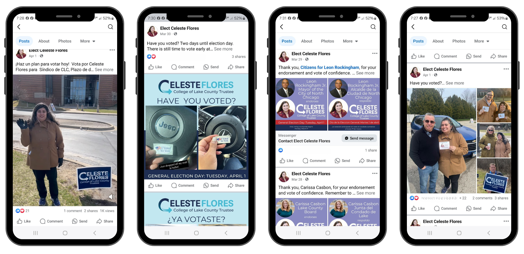
I had the pleasure of collaborating with Diana on developing my brand identity for my campaign for College of Lake County Trustee. From our initial consultation, Diana demonstrated a deep understanding of my vision, heritage, and the message I wanted to convey. She skillfully translated my ideas into a logo that beautifully encapsulates my values and aspirations. Diana’s creative process was collaborative and insightful, ensuring every design element resonated with my story. Her professionalism, attention to detail, and commitment to excellence made the entire experience seamless and rewarding. I wholeheartedly recommend Diana to anyone seeking a designer who can bring authenticity and creativity to their brand.